| Image |
Comment |
| 02/23/2006 05:16:45 AM |
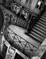
A dark side of the cityby AntoninoComment: This is a wonderful city detail. It reminds me of some of the Paris photographs of Eugene Atget, except for the rotation, of course. But in this case the rotation seems justified, because it forces some depth and perspective into this staircase and its surroundings. Processing is very nice, too .... there's really no clue (other than the rotation, and that bit of graffiti) that this is not a photograph from the 1920/30's. It's a very impressive, absorbing work. 8. |
| 02/23/2006 05:01:27 AM |
Designer Thoughtsby honikumComment: Unusual. Great impact too, and not just because of the body art. The lighting and composition are very effective, and the simple background motif is used brilliantly for your intended purpose. The toning is excellent. It would have been even better in the maximum allowed size ... it's such a clever and thoughtful photograph that I'm wondering if your under-sizing was deliberate? If so, it's the only choice you made that I can't support. 7. |
 Photographer found comment helpful. Photographer found comment helpful. |
| 02/23/2006 04:55:48 AM |
Gothicby commendatoriComment: Very good tribute, or perhaps parody. Oddly enough, in spite of it having more overtly "gothic" cues than the original, the effect is actually less starkly gothic. I think it may be the lower point-of-view, which establishes a less confrontational impact than the Wood painting. But so what; this is a very interesting and well processed image. 7. |
| Photographer found comment helpful. |
| 02/23/2006 04:48:50 AM |
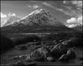
Buachaille Etive Morby TallblokeComment: Best landscape in the challenge, no doubt. The beautiful toning and other processing have made the very best of what must have already been a very fine photograph. And the composition, with the range of alps "in miniature" in the foreground, is really outstanding. 9. |
| Photographer found comment helpful. |
| 02/23/2006 04:45:42 AM |
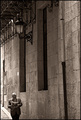
Sundayby alexgarciaComment: Very nice composition and processing. I suppose the absence of the man's legs will confuse some (a sad few may even be "distracted"). But I'm guessing that you deliberately cropped 'em out. Either way, I like it like this; it makes the photograph harder to "understand" and thus harder to easily dismiss! The stately old window openings and the formal balcony supports and lamp are nicely upset by the informality of the strolling man, smoking and reading his Sunday paper. 8. |
| Photographer found comment helpful. |
| 02/23/2006 04:35:21 AM |
white run blackby chusterComment: I like this. The processing is brutal, and that seems to very effectively isolate and contrast the primary subject and the several secondary subjects. They seem insulated from each other. The effect is to make the image easy to appreciate and enjoy. It's also interesting that the shadow, which is both the least dramatic and most interesting element in the photograph, is where my attention finishes up, no matter where in the image my scan starts out. 8. |
| 02/23/2006 04:27:14 AM |
waiting for the springby gocComment: That's a wonderful composition, and a beautiful, lush toning job. I especially admire the economy of it; everything that's there is part of the story, and everything that isn't, isn't. 7. |
| Photographer found comment helpful. |
| 02/23/2006 04:24:55 AM |
Moonlight Narcissistby jaxsondComment: Beautifully toned. Beautifully processed all round, in fact. Not my kind of photograph, but I can't help but admire the technical skill. And I'd better get used to admiring it, because it's surely going to ribbon. I'd guess blue ribbon, appropriately enough. 7. |
| Photographer found comment helpful. |
| 02/23/2006 04:19:42 AM |
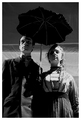
Calm eveningby TUBORGComment: Something very appealing about this. Its slightly whacky composition, and the juxtaposition of a "businessman" subject with an apparently out-of-context background, together produce an off-balance feel. The effect is to grab and hold the viewer's attention and interest. It has no obvious story to tell, yet the feeling is that there is something there after all. Unsettling. I like that. 7. |
| Photographer found comment helpful. |
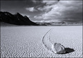
| 02/23/2006 04:12:37 AM |
Moving Rock by rd_325Comment: Interesting whimsical zen touch in an otherwise conventional landscape. Odd that I prefer this one with the rock, whereas its sibling I'd prefer without the rock. 7. |
| Photographer found comment helpful. |
Home -
Challenges -
Community -
League -
Photos -
Cameras -
Lenses -
Learn -
Help -
Terms of Use -
Privacy -
Top ^
DPChallenge, and website content and design, Copyright © 2001-2025 Challenging Technologies, LLC.
All digital photo copyrights belong to the photographers and may not be used without permission.
Current Server Time: 08/17/2025 08:35:35 PM EDT.