| Image |
Comment |
| 04/22/2006 07:15:13 AM |
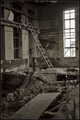
nothingby frumoazniculComment: I nearly blew right by this, which would have been a mistake. It's a terrific, meticulous photograph of ... well, you said it: nothing! And what a welcome change that is, amid so much leaden cliché. I seldom have much interest in technical matters, but the tonal control here is really very nice; it gives the scene a lovely depth and atmosphere. And the apparent chaos is actually very cleverly and confidently resolved by a few leading lines, shapes and tones: looks random, but it ain't! It's a photograph with a lot more to offer than first appears. 9. |
 Photographer found comment helpful. Photographer found comment helpful. |
| 04/22/2006 06:50:53 AM |
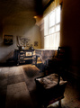
Grandma's kitchen by kiwinessComment: This has great charm. The light and the subdued palette create an atmosphere of familiarity and gentle age. 7. |
| Photographer found comment helpful. |
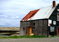
| 04/22/2006 06:47:54 AM |
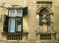
Glory's Remainsby chipucComment: This is very good, and made all the better by the wildly askew and shabby wooden shutters ... even the 'new' additions are old! Also pleasing that the man (the bust) apparently disapproves of the state of those shutters. 8. |
| Photographer found comment helpful. |
| 04/22/2006 06:44:11 AM |
Remembering the Old Waysby dsidwellComment: A startling point-of-view, and very effective. Interesting, too ... for people (including me) unfamiliar with the details of how these structures work, the foreground pole is a surprise. I thought all the poles would be inside? So the photograph not only looks good, it also stimulates thought. That's always a good thing. 7. |
| Photographer found comment helpful. |
| 04/22/2006 06:24:13 AM |
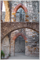
If Walls Could Talkby TheresaAComment: An interesting image. Your decision to keep the contrast subtle is thoughtful ... at first I thought it made the scene seem a little flat and two dimensional (with none of the revolting 'pop' so beloved at DPC). However, there's a lovely tonal progression starting from the foreground arch, then the upper arch, the lower arch, and finally to the lower rear wall. It establishes a pleasing gentle horizontal layering effect that would not have been possible with a high-contrast version. Sympathetic treatment of colour - subtle again! Title sucks, but I suppose you could hardly resist it. 8. |
| Photographer found comment helpful. |
| 04/22/2006 06:11:49 AM |
Old Fish Shackby KOKOCATComment: Cropping off part of the building makes the photograph so much more interesting. Somehow it helps the viewer to look at the shack in the context of its environment. Good decision. 7. |
| Photographer found comment helpful. |
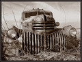
| 04/22/2006 06:06:42 AM |
Past it's gloryby BMacDComment: I like the grinning 'teeth' formed by the grille; gives it a nice rakish air, like a skull! There is no apostrophe (sorry; I'm uncontrollably anal about apostrophes). 7. |
| Photographer found comment helpful. |
| 04/21/2006 06:45:24 AM |
|
| Photographer found comment helpful. |
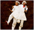
| 04/21/2006 06:40:09 AM |
cooksby whiteroomComment: Well, now you're just being silly. I like that in a gurl!
This would have won Jump. |
| Photographer found comment helpful. |
| 04/21/2006 03:52:10 AM |
|
| Photographer found comment helpful. |
Home -
Challenges -
Community -
League -
Photos -
Cameras -
Lenses -
Learn -
Help -
Terms of Use -
Privacy -
Top ^
DPChallenge, and website content and design, Copyright © 2001-2025 Challenging Technologies, LLC.
All digital photo copyrights belong to the photographers and may not be used without permission.
Current Server Time: 08/18/2025 11:39:19 AM EDT.