| Image |
Comment |
| 09/28/2005 08:27:15 AM |
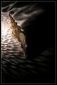
Light and Shellby ElemmennopeComment: I like this, however, I like your outtake  better. The outtake IMO is more natural (orientation of the shell) and a bit brighter. Plus I like the appearance of sand in the outtake. The lighting on your entry is low and leaves the top back side of the shell a little dark.
The concept is wonderful and I think you have a winning idea here that could do well in print sales. Keep up the good work! |
 Photographer found comment helpful. Photographer found comment helpful. |
| 09/28/2005 08:19:14 AM |
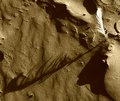
Rule ofThirds Outtakeby ElemmennopeComment: This is VERY nice. The composition is great, the lighting is good, and I really like the texture (sand imitation) to the left. Minor drawback is the lighting probably would have garnered a few "too hot" comments. It's borderline on the extreme left on being overexposed. JMO of course. ;^) |
| Photographer found comment helpful. |
| 09/27/2005 03:08:29 PM |
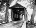
CollinsBridge.jpgby saracatComment: I'm still thinking about whether I like it or not...
The composition is good, I like the camera level at which it was taken. There are natural leading lines here with the bridge and road - takes me to ???. Ahh...the light. I SEE the light! ;^)
This works well in B/W - probably better than color. Sepia might be interesting also. Did I mention the image is a bit "hot", maybe a bit overexposed? He-he.
Ok, ok...I like it. The extreme exposure in this case works very well. Job well done.
Smile and keep having fun!!! |
| Photographer found comment helpful. |
| 09/26/2005 04:12:35 PM |
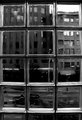
seattle window sharpened.jpgby rasdubComment: This is nice. A very interesting image to look at. Detail inside the blocks is good and the tonal range for the whole image is good. Two things I find distracting and I don't have any good suggestions for a fix: 1) The area between the panes appear oversharpened - a little jaggy. It could be the resizing done for forum posting. 2) Cropping. This image is a tough one to "draw the line". Personally, it feels a bit tight on the sides (maybe a black border would help it breath a little. If it was mine I might also crop at the bottom to take out the partial block row as it doesn't balance with the top of the image.
Good eye to see this and capture it. Well done. |
| Photographer found comment helpful. |
| 09/26/2005 03:55:32 PM |
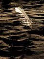
Feather.jpgby bpickardComment: Ok, you're having TOO much fun! This works well also, although I like the composition of the other one a little more because it's more unique with the feather's shadow and diagonal line. Well done! |
| Photographer found comment helpful. |
| 09/26/2005 03:52:25 PM |
Feather 2.jpgby bpickardComment: This is a very unique shot - I really like it. The composition works great. The contrast and color is right on. Creative! Only nitpik...it's a bit grainy (JK!). ;^) |
| Photographer found comment helpful. |
| 09/26/2005 09:22:02 AM |
The Harbour Iby gsalComment: You've posted several images today that I like - this one especially. Very nice job of seeing this and capturing it! Wonderful colors and exposure...composed artfully. |
| Photographer found comment helpful. |
| 09/26/2005 09:19:03 AM |
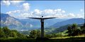
The Sense of Balanceby sz1_Comment: What a wonderful location for photos! You have two choices, include the sculpture or move in front of it and take in the beautiful scenery. I like the option you selected. It has nice symetry. Who says centered compositions don't work? ;^) Only constructive criticism I have is I wish it wasn't so hazy in the distance. A UV have filter may have helped a little (of course it could have been WAY hazy and you already used one...).
Smile and keep having fun! |
| Photographer found comment helpful. |
| 09/25/2005 09:06:45 PM |
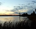
Sunrise on Stoney Creek Lakeby JewellianComment: Beautiful color. Well composed and captured. Very nice lighting and it's exposed right on! Normally a silhouette shot is a singular subject, but this works very well. Thanks for the idea! ;^)
Smile and keep having fun... |
| Photographer found comment helpful. |
| 09/24/2005 08:37:51 AM |
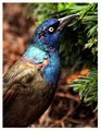
Grackleby bobdaveantComment: Nice job with the lighting here. Depending on the angle grackles can look darker brown with the head being more purple - then again, maybe that's just the way they look around our area (Virginia). I don't know if this is a full frame shot, or you cropped it, but the composition is nice - the bird creates a nice diagonal line across the image.
Did you post-process much? The feathers are quite sharp (noticed your lens has USM), yet the pine needles are blurred. Could be DOF and the needles aren't as close as they appear. Just curious. Looks good. |
| Photographer found comment helpful. |
Home -
Challenges -
Community -
League -
Photos -
Cameras -
Lenses -
Learn -
Help -
Terms of Use -
Privacy -
Top ^
DPChallenge, and website content and design, Copyright © 2001-2025 Challenging Technologies, LLC.
All digital photo copyrights belong to the photographers and may not be used without permission.
Current Server Time: 08/11/2025 01:56:07 PM EDT.