| Image |
Comment |
| 01/10/2005 12:05:27 AM |
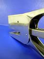
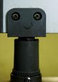
sharktales~by messerschmittComment: Cheers from the Critique Club...
This image was a great entry to hidden faces. The compostion is bang on with the contrasting blue backgrounds. The reflection on the stapler gives it a feeling of the shark lurking just above the water. Your angle on the subject also leads those viewing the image to wonder where is he going or better yet, what prey has he set his sights on.
Back to the backgrounds. I really like the effect. The blue for the water is a nice strong colour while the blue in the sky provides a nice contrast and the lighting gives the effects of clouds, which in my mind improves this image.
Now to the camera work. Unfortunately, I am not gonna tell you anything that already hasn't been said by other comments. Your shallow depth of field (DOF) "wounds" this image as the viewer is first drawn to the end (camera focal point)of the stapler and not to the head. If you were able focus and capture the head, this image would have probably scored in the top 15.
I understand your response to the lettering on the sharks head, and we can never please everyone, and you may be right in it taking a way from the illusion. With the challenge being Hidden faces, some may have looked at those markings as the sharks "battle scars" and simply could have added to the illusion.
Nonetheless, I think this was a great entry in the spirit of this challenge.
All the best,
Shawn
|
 Photographer found comment helpful. Photographer found comment helpful. |
| 01/05/2005 11:58:56 PM |
|
| Photographer found comment helpful. |
| 01/05/2005 12:05:25 AM |
|
| 01/04/2005 02:10:35 PM |
Last Surferby DiscraftComment: Beautifully composed candid and use of framing (for both the surfer and the for the sun). In my top 10 for this challenge...7. Great image. |
| Photographer found comment helpful. |
| 01/03/2005 12:01:19 AM |
Sheepish by PixelstateComment: Congrats...This was one of my highest rated images...Wonderful job!!!
|
| Photographer found comment helpful. |
| 12/30/2004 10:23:15 PM |
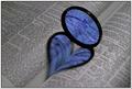
Broken Loveby GautiComment: Cheers from the Critique Club...
This is a great contrasting version on Konador's image. I studied the image quite a bit prior to reading the comments and your explaination and agree with your execution.
The composition truly represents the heartache of love...Red drives love and the heat of passion, while blue creates a distance, less romantic (cold) feel...and the convenience of the filter being broken just adds strength to this image. The fact that the book was upside down made sense to me prior to reading your reasoning...Love is definately in turmoil here.
Technically, I would have liked it to be a little sharper. I would have liked to see more lighting or more of a spotlight effect as in the original image, however I do like the gleam of the light off the cracks in the filter.
Another option that may have enhanced the contrast would be to have the light shine on the filter from a higher position to minimize the size of the reflecting heart, but of course it may not have appealed to some.
A great entry to this challange and deserving of your 11th place result.
Congratulations.
Regards,
Shawn Message edited by author 2004-12-30 22:24:47. |
| Photographer found comment helpful. |
| 12/29/2004 06:58:40 PM |
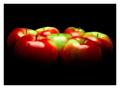
Still Life: Macintoshby gaurawaComment: Cheers from the Critique Club...
This is a wonderful re-creation of Scablab's original third place Still life and in my opinion is more appealing. The composition is bang on and the lighting helps bring out the colours and shine of each apple. The image is very sharp and the contours of the apples draw my attention right to the centre making it very appealing and inviting (makes your mouth water).
The only thing that may negatively impact this image for some is the glare from the lights. Some minor cloning (under the advanced editing rules) to tone this down may have improved the image for some.
In my amatuer opinion, this was one of a few re-creations in this challenge that resulted in a stronger image then the original. Great job!
Congratulations on your 15th place finish.
Regards,
Shawn Muir Message edited by author 2004-12-29 19:05:46. |
| Photographer found comment helpful. |
| 12/28/2004 09:40:59 PM |
|
| Photographer found comment helpful. |
| 12/28/2004 09:40:02 PM |
Elephantby SteveJComment: great image...I would have rotated 180 to have the image right side up (as I look at the image the knob above the left eye looks like the trunk...not sure if you envisioned it the same way)...6 |
| Photographer found comment helpful. |
| 12/28/2004 09:33:18 PM |
1970's Bathroom Tileby ali626Comment: great image and facial figures however you need to take advantage of the 640 pixels available to you...some will score low because of the size of your image. I really like to image created by this tile...do wish it were bigger...6 |
| Photographer found comment helpful. |
Home -
Challenges -
Community -
League -
Photos -
Cameras -
Lenses -
Learn -
Help -
Terms of Use -
Privacy -
Top ^
DPChallenge, and website content and design, Copyright © 2001-2025 Challenging Technologies, LLC.
All digital photo copyrights belong to the photographers and may not be used without permission.
Current Server Time: 08/20/2025 02:07:22 PM EDT.