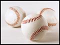
DPChallenge: A Digital Photography Contest You are not logged in. (log in or register
 
Browse Settings
Currently viewing:
Registered UserTommy 2 Tone

Show comments:

Per page:

Order:

Comments:


Comments Received by Tommy 2 Tone
Pages:  
Showing 1 - 9 of ~9
Image Comment
Beautiful Ocean and A Beer = Comfort
03/06/2006 10:32:49 AM
Beautiful Ocean and A Beer = Comfort3rd Place
by Tommy 2 Tone

Comment by dleach:
good color. The horizon being crooked is distracting though.
Photographer found comment helpful.
Beautiful Ocean and A Beer = Comfort
03/03/2006 07:57:44 PM
Beautiful Ocean and A Beer = Comfort3rd Place
by Tommy 2 Tone

Comment by caba:
Send it to Corona, nice ad, just straighten horizon a little.
Photographer found comment helpful.
Now We're Even
11/29/2005 05:02:49 PM
Now We're Even
by Tommy 2 Tone

Comment by thelucas:
excellent photo(colors,composition,dynamics)-8/10. Too bad I have to underate as the link to the challenge isn't visible and the title won't make up for it. 7/10 with both eyes shut.
Photographer found comment helpful.
Now We're Even
11/26/2005 08:23:51 AM
Now We're Even
by Tommy 2 Tone

Comment by Jammur:
Beautiful colors, great sense of action, but I think its somewhat thin towards the topic.
Photographer found comment helpful.
America's Favorite Pastime
11/04/2005 01:31:31 PM
America's Favorite Pastime
by Tommy 2 Tone

Comment by CEJ:
Hello from the Critique Club!

Composition/perspective - good ratio between your subjects and the overall size of the image. The slight down angle to the subjects works quite well here. Lower or higher would have made it hard to look at and still be pleasing to the eye. The DoF really works on this one. If all three were in focus it would lose it spacial relationships. Well done!

Lighting - the shadows are not too dark, yet they help define the individual space each ball occupies. No glares or bright spots to distract from the continuity of the white/white concept except for a small spot on the right most ball. You start to lose definition on the very right hand edge where it begins to blend into the background. However, it appears more than one light source was used which helps to keep the balls isolated and not blend into each other.

Color - the red laces as the only color is good. Kind of like 'a splash' of color. The balls and background are almost the same exact white so the laces really do their job here. The two balls in the background appear a little dirty which I find a slight distraction. The 'light' is so well done and separated from the 'white' that the dirt spots really stand out. I realize with basic editing they cannot be removed, however, washing, bleaching, showing a different side may have helped remove these. Even shoe polish could have been used.

Challenge requirements - there is no question that this image meets the challenge. Your choice of subjects was good and your control over placement demonstrates a good grasp of not only what was needed, but how to present it as well. [Suggestion: if you care, try to align the balls so the laces form their own continuity]

Overall/my opinion - I like the image and feel you did a great job for a difficult challenge. White on white is not easy to do. My strongest criticism would be the dirt spots on the balls as well as the word(s) 'China.' Both could have either been placed so they were not visible or covered with white-out or shoe polish.
Photographer found comment helpful.
America's Favorite Pastime
10/27/2005 06:08:04 PM
America's Favorite Pastime
by Tommy 2 Tone

Comment by jrtodd:
America's Favorite Pastime, made in China. What have we come to : (. The balls seem a little dirty in some spots. Nice detail in the front ball.
Photographer found comment helpful.
America's Favorite Pastime
10/27/2005 04:06:07 PM
America's Favorite Pastime
by Tommy 2 Tone

Comment by misterjosh:
Wassup with AMERICA'S favorite pastime balls being made in China? :) Nice photo.
Photographer found comment helpful.
Lounging Around
09/21/2005 07:24:27 PM
Lounging Around
by Tommy 2 Tone

Comment by macrothing:
6 - Good potential here. Criticism; whilst the eye(s) seem to be well placed for the Challenge/rule(s), I would like to see even more impact/contrast there. The carpet/floor is competing with the dog in my opinion and if it were not noticeable, more definition/focus on the dog, would have made this a better shot in my opinion.
Photographer found comment helpful.
Lounging Around
09/21/2005 03:12:14 PM
Lounging Around
by Tommy 2 Tone

Comment by Jutilda:
HEE HEE Great clear eye! I am not crazy about the carpet texture, but for a cute dog to be in the shot, I gotta up the score by one point. ;~D
Photographer found comment helpful.
Pages:  
Showing 1 - 9 of ~9


Home - Challenges - Community - League - Photos - Cameras - Lenses - Learn - Prints! - Help - Terms of Use - Privacy - Top ^
DPChallenge, and website content and design, Copyright © 2001-2024 Challenging Technologies, LLC.
All digital photo copyrights belong to the photographers and may not be used without permission.
Current Server Time: 04/26/2024 05:48:05 AM EDT.