| Image |
Comment |
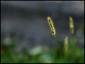
| 10/07/2007 03:23:02 PM |
Timothyby dsternerComment: Well, not a lot here. Perhaps a tighter vertical or square crop would help. There is too much space on the left side. I know, I know, negative space is good--sometimes---but I think there is too much of it in this crop. There is not that much to look at here. |
 Photographer found comment helpful. Photographer found comment helpful. |
| 10/07/2007 03:19:35 PM |
Happy Rythemsby BugzeyeComment: Good composition. There is a lot of play between the cup in the lower left hand corner and the subject. Maybe it should come out---maybe not. |
| Photographer found comment helpful. |
| 10/07/2007 03:17:08 PM |
Dawn of a new ageby tdevoeComment: Great photo. Maybe a little more detail in the darks would help but maybe not. I think that it is pretty good the way it is. Square crop is good. |
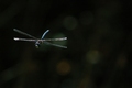
| 10/07/2007 03:15:12 PM |
Dragonfly at 1/2000by sh0rtyComment: I would have liked to have seen the original resolution.Interesting capture but not a lot for a photograph. Maybe a little bit more cropping would help. If there is a border around this, I think that it is too dark, it adds too much space to the composition. A tighter crop and lighter border would help this one. |
| Photographer found comment helpful. |
| 10/07/2007 03:11:12 PM |
Refractionby brownsmComment: Good color, Composition OK but not all that interesting. |
| Photographer found comment helpful. |
| 10/07/2007 03:10:23 PM |
West Tanfield, Yorkshireby ChinarosepetalComment: Too much saturation of color, especially the roofs. The bright color doesn't work with the cloudy day. This is a nice subject and the composition is good. Maybe this was sharpened too much. I think that a softer look would have helped this one. |
| Photographer found comment helpful. |
| 10/07/2007 03:06:09 PM |
Paperby Dirt_DiverComment: Interesting color. Interesting design. Not much else though. |
| Photographer found comment helpful. |
| 10/07/2007 03:05:11 PM |
Sweet Septemberby BradComment: Pretty girl. Good focus. Horizontal crop works OK. Balance of lights and darks good. Color good. Great skin. I don't know but the bright background spot behind her head is somewhat distracting. It's a little bit too intense. I think if it could be brought down by about half that the focus would stay longer on the girl's face. Yes, I think that this picture could be inproved considerably if that bright spot were darkened. |
| Photographer found comment helpful. |
| 10/07/2007 03:00:34 PM |
Green Lynx on the Prowlby sparrowsdeathComment: Great closeup! Wonderful detail. Nice background blur. Maybe a little dodging of the spider legs would help, maybe not. Nice Crop. Good composition. |
| Photographer found comment helpful. |
| 10/07/2007 02:58:12 PM |
Danceby joynimComment: Sweet. Doesn't show a lot of "dance" though Maybe a closer crop getting rid of the armpits would help. Maybe framing it as a head shot would be better. |
| Photographer found comment helpful. |
Home -
Challenges -
Community -
League -
Photos -
Cameras -
Lenses -
Learn -
Help -
Terms of Use -
Privacy -
Top ^
DPChallenge, and website content and design, Copyright © 2001-2025 Challenging Technologies, LLC.
All digital photo copyrights belong to the photographers and may not be used without permission.
Current Server Time: 08/05/2025 12:00:50 AM EDT.