| Image |
Comment |
| 12/05/2005 11:04:25 PM |
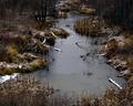
Freeze Upby dw_photoComment: I like the color balance in this photo and the exposure is great. I find that this photo may lack a definate point of focus. I know the frozen pond was meant to be a point of focus but it seems to centrally placed. |
 Photographer found comment helpful. Photographer found comment helpful. |
| 12/05/2005 11:02:31 PM |
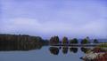
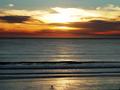
blue on blueby madison461Comment: I like the subdued colors in this photo. This doesn't look overprocessed as many landscapes shot digitally do. The reflections are well captured also. (8) |
| Photographer found comment helpful. |
| 12/03/2005 12:14:25 AM |
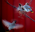
Red in focusby korpenComment: Very interesting. Most of the time I see a nature shot where there is blur I think that the photographer didn't use a fast enough shutter but in this case it looks intentional...and it works. Great job. The contrast in color in this photo between yellow and red makes the photo seem even more dynamic. (9) |
| Photographer found comment helpful. |
| 12/03/2005 12:11:10 AM |
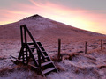
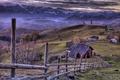
Unknown Territoryby jonrComment: Simple compostion that is very effective. The color balance also helps this image. Good use of diagonals. (7) |
| Photographer found comment helpful. |
| 12/03/2005 12:09:35 AM |
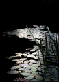
Lilly Pad Impressionsby hokieComment: This photo has a lot of potential. I like the colors and the composition is great. The only problem is the photo doesn't seem to be in focus or is blurry. |
| 12/03/2005 12:07:37 AM |
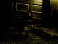
thinkingby arsenalComment: I like the low key lighting in this and whateve you did to post process. The contrast makes this look dramtic. Well done (8). |
| Photographer found comment helpful. |
| 12/03/2005 12:06:37 AM |
|
| Photographer found comment helpful. |
| 12/01/2005 01:25:42 AM |
Boundlessby 4scoreComment: Great use of negative space. I like everything about this photo excpet the two people seem to be too much to the center for my taste. (7) |
| Photographer found comment helpful. |
| 11/16/2005 10:16:48 PM |
Re-bar Rollercoasterby tmhallingComment: Originally posted by DrAchoo:
I sorta like this one. I'm not sure about the blue tint though. Rebar makes me think of rusty red. Either going with the natural tint or trying B&W since this is a picture mainly concerned with shapes and patterns (color isn't an issue with those so why use it?).
The white splotch is too bad and you probably could have done something about it. A bit overexposed on the middle highlight. The composition is nice though. |
Thanks for the review. |
| 11/11/2005 05:49:36 PM |
In the valleyby alithenakeComment: Great job. I am giving this 10. Excellent contrast and compostion. My only question is this appears to be a composite. |
Home -
Challenges -
Community -
League -
Photos -
Cameras -
Lenses -
Learn -
Help -
Terms of Use -
Privacy -
Top ^
DPChallenge, and website content and design, Copyright © 2001-2025 Challenging Technologies, LLC.
All digital photo copyrights belong to the photographers and may not be used without permission.
Current Server Time: 08/23/2025 01:07:56 PM EDT.