| Image |
Comment |
| 01/19/2003 12:34:01 PM |
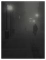
L'etrangerby greenem2Comment: A visit from the Critique Club :)
Wow, I really like the atmosphere of the photo. I think this is an excellent photo. You managed to capture the scene as you say it was in real life. The only minor complaint that I have is that black blob that looks like a garbage container seems to add another "person" into the photo. I love the repeating lights and the lines. The placement of the person is almost perfect too but maybe move him a tiny bit more to the left. |
 Photographer found comment helpful. Photographer found comment helpful. |
| 01/19/2003 12:17:26 PM |
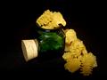
Bug casings? I thought they were noodles!by justineComment: A visit from the Critique Club :)
Ok, first two things I thought of were "I don't get it" and "It's too dark"
After looking for it a while I retracted my "too dark" remark because you have all of the elements well lit. Infact I would say the noodles are perfectly lit since they do show depth and very intricate bends and curves. They also have a good texture.
I read some other comments and the suggestion was that the cork was the stranger in the strange land but I fail to make this association as the cork seems to fit perfectly with the container so the "I don't get it" remark is still appropriate.
I think if I was doing this photo I would try it with a frame full of those noodles and another different type of a noodle. Something very similiar to the grapes photo I have done for the Fruits & Veggies challenge.
Another thing that I did notice was that the jar was a centered and I feel shifting it a little to the left would have made for a stronger composition. |
| Photographer found comment helpful. |
| 01/19/2003 12:06:32 PM |
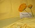
Yellow - ColdPlayby EnzoComment: Well, personally, I have never heard of the song or the band but I would say it definitely meets the challenge.
Composition is ok, I think it could be improved by making the flowers stand out a little more. They seem to be kind of added in and not really part of the scene. Perhaps lay them down.
The card is kind of odd. I can see what you were trying to do with it but you cut off the bottom line and since everything else is yellow a yellow card or perhaps a post-it note would have been more appropriate.
I definitely like the bunched up cloth to give the image depth and the curves. Good use of diagonal lines to bring the viewer's eye towards the card and the flowers. But I think there's also too much negative space in this photo.
Overall I think it's a good photo but there's definitely some room for improvement. |
| 01/14/2003 02:45:39 PM |
"Jenny" - Tommy Tutoneby calailleComment: A visit from the Critique Club :)
I definitely recognize the song. Which means you have successfuly met the challenge (at least in my eyes). It's a good concept but the technical execution leaves me wanting more. The biggest problem I see is the distracting background. The vertical lines in the background do not help and the white walls show some noise. I would try using a dark or light background and more light. Also, I would try to be a little closer to the screen. Otherwise it's a very good song title that would make for a good photo. |
| Photographer found comment helpful. |
| 01/08/2003 02:20:33 PM |
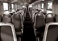
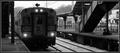
You Wish !!by miss parkerComment: A visit from the Critique Club :)
Things I really like about this image is the repeating shapes of the chairs, perfect depth of field, the antique tone and almost perfect exposure. I find especially interesting the patterns from the sun on the walkway. This train is very clean, not like our New York subways and railroad :(
There are a few things I am disappointed at, for example the slight tilt of the camera to the left. This draws more attention to the overexposed windows to the left. Also, this photo seems kind of desolate, I really wish there were more people in the photo. The connection to the challenge would have been even stronger. |
| 01/07/2003 11:17:34 PM |
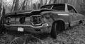
Stuck in Neutralby BullwinkleComment: A visit from the critique club :)
I think this photo is excellent. I love that you used B&W for this and chose to put a good spin on this challenge by showing the means of travel after it has served it's time. The composition for this is great, you show the whole car in a tight crop and it's sufficient. I would think the only conditional improvement would be is that if this car was in the woods, I would try to emphazise that as well. But if it's on the side of the road the way you have chose to compose is perfect. Depth of field is dead on, the whole car is in focus. Very well done.
|
| 01/06/2003 09:29:10 PM |
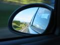
Road Tripby Swami GComment: A visit from the critique club:
If anyone ever travelled by car long distances knows this is a familiar sight. Definitely meets the challenge. I can see what you were trying to do but I feel a better job can be accomplished.
The biggest problem I see with this photo is that the reflection in the mirror is blurry from a longer shutter speed. The motion blur outside the window is nice but I would think that it is secondary in this particular photo.
It would have been a better emphasis/fit for the Motion challenge. Another thing I would love to see is the face of the driver. Perhaps something of a sad/bored facial expression to emphasize the distances traveled.
Of course you being the driver this might be a rather dangerous situation. I'm pretty sure they sell window clamp tripods that you can put on your window which would be a great thing to use for something like this. |
| 01/04/2003 09:40:29 PM |
|
| 12/30/2002 12:06:36 AM |
I am dumby AnthraXComment: Then what is the point of submitting at all?
You're obviously not going to win...and I doubt you had any fun taking the photo...So, why make yourself feel bad by getting a low score? |
| 11/26/2002 02:20:00 PM |
|
Home -
Challenges -
Community -
League -
Photos -
Cameras -
Lenses -
Learn -
Help -
Terms of Use -
Privacy -
Top ^
DPChallenge, and website content and design, Copyright © 2001-2025 Challenging Technologies, LLC.
All digital photo copyrights belong to the photographers and may not be used without permission.
Current Server Time: 08/04/2025 11:10:23 PM EDT.