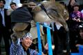
DPChallenge: A Digital Photography Contest You are not logged in. (log in or register
 
Browse Settings
Currently viewing:
Registered Userpsychephylax

Show comments:

Per page:

Order:

Comments:


Comments Made by psychephylax
Pages:   ... ...
Showing 121 - 130 of ~344
Image Comment
Alcohol
11/28/2005 12:55:21 PM
Alcohol
by gloda

Comment:
I love the stark contrast but there is just too much reliance on the title to convey the idea of adulthood, the image looks very unrealistic and it's hard to tell if the person is a young kid, teenager or an adult.
1 for Arthritis, 1 for Dementia, 1 for ...How about them Braves?
11/28/2005 12:53:34 PM
1 for Arthritis, 1 for Dementia, 1 for ...How about them Braves?
by macrothing

Comment:
a clever image but I must admit those pebbles do not look like meds. That's probably my biggest complaint here. The idea is there, the execution is there but the meds don't look real.
Photographer found comment helpful.
Whisky
11/28/2005 12:52:17 PM
Whisky
by barbaraanne

Comment:
Nice idea but the out of focus table edge in the foreground is really distracting to me.
Photographer found comment helpful.
boudoir
11/28/2005 12:51:44 PM
boudoir
by nolock

Comment:
Seems to be a bit on the yellow side. I think you aimed to have a warm feel to it? Also, I'd expect there to be more clothes. Who wanders outside with only one shoe and a bra? There should be a lot more clothes for the image to "work" but I like the idea.
Photographer found comment helpful.
Uuuuiiiiiihhhhh
04/21/2005 11:47:38 PM
Uuuuiiiiiihhhhh
by Winterberg

Comment:
A visit from the Critique Club

(1) COMPOSITION -CONTENT - This kind of looks like a shot from a Lensbaby. A very interesting take on the Extreme Action challenge. I'm torn between saying this is great and saying I'm not happy with some elements. I agree with some of the comments that the colors are superb, the motion blur adds a lot of fun to this shot and the photo is acceptably sharp. There are a few elements that bother me just a bit: the background faces at the top are kind of a distraction. I feel if you cropped right above the motion blurred main subject it would increase the impact of the blur and draw the eye to the sharp point (people) in the photo more. The slightly blown out highlight right below the woman, and the streak of light right next to her right eye.

(2) BACKGROUND - Background is very nice, colorful and fun but not cluttered and overpowering.

(3) CAMERA WORK -TECHNICAL - Exposure is good but maybe underexpose this by a stop or so, may improve the details slightly. Focus is decent on the main subject. Tricky shot I would say, and I'd say you pulled it off quite well.

(4) DIGITAL PROCESSING - TECHNICAL - Aside from the crop I suggested I think this was well processed. The lighting is very natural looking.

(5) MY OPINION ON THE PHOTO - I wish it scored higher I think it's definitely a top 10 with it's unique take on the challenge.
Performing Monkey
04/20/2005 10:14:20 PM
Performing Monkey
by Pug-H

Comment:
A visit from the Critique Club

(1) COMPOSITION -CONTENT - I do not like the composition here at all. One of the most important things in photography in my opinion is having a clearly defined subject. Here it appears as if the main subject of the photo is either the trainer or the blue bar, however they are clearly not doing anything that would qualify as "Extreme Action". The monkey looks like a ragdoll being flung over the blue bars. One of the biggest concerns on the composition is that the front limb of the monkey is blocking the face. Major points got deducted for that I suspect.

(2) BACKGROUND - Way too busy in my opinion. But then again, it looks like you were in a bind since that was most likely a performance of some kind and you probably couldn't move around much at all. Also looks like your aperture was wide open as it is.

(3) CAMERA WORK -TECHNICAL -
The exposure looks good, there are no blown out hightlights or underexposed parts. Going back to composition, I would say it might have been more captivating if you chose to frame it a bit differently on the shot. Moving the monkey to the lower left corner and giving it some negative space at the top might have helped focus the attention on the actual act of jumping the bar.

(4) DIGITAL PROCESSING - TECHNICAL - Post processing looks pretty good. One thing you could try is using curves to boost some of the detail in the shadows and maybe a smidgen of Unsharp Mask as the finishing touch.

(5) MY OPINION ON THE PHOTO - In my opinion this has some room for improvement by using a shallow depth of field, different composition, some negative space to give the monkey room to jump into are some of the ways you could improve on this. It does not strike me as a captivating photo.

One other thing that would probably be quite interesting is showing motion. This could have been done with a slower shutter speed, and a rear curtain flash to get a trail of the jumping monkey then freeze the action and get a sharp photo.
Photographer found comment helpful.
Spring arrive, Kittens born
04/19/2005 08:00:10 AM
Spring arrive, Kittens born
by mkirdal

Comment:
Does that mean you're going to eat the kittens? hehe
The title and the photo do not match. These are kittens not puppies.
They look very cute but out of focus. There is just a bit of harsh light on the cover to the right from the lights (diffuse the light with some tissues/napkins/cloth/reflector) and I wish at least one of the kittens was looking up at the camera. Also, that light crossing the background is a bit distracting and doesn't appear to serve any purpose.
Photographer found comment helpful.
My Rather Vain Macaw
04/17/2005 10:54:41 AM
My Rather Vain Macaw
by beamsclan

Comment:
A visit from the Critique Club

(1) COMPOSITION -CONTENT - I'm torn between saying it's a good composition and saying it can be improved per some of the suggestions from other comments. I feel that overall composition works here and a lot of leading lines result in my eye resting on the beak time and time again. Anyone who has watched birds knows what they look like when they're cleaning themselves/plucking out their feathers and I feel you have captured that moment well. Almost like a candid photo of the unsuspecting pet parrot.
I think you've even used the rule of thirds placing the eye in the top left section of the photo. I think some of the other compositional suggestions are good ones, like getting a slightly different angle.

(3) CAMERA WORK -TECHNICAL - I would say the exposure is spot on, you kept the whites without blowing them up. Focus, on the other hand is acceptable in some parts but the depth of field here is lacking. Which I suspect contributed to some of the compositional comments. I noticed that you've shot this at f/5.6 with a shutter of 1/50 and ISO 200. I think you would have been better off setting the aperture in the f/8 to f/11 range and bumping up the ISO to 800. I understand that may introduce some more noise than say ISO 100/200/400 but that could be fixed with NeatImage/Noise Ninja and still give a good result.

(4) DIGITAL PROCESSING - TECHNICAL - As I mentioned before, I think that this photo lacks depth of field which is not something that's easily curable with post processing. On my monitor I do not see any flaws that jump out at me such as a color cast. I think a pass of Unsharp Mask would yield a bit sharper photo (I'm not sure if you used it or not since you left no comments).

(5) YOUR OPINION ON THE PHOTO - I like the photo and I think you have a good subject for the challenge. I'm not sure I want to say the photo tells us a story, but it's something I would consider printing had the Depth of Field issue been a bit less obvious.
Photographer found comment helpful.
Q
04/09/2005 09:30:43 PM
Q
by msdoubletrouble

Comment:
It's definitely a letter Q but I don't think this is screaming creative at me....I would classify this as a mediocre shot that meets the challenge. On the technical side the squigly part of the Q seems to be out of focus a bit.
Photographer found comment helpful.
In the begining of the Egyptian history
04/04/2005 10:35:32 PM
In the begining of the Egyptian history
by hossam

Comment:
I feel this photo has a lot of potential and probably would have gotten a perfect 10 from me had there been no car and no man to the left. On one hand it's a contrast between modern world and many ages ago, but I feel that leaving out the modern commodities would have produced a much stronger image. Perhaps cropping the car out would have sufficed but I guess it's too late now. Still a worthy submission.
Pages:   ... ...
Showing 121 - 130 of ~344


Home - Challenges - Community - League - Photos - Cameras - Lenses - Learn - Help - Terms of Use - Privacy - Top ^
DPChallenge, and website content and design, Copyright © 2001-2025 Challenging Technologies, LLC.
All digital photo copyrights belong to the photographers and may not be used without permission.
Current Server Time: 08/02/2025 10:20:27 PM EDT.