| Image |
Comment |
| 05/27/2005 07:43:01 AM |
Gerber Daisyby amcfotoComment: This is very nicely shot. The color gradient from center to outer edge shows off the light very well. Would like to see the center off-centered with a really low dof allowing something behind to fill in with a complimentary color and add some artistic interest to it, but is very nice as is.
Did you use a tripod or handhold this one? |
 Photographer found comment helpful. Photographer found comment helpful. |
| 05/26/2005 08:45:45 PM |
Seagull_2334.jpgby 2ShayComment: I like this image just the way it is. The blurring of the wings is minimal and the detail in the rest does not appear to have been over 'neat imaged' |
| Photographer found comment helpful. |
| 05/22/2005 07:01:51 PM |
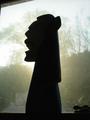
Mr. Hitchcockby alanbataarComment: Concept: Good Idea, not well executed. Comes off cheap (toys and shadow boxing)
Composition: Lighting seems good, but the use of shadowcasting as a sil will hurt this image. Shadows themselves are uneven and come off blurry.
Challenge: Hurt by shadowcast as opposed to backlighting. |
| 05/22/2005 06:58:54 PM |
|
| Photographer found comment helpful. |
| 05/22/2005 06:55:27 PM |
Calungaby CEJComment: Concept: Good subject, very bad background choice.
Composition: The screen would have been better cropped to show no evidence of the window sill.
Challenge: Yes, definitely, but the background is so harshly lit and ultimately ugly as to detract from the potential that this image could have achieved. |
| Photographer found comment helpful. |
| 05/22/2005 06:52:56 PM |
Up Against A Brick Wallby dphillipsComment: Challenge: Sil or Shadowcast? The very question will hurt this image, although technically a sil, in the 'purist's' minds, this will cost you.
Composition: There is an uneven lighting top to bottom that causes some distraction and lends a yellowish cast to part of the image.
Concept: Fails on interest level, but does not hurt or help the overall. |
| Photographer found comment helpful. |
| 05/22/2005 06:50:36 PM |
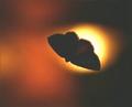
late night landingby ShutterPugComment: Concept: Nice idea, but composition detracts too much.
Composition: Good placement of subject and light, but very oof, with light streaming through the wings, hurting the challenge topic. Blur factor on background and subject make this seem very overprocessed on a ho-hum image.
Challenge: Almost. Too much light/detail in the subject. |
| Photographer found comment helpful. |
| 05/22/2005 06:47:57 PM |
Silhouette Memorialby zagmanComment: Concept: Nice Idea, but fails in the composition.
Composition: Backlit by what could be a monitor, replica buildings come off cheap and the background is not realistic. Centered subject here could work much better with a different crop-ratio or orientation.
Challenge: Not enough dark where there should be. Too much detail in the buildings. |
| 05/22/2005 06:45:15 PM |
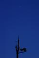
Blue Mood & Moonby MonaComment: Subject: Torn on this one. It is minimalist and well balanced due to crop, but seems less than interesting which detracts from the whole.
Concept: Good Idea, perhaps the division (space) between the two is what is causing me to not appreciate this image as I should.
Challenge: Bit too much detail in the top portion of the branch. Almost side-lit which does not lend well to the concept of a sil. |
| Photographer found comment helpful. |
| 05/22/2005 06:39:04 PM |
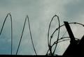
safety first (barbed-wired fence)by redpandaComment: Challenge: Yup its a sil.
Concept: Is there one? This appears to be a happenstance.
Composition: Balanced in the thirds concept
Subject: Could be interesting but it is so (thin) minor to the background that it is easily overlooked. On one side, the wire starts a wave pattern that if repeated a few more times would stand on its own, but it ends prematurely into a cacophany of other shapes that hurt the overall image and cause it to be less interesting than its potential. |
Home -
Challenges -
Community -
League -
Photos -
Cameras -
Lenses -
Learn -
Help -
Terms of Use -
Privacy -
Top ^
DPChallenge, and website content and design, Copyright © 2001-2025 Challenging Technologies, LLC.
All digital photo copyrights belong to the photographers and may not be used without permission.
Current Server Time: 08/21/2025 07:23:45 PM EDT.