| Image |
Comment |
| 01/15/2007 12:34:29 PM |
Red vs Blueby marvinComment: A tough translation to the challenge, but given the doubt. A good concept, well executed with DOF and crop - Noise levels in this image are really distracting and a pass with neat image would have raised the bar so to speak at least a point or two.
( 5 ) |
 Photographer found comment helpful. Photographer found comment helpful. |
| 01/15/2007 12:27:06 PM |
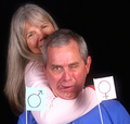
40 years and countingby sfmorrisComment: The use of the gender flags really took away from the impact of this otherwise great image. I loved the concept, expression and lighting. A narrower crop and no flags would have resulted in a 7 at least.
( 5 ) |
| Photographer found comment helpful. |
| 01/15/2007 12:25:29 PM |
Crossdressingby jrdawsonComment: Concept: Does not translate well without title.
Image Quality: Excellent. Nice finesse. Lighting is flat over majority of image and really hurts the overall. Could have used a slight rotation.
( 5 ) |
| Photographer found comment helpful. |
| 01/15/2007 12:20:40 PM |
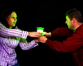
Project "X"by Mal37Comment: Concept: Confusing translation to challenge subject. Unique but not superbly executed...too much negative space, scene appears contrived/posed.
Lighting: Excellent use of elements here. Nice color cast usage.
Subjects feel 'cut off' with the crop. A subtle backlighting would have gone a long way in this image, helping the subject's to not fall off into the shadow/background.
( 5 ) |
| Photographer found comment helpful. |
| 01/15/2007 12:14:23 PM |
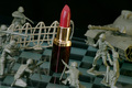
Combatting Cosmeticsby sarrobiComment: Choice of greenish men on greenish chess board hurts this image directly. Black and white spaces would have created a much needed contrast element.
Great concept and well setup. Great focus, crop etc. Comes off as flat due to coloration conflicts.
( 5 ) |
| Photographer found comment helpful. |
| 01/15/2007 12:12:18 PM |
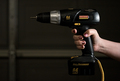
Quit Gettin' Into My Toolbox, Woman!by freakin_hilariousComment: Concept: Decent - Does not translate well without title.
Lighting: OK, Subject almost lost in shadows on left side.
Image/concept is not finessed to point where it can compete with others in the challenge but it is good quality photography.
( 5 ) |
| Photographer found comment helpful. |
| 01/15/2007 12:10:09 PM |
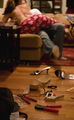
Hard Work Interrupted By Playby navyasw02Comment: Great Concept. Great Execution. DOF well used. Props well used.
Lighting Quality unfortunately flat and really hurts this image a lot.
( 5 ) |
| Photographer found comment helpful. |
| 01/15/2007 12:03:35 PM |
aaaarrgg.....not again!!!by AirricKComment: While a unique concept, the image itself appears oversharpened to the point that the colorations are distorted. This would have done much much better in black/white. The hair appears oof because of the finishing.
( 4 ) |
| Photographer found comment helpful. |
| 01/15/2007 11:56:47 AM |
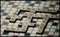
War Of Wordsby TiNComment: Concept: Unique - Execution: Excellent. Nice clean image.
Lighting: Poor, flat. The subtle desaturation in this image has taken something away from the punch it could have had.
Image Quality: Excellent
Should have been an 8-9
( 6 ) |
| 01/15/2007 11:54:59 AM |
Does SIZE matter?by JuliBocComment: Concept: Does not translate well without title.
Execution: Snapshot.
Lighting: Great. Quality: Nice use of focus and DOF.
( 4 ) |
| Photographer found comment helpful. |
Home -
Challenges -
Community -
League -
Photos -
Cameras -
Lenses -
Learn -
Help -
Terms of Use -
Privacy -
Top ^
DPChallenge, and website content and design, Copyright © 2001-2025 Challenging Technologies, LLC.
All digital photo copyrights belong to the photographers and may not be used without permission.
Current Server Time: 08/22/2025 05:47:13 PM EDT.