| Image |
Comment |
| 11/17/2004 03:11:11 AM |
|
| 11/17/2004 03:09:13 AM |
Black and Whiteby stragsComment: Great idea for this theme - bit down from the technical side: ugly shadows from the flash and lack of black/white squares in the reflection on the black cup. I don't know why you needed the spoon though, it only got overexposed from the flash and showed the rest of the room... Details, details... I'll still give you a 9, great idea... |
 Photographer found comment helpful. Photographer found comment helpful. |
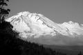
| 11/17/2004 03:04:18 AM |
Shasta Mountainby prbettsComment: Really tough shot, but you handled it well (trees in the shadow and bright snow on the sun) - there is still much detail to be seen in the trees and mountain in snow isn't overexposed.
I don't know about this tree in upper left corner though - it kind of doesn't fit in... |
| Photographer found comment helpful. |
| 11/17/2004 02:55:06 AM |
Mic & Bassby BeeGeeComment: Good composition, I would suggest to put the bass in even lower position to balance the photo more and to emphesize the parallel lines of microphone and neck of the bass... |
| Photographer found comment helpful. |
| 11/17/2004 02:27:45 AM |
rainy dayby kittenfcComment: Took me a while to figure this out...
These two black spots are a bit distracting, otherwise nice composition. |
| Photographer found comment helpful. |
| 11/17/2004 02:25:36 AM |
Near the Ghost Mineby SammieComment: Great landscape with beautiful light and nice crispness, slightly overexposed on the vertical rock... |
| Photographer found comment helpful. |
| 11/17/2004 02:22:45 AM |
Bedtime Candidby cbellerComment: Double framing? Too much - the frame you made during photographing would have been enough... |
| Photographer found comment helpful. |
| 11/17/2004 02:20:22 AM |
Your alternate option: Appleby hyphaefungiComment: Nice idea, but your shot doesn't reflect the title in full: unfortunately apple sign is out of focus :-(
While inverting colors it would have been a better option to decrease output levels on the black side so that the final photo doesn't look so much overexposed... |
| Photographer found comment helpful. |
| 11/12/2004 02:51:22 AM |
|
| Photographer found comment helpful. |
| 11/12/2004 02:45:48 AM |
Traditional Embroideryby mannjuditComment: Interesting motive, but looks washed out - colors could have been so much more lively with a small use of cuves/levels... |
| Photographer found comment helpful. |
Home -
Challenges -
Community -
League -
Photos -
Cameras -
Lenses -
Learn -
Help -
Terms of Use -
Privacy -
Top ^
DPChallenge, and website content and design, Copyright © 2001-2025 Challenging Technologies, LLC.
All digital photo copyrights belong to the photographers and may not be used without permission.
Current Server Time: 08/21/2025 11:51:52 AM EDT.