| Image |
Comment |
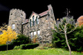
| 12/06/2005 08:40:19 PM |
The Guardianby msdoubletroubleComment: The shot's nice enough, but I find the brown part of th border kindof distracting. A border should subtly augment, not draw the eye away from the photo. |
 Photographer found comment helpful. Photographer found comment helpful. |
| 12/06/2005 08:35:02 PM |
Spiritsby ubiqueComment: I like the shot, but the border is so big that it's distracting. |
| Photographer found comment helpful. |
| 12/04/2005 07:32:09 PM |
|
| Photographer found comment helpful. |
| 12/04/2005 07:31:11 PM |
|
| Photographer found comment helpful. |
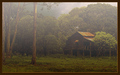
| 12/04/2005 07:29:40 PM |
Roycrofters' Fantasyby lwkimagesComment: Not sure what you did to make the sky black, but it seems out of place. Overything looks well lit so it doesn't appear to be night, making the black sky seem totally fake and it doesn't seem to accent the subject much. |
| 12/04/2005 07:11:49 PM |
My chicksby olnosComment: Seems distorted. Not sure if that was intentional, but I think it detracts rather than adds to the image. |
| Photographer found comment helpful. |
| 12/04/2005 07:09:15 PM |
|
| Photographer found comment helpful. |
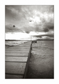
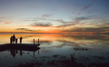
| 12/04/2005 06:34:14 PM |
Twilight's Exhibitionby secondglantzComment: I very much like the silhouette of the people on the dock, but the composition needs work. First of all, the horizon needs to be horizontal (it appears to be dipping to the right). I would also place the dock people a little closer to the center (rule of thirds perhaps). The way they are, the people are so far to the side that it's easy to miss them and get lost in the sunset, which is nice, but not all that exciting as sunsets go. The people are the impact of the photo so they should placed more prominently. |
| 12/04/2005 06:30:03 PM |
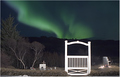
Aurorasby IceRockComment: The big white gate is extremely distracting. |
| 12/04/2005 06:28:07 PM |
Atlanta Twilightby ericwooComment: Perhaps my eyes are playing tricks on me, but it appears as though the buildings are tilted slightly to the right. I also find the border a little distracting (the white part is too bright against the black and the image). |
| Photographer found comment helpful. |
Home -
Challenges -
Community -
League -
Photos -
Cameras -
Lenses -
Learn -
Help -
Terms of Use -
Privacy -
Top ^
DPChallenge, and website content and design, Copyright © 2001-2025 Challenging Technologies, LLC.
All digital photo copyrights belong to the photographers and may not be used without permission.
Current Server Time: 09/04/2025 12:41:26 PM EDT.