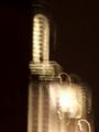
Empire State Lightby
suecunningComment: Thanks to everyone for their comments. Just got this camera and have never entered anything before so I suppose this was a way to get the feet wet. Doesn't help that I don't have access to Photoshop yet which is why I had trouble with sizing. Anyway, hopefully I can tweak the rudimentary stuff and submit more meaningful shots in the future.
Originally posted by Britannica:
The points that I am sure you have heard already in the comments; image size is not using the allowed size of 640 pixels on a side and has a bit of a clockwise tilt. The motion blur is so obvious I will assume it was intentional, and it certainly brings the focus of the image away from the building (as a building) and places it squarely on the lights. A great way to meet the challenge topic head on. However, abstracting the building in this way leaves you with composition only to produce an effect -- and it is a bit heavy on the right hand side. The large bright area in the lower right out weights the rest of the image -- I believe placing more negative space on the right and less on the left would have produced a better composed image. |