| Image |
Comment |
| 04/15/2003 07:10:38 AM |
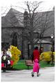
On Locust Walkby JPRComment: Greetings from the Critique Club
First off - this is an interesting picture. I've just spent a good couple of minutes looking at it. I see that you've desaturated some colours and that's left us with a few very strong colours in the foreground. I'm left wondering if there is significance to the fact that the church is almost totally desaturated while the child and her mother are bright and vibrant. I also wish I knew more about Locust Walk - there has to be a story behind that name and I wonder if it's related to the meaning in this picture.
What I also find interesting is that the young lady and her mother have some movement left to right but where most pictures depicting movement would leave open space in front of them to move into you've left space beind them. That gives the feeling that they're leaving the scene - perhaps going to the church which has those interesting orange lights inside.
I really can't get a grip on how much of this is intentional and how much is simply an artifact of what can be achieved within the DPC rules.
Your picture certainly meets the challenge - your use of colour is interesting and is the primary focus of the picture. The cropping I've got mixed feelings about - you seem to have wanted to catch the couple and the church together but did you specifically want that lamp in shot? My own style is to crop in as much as I can so I would probably have taken out the lamp and some of the flyers on the left but that's just me.
Your exposure of the church and the foreground is good but there's some definite bleeding of sky onto the branches at the top. I imagine on the original full colour version we'd see blue fringes there too. I wonder if your use of a 1/30 exposure is the culprit here - it's also resulted in some motion blurring on the walker's feet. If the motion blur was your intention then there's little that could be done about the sky. But the focus in this picture is also a little soft - especially on the church. A smaller aperture than the f/3.2 you used would have increased your depth of field as well as perhaps eliminating the light bleeding and would still have allowed you a long enough exposure to get the motion blur.
Of course if this was an opportunity shot then all that I've just described is far too much to think about before taking the picture. |
 Photographer found comment helpful. Photographer found comment helpful. |
| 04/14/2003 06:29:34 AM |
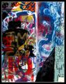
Graffiti in the Sunby greenem2Comment: Greetings from the Critique Club
My very first impression of this is that I really can't imagine a more fitting subject for the Colour challenge. So well done on that score - definitely meets the challenge in my view. There is perhaps some question about whether this is simply a photograph of someone else's artwork but in my view this is both a collage of a number of people's artwork plus it's a real 3D structure as evidenced by the shadows and that makes this OK in my book. This seems to me to be a reflection of something about this neighborhood as well as being a celebration of how grafitti can actully be vibrant and attractive.
The second thing that strikes me about your photo is the very strong importance of light and shadow. Somehow the shadows in the top left and bottom right frame the scene in a very interesting way that lifts the picture. Those shadows combine with the border to turn this shot into what is almost a painted canvas. The very strong sunlight has also really made those colours shine and that's really what this picture is all about.
Your focus seems good and exposure too - which might have been tricky considering the light. Your composition is very face-on but as I mention above it really works for this shot. It's hard to know what your own intentions where with this picture or whether you succeeded with them but you've captured a wonderfully vibrant image with tons and tons of detail. Really something to stare at and keep finding new things. |
| Photographer found comment helpful. |
| 04/14/2003 06:15:30 AM |
Pizza Piby sherComment: Greetings from the Critique Club
My first impression of your picture is that you probably spent longer setting up your props than you did setting up your shot. And this was a really GREAT prop - well done for that, it must have taken a lot of effort.
Your concept for this picture fits the challenge very nicely on two counts - the pi shape and the pizza pie - so well done on meeting the challenge. The arrangement and lighting is a little conventional. I think this could have been made more dramatic by shooting at a lower angle and being bolder with your use of lights. You might also have used a shiny metal tray as a backdrop instead of that brown cloth - a reflective metal surface would have made a nice contrast to the organic looking food.
Your focus looks good and the exposure is fine. More light in the scene would have given your exposure more interest but the biggest culprit isnt the lack of light it's the dark background. Your composition is good and the border lifts the picture a little.
Overall - I think you set out with a very strong idea of what subject you wanted to shoot but you let yourself get distracted into making that before you'd really thought about how you were going to shoot it. |
| Photographer found comment helpful. |
| 04/14/2003 05:26:16 AM |
Let Freedom Ringby floydComment: Thanks to everyone that voted on this shot including those of you that didn't decode what I was trying to capture - it's useful to me to know that my meaning wasn't as clear as I'd hoped.
For the record this picture is about racial equality which is why we have a patch of light and dark. It wasn't intentional but I like how that line is blurred too. The coloured letters spell out blind which is supposed to suggest colour blindness (in a racial sense) and the fact that it's in children's letters is meant to suggest the basic simplicity of the equality ideal. Frisca spotted another twist to this shot that I'd not intended - the long shadows imply a dawning light as if the light is dawning on the idea.
Finally the title is a refrain from Dr Martin Luther King Jr's famous "I have a dream" speach which deals with racial equality.
Thanks everyone for your comments and votes. |
| 04/13/2003 06:07:54 PM |
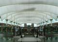
Airportby amonteforteComment: Greetings from the Critique Club
My first impression of your picture is of the very very strong symmetry in it. Congrats on meeting the challenge so well. My second thought is of light - or more accurately the lack of it. It's hard to imagine an airport that isnt well lit but somehow this picture manages to look underexposed and dim. That's a real shame because with more light you'd have picked out the lovely reds and yellows of the figures either side of the escalator.
Your composition is what makes this shot a winner. The balance of those ceiling beams against the escalator and the rails is just right - excellent use of the rule of thirds. Your focus seems just fine too with plenty of depth of field. I see you stopped up to f/8 - I wonder if your camera did that automatically or whether you chose that small aperture deliberately to get the depth of field. I'm going to guess that you did it yourself and that forced you to increase your exposure time up to 1/60th which is about the slowest shutter you can hold with your hands without getting shake. That's probably how you ended up with a slightly underexposed picture. Perhaps you should have moved your camera's ISO rating up to 200 or even 400. On a detailed image like this I doubt the grain of an ISO 400 image would have been visible.
All in all I'm given the impression of a photographer that knows how to use all the buttons on the camera as well as having a keen eye for a good shot. Your composition is great and getting it without any people in-shot was a real bonus - not easy at an airport! |
| 04/13/2003 05:54:58 PM |
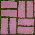
Backyard Symmetryby magnusComment: Greetings from the Critique Club
No question here about whether this fits the Symmetry challenge. It's clear that it does. Compositionally this looks almost Warhol-esque or perhaps even a fabric print. It's a very brash collection of shapes when photographed up close like that, filling the frame. That boldness could have been used more to your advantage, I think, by playing with the colours more and perhaps making them equally brash. It is, I think, the colours that let this image down a little. You've taken an everyday household object and photographed it in a way that we wouldn't normally see. You've managed to disassociate your image quite strongly from the original scene very successfully and I'd have liked to have seen you sever the link entirely by not attempting to keep the original colours. The bricks have come out a little purple-looking and the light is very flat. That really brings down this otherwise in your face image.
Technically your image is just fine. The focus seems OK if bordering a little on the soft side - I dont think that's a problem. The exposure is OK but the whole scene could have used a lot more light. I've already covered composition and that's your strongest element here.
I think your concept was good - you went out with an idea in mind and you captured it well. I just think you needed to develop that idea a little more to turn it into something that really stands out. |
| Photographer found comment helpful. |
| 04/13/2003 05:44:38 PM |
Reflected Lightby Clou9Comment: Greetings from the Critique Club
It's not the first time I've said it during this Symmetry challenge but this photo might just as well have been entered in the colour challenge! Ok, first impressions on this photo - there are two things that hit me right away. The first is that border - I find it very distracting. The green was a mistake in my opinion. The question of whether to use a border and how best to do it has been covered in length on the message boards but my own view is that it should improve the image without distracting from it. If it doesnt improve the image then it shouldn't be there. In this case I think you'd have been better served with something neutral in order to allow the eye to be drawn to the displays of colour in the main image.
That brings me to my second observation - the main image is very dark. Your comment on this photo says you used a single reading light in an otherwise pitch black room. That made it very difficult for you to bring out the full circle of the CDs. Using a single light source can be very effective but it's also tricky and doing it with very reflective subjects is that much harder. I think another light source would have made things easier. You could perhaps have had multiple reflected rainbows on each CD or a gentle light showing the whole scene as well as the strong rainbows.
Composition-wise your picture is just dandy. You've stuck to the tried and true rule of thirds and there's nothing at all bad about that. Your focus seems good but it's hard to tell because things are so dark. Exposure was always going to be difficult with such extremes of light and dark but you've captured the colours extremely well.
Overall it looks like you started with a very clear idea in your head about what you wanted to photograph. You've made significant progress in capturing that but the lighting and that border detract. |
| 04/13/2003 03:07:00 PM |
Red Daisyby EnzoComment: Greetings from the Critique Club
This is in many ways the perfect symmetry. Those seeds in the middle are rotationally symmetrical using the golden ratio If I remember my physics correctly. So there's no problem meeting the challenge here!
Normally I'd be critical of a very central subject placement in a photograph but in this case I think it works rather well. It's something to do with the very close zoom into the centre of this flower - I like the way the petals fill the frame. It's a shame the flower is less than perfect. I see curled up petals and a smudge of pollen across the middle. These are only small niggles but they spoil the "perfect flower" image.
The other technical aspects have variable success in this shot. The focus is good though not quite pin sharp and the exposure is just fine. But somehow you've lost a lot of detail in those petals. I'm not sure if you've pushed the saturation and/or contrast in order to make the picture so very red or whether your camera simply failed to catch that detail but either way it makes the petals a little too flat. Perhaps the culprit is your lighting which is very even and directionless. It looks like your light is directly behind the camera and that's good for a nice even lighting level but a couple of lightsources off to the sides might have helped define the shape of the petals better and perhaps bring out the detail.
Overall this is a VERY effective shot. You obviously had a very clear idea of what you wanted to achieve and you did a great job producing it. Your colours are excellent - the red and yellow stand out beautifully and your composition is good despite breaking the much repeated rule of thirds - or perhaps because you break it. |
| Photographer found comment helpful. |
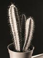
| 04/13/2003 12:49:11 PM |
Small, but fierce!by rooComment: Greetings from the Critique Club
The first thing that strikes me about this submission is that it doesn't seem close-up enough to be considered a macro shot. However, I'm reminded that there are some *really* small cactii out there so perhaps this really is a very close up shot of a very small cactus. If so I think you really needed to put something else in-shot to give us the impression of that.
Your lighting on this shot is excellent with a good range of light and dark all across the frame. The light picks out the shapes in the cactus very nicely. The black and white is fine - it adds a little to the stark feeling of the shot which enhances the ferocity of the cactus. Focus seems just a shade too soft. It wouldn't be an issue at all except for those needles that somehow don't look as fearsome as they should. Your composition is fine if a little conventional - that central placement is a little rigid and I'm wondering why I can see a little tabletop in the bottom right. It's fine, I think, to see some table surface but if you're going to show it I think you should show more - in for a penney, in for a pound as they say.
Overall you've taken a technically good shot of a cactus. I think the next step with this shot would be to decide what you're trying to portray and really go all out to capture that aspect of it. If it's a fierce cactus you're trying to show then really let us see those needles. Perhaps even zoom right up to them and fill the frame with needles. If it's a small cactus you're trying to show then really give us the feeling of it being small by putting something larger that we can identify in shot with it.
John Message edited by author 2003-04-13 12:51:01. |
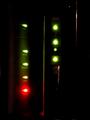
| 04/13/2003 12:36:24 PM |
internet safety lights at midnightby kenboComment: Greetings from the Critique Club
This photograph was submitted to the Indoor Macro Shot challenge. While your photograph certainly is both indoor and close-up or macro I think you've perhaps missed what I believe is the most important element of a macro shot. My favourite macro shots show me something I've never seen before. That might be extra detail in a subject or a different angle on a subject. This blend of familiar and new is what makes a great macro shot work for me.
I believe your concept for this shot is a good one - the bright coloured lights add a focal point to the image but alone they're not enough. Adding a gentle white light off to the side would have kept the midnight feel but also given the viewer some feeling for the shapes of what we're seeing. It might also have created some interesting gradients of light on any rounded surfaces.
It's hard to judge the technical aspects of this photograph. There's not much detail but focus appears to be good. The vast majority of the shot is completely un-exposed and that's, I think, what you were aiming for. Composition is a little straight-on and I'm wondering what the orange/red line in the top right is there for. Perhaps cropping that might have given the image more focus on the lights. Message edited by author 2003-04-13 12:52:12. |
Home -
Challenges -
Community -
League -
Photos -
Cameras -
Lenses -
Learn -
Help -
Terms of Use -
Privacy -
Top ^
DPChallenge, and website content and design, Copyright © 2001-2025 Challenging Technologies, LLC.
All digital photo copyrights belong to the photographers and may not be used without permission.
Current Server Time: 08/28/2025 12:35:37 AM EDT.