| Image |
Comment |
| 11/14/2004 03:18:42 PM |
|
 Photographer found comment helpful. Photographer found comment helpful. |
| 11/14/2004 03:13:42 PM |
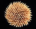
Illusionby joaobaComment: Looka at that! This seems known to me! Now I'll have to decide whether yours or the one with the white background works better...
Edit: I found the other one. It's called just simply 'Toothpicks'. And the white background with the blue shadow is more appealing than a solid black. Thats why I gave one more point to that one. Hey, I give you a 7, after all. |
| Photographer found comment helpful. |
| 11/14/2004 03:08:57 PM |
black iceby daniloComment: What a nice oxymoron. Another background would have made the cube come out better. |
| 11/14/2004 03:08:10 PM |
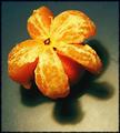
Hey.... that's not a flowerby anatolio25Comment: This is scary. I had this very idea this afternoon (14th Nov) when I was eating a mandarine. Unforunatley, ideas often look better than the photographs: The background should be smooth, as opposed to the fruit's 'toes'. I'd also have liked harder shadows, but I guess that's a matter of taste. |
| Photographer found comment helpful. |
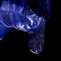
| 11/14/2004 02:54:44 PM |
Celestial Flow by BradComment: Woahw! This ain't water, is it?Those tiny specks look awesome. And you cropped it just right. I really can't find anything to critisize. Looks great. The first 10 I'm giving out for this contest! |
| Photographer found comment helpful. |
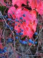
| 11/14/2004 03:58:00 AM |
Don't Be A Clinging Vineby bobgaitherComment: The berries don't come out well enoug against the background. You might have concentrated on a smaller detail, so that the berries would have one single leaf as background. You might even have cropped this one. |
| Photographer found comment helpful. |
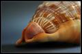
| 11/14/2004 03:49:58 AM |
She Sells Sea Shells...by yael27Comment: Repeat the title ten times in a row...
Luckily the picture is not as complicated as it's name. Nice orange-blue complementary contrast. |
| Photographer found comment helpful. |
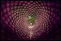
| 11/14/2004 03:46:36 AM |
Glass Vortexby myorkComment: Well I really don't know what this is. Except for the center it doesn't look like glass at all! A great composition, except fot htose bright spots at the bottom.
I really can't figure it out. I'm eager for your explanations after voting! |
| Photographer found comment helpful. |
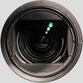
| 11/13/2004 06:35:11 PM |
Selfby GabrielComment: Well, now, this really looks like a circular selection around the lens. Especially as the colour matches the DPC background. I guess you used the DPC grey as photoshop target for the color correction? Anyway, it doesn't provide a refreshing view of a camera lens. There's nothing too special about it. |
| Photographer found comment helpful. |
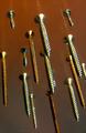
| 11/13/2004 06:29:06 PM |
Screws attackby xoaoComment: I bet you're crazy that you can't do any cloning, eh? What a great idea. I feel attacked. |
| Photographer found comment helpful. |
Home -
Challenges -
Community -
League -
Photos -
Cameras -
Lenses -
Learn -
Help -
Terms of Use -
Privacy -
Top ^
DPChallenge, and website content and design, Copyright © 2001-2025 Challenging Technologies, LLC.
All digital photo copyrights belong to the photographers and may not be used without permission.
Current Server Time: 09/04/2025 08:48:33 PM EDT.