|
|
|
Showing 581 - 590 of ~2342 |
| Image |
Comment |
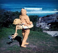
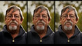
| 11/17/2010 12:42:15 PM | A difficult choiceby bjoernComment: GOOD DAY FROM YOUR DPCHALLENGE CRITIQUE CLUB!
Dear Bjoern, ,
Thanks for allowing us to have a closer look at your photograph. It is a fact that on average people look and evaluate an image presented to them in 5 seconds. When we are given the opportunity to really look and interpret an image, that is when we appreciate people like you. And thanks to you, we hope to learn much together.
The process I deploy is first of all to look at your previous work and then look at the currents comments made. I want to have a 'feel' for the person who entrusted me with this responsibility. Only then do I spend time with the image for a critique.
The critique can be both Applied (To the image self) and Theoretical (Attempt to philosophy and theorise about the work). It is important for me to be able to describe, to interpret, to evaluate and even to theorize about it. If I can encourage discourse about your work I will be happy.
In the final analysis, I hope you to learn something from it, take something of it and improve both your skill and self confidence.
So, here goes for your image.
This challenge had a few excellent and very creative images. Yours included. I love the fact that your model is all 3 images in a very natural and relaxed position, you clearly mastered the art of working with models as can also be seen in your Silhouette image.
From the feedback you received you had 'votes' for all 3 images with the 3rd one doing the best. This clearly indicates that although people are different in their preferences, there are a mainstream of opinions. I think the reason for #3 is eye contact more than anything else. Seen in the whole that maybe one of the critical points for improvement. I would like to say you have captured a priceless expression in the third image.
I agree that this image could be improved with the use of levels/curves that will improve the contrast slightly. It would at least have given you a bit sharper looking image.
The fact that the first two images are different at distance/zoom from the 3rd must be noted. If you wanted to use a closer focus, that image should have been in the center providing a balance.
Personally I think the fact that all three images are from the same angle also make the image composition less attractive. Allow me to give an example; the third picture in the center, the second picture first and the first picture flipped and in third position could make an interesting composition.
Looking at the neutral grey frame as opposed to they darker grey background bothered me at first, but the longer I looked the more it appealed and proved to be a good choice. By the way, did you notice the center image's background is slightly lighter than the first and last?
Finally, I valued the triptych at a higher level than the average because it is worthy of a better score. Keep it up, you are doing a good job.
Kind regards,
docpjv
|  Photographer found comment helpful. Photographer found comment helpful. |
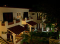
| 11/16/2010 06:44:27 AM | Spanish Courtyardby hopefulcrafty1Comment: GOOD DAY FROM YOUR DPCHALLENGE CRITIQUE CLUB!
Dear Angela, ,
Thanks for allowing us to have a closer look at your photograph. It is a fact that the average person look and evaluate an image presented to them in 5 seconds. When we get the opportunity to really look and interpret the picture, that is when we appreciate people like you. We all learn by this.
The process I deploy is first of all to look at your previous work and then look at the comments made. I want to have a 'feel' for the person who entrusted me with this responsibility. Only then do I spend time with the image for critique.
The critique can be both Applied (To the image self) and Theoretical (Attempt to philosophy and theorise about the work). It is important for me to be able to describe, to interpret, to evaluate and even to theorize about it. If I can encourage discourse about your work I will be happy.
In the final analysis, I want you to learn something from it, take something of it and improve both your skill and self confidence.
So, your image.
On first impression I feel it scored unrealistically low. Yet, that being said there are quite a number of learning points from this photograph.
Note that it is not an exciting art photograph, it is more a memory shot, something you take to remember your vacation. This is supported by some of the feedback where the the words "..reminds me of.." and '..wish for a holiday.." is commented. The not so subtle feedback of "rather boring" is actually harsh. I see the hanging clothes on the porch, the out of place chair, the gorgeous garden lit by night, the tree that frames the picture at the right, keeping the eye in the photograph. Boring, it surely is not. Key issue here, an image should rather be interesting than perfect. An amazing truth, yours is 'perfect' but not that interesting.
There are another two basic issues. One, the image is skew, not vertical, just look at the pillars. The most distractive part on this point is the skew door, left top. Two, the crop could have excluded the light on the top left. What I see is my eye always going back up, that is not what you want.
The last issue, what is your point of interest? what do you want me to REALLY see? Surely not the whole image. Remember that is why there are composition rules, although we are not slaves of rules, it does guide our eye to the point of interest.
I want to compliment you on your lighting and the detail you got. Never easy, not even with a tripod.
I hope you found this worth doing and learned something from it.
Kind regards,
docpjv
| | Photographer found comment helpful. |
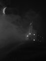
| 11/16/2010 05:06:18 AM | Trick or Treatby stantheman1313Comment: Greetings from the Critique Club,
Stanley,
You are a very creative and gifted photographer. Your portfolio in general shows a man with a special talent.
Looking at a picture in the top 10 with a score of 6,5622 is most difficult to critique depending on approach. This critique will hopefully give you a little bit of how others may have seen it.
First of all, the photograph fits the challenge, is very creative and the monochrome works very well. The feedback from all the members who took time to comment was very positive and rightly so.
I considered a number of points looking closely at this picture.
In my opinion this work would have had a bigger impact if it was landscaped and not in portrait. That would also have given you the opportunity to play with the Rules of Thirds. That definitely would have had an impact on your composition. You have three points of interest IE the lighted mansion, the moon and the fog. The foreground gets lost as the eye diagonally from the house through the mist to the moon, hence my suggestion for a landscape.
It is also a fact that a little sharper house and more visible trees would have enhanced the appeal. The house should also have been horizontal and not sloping to the back for a bit more of the realism you worked into this picture.
Finally, I would have played with a little more contrast and then neat imaged the whole photograph to take the graininess out of the mist.
In Summary;
A clean, smooth spooky mist, a sharper,level house, more tree visibility and a tad more contrast on a landscape would have made this more of the winner it already was.
Congratulations on a well placed and scoring photograph.
docpjv | | Photographer found comment helpful. |
| 11/15/2010 07:30:10 AM | two treesby posthumousComment: Dear Don,
This is a big 'Hi' from the Critique Club.
Before we get to this specific image, I must say that looking at your previous challenge high scorers and your portfolio, you have a very specific style and preference for the more abstract. Please never change a wonderful style for the sake of popularity.
I have had a long look at your entry and read every one of your feedbacks. As you will gather from that, and in my opinion, one will either love this creation, or hate it. There is no middle ground when it comes to abstracts.
You have displayed a very good sense of composition and playing with colors. The fact that the eye must search, and keep on searching for some point to focus on, might have been the main shortcoming of the picture. The burned out area of the red, right, keeps taking the eye in, involuntary making it the point of focus.
The background would have benefited if it was a solid black. It could have at least set the image free by creating another visual dimension.
A daring image presented to a fussy membership was indeed brave. You succeeded with "Ophelia's Net Weight" (3rd highest challenge entry) in what I would call an abstract, but you must admit that that photograph is in another class in every respect. Remember abstracts and impressionisms are either love or hate pictures, this one did not appeal. By creating a more specific point of focus for the eye, and keeping the eye in photograph will surely go a long way in improving a photograph.
Kind regards,
docpjv
| | Photographer found comment helpful. |
| 11/15/2010 06:32:57 AM | | | Photographer found comment helpful. |
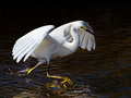
| 11/08/2010 01:51:39 PM | Walking on Water by vawendyComment: I gave it a ten, knowing how hard one has to work for a good animal pic. I am honored to be part of the great photographers on this site.
| | Photographer found comment helpful. |
| 11/08/2010 12:53:18 PM | | | Photographer found comment helpful. |
| 11/08/2010 12:34:28 PM | | | Photographer found comment helpful. |
| 11/08/2010 12:32:57 PM | sentby JulietNNComment: The tile should be "Heaven Sent". You have a feel for this game, love your work. | | Photographer found comment helpful. |
| 11/08/2010 12:31:21 PM | | | Photographer found comment helpful. |
|
Showing 581 - 590 of ~2342 |
Home -
Challenges -
Community -
League -
Photos -
Cameras -
Lenses -
Learn -
Help -
Terms of Use -
Privacy -
Top ^
DPChallenge, and website content and design, Copyright © 2001-2025 Challenging Technologies, LLC.
All digital photo copyrights belong to the photographers and may not be used without permission.
Current Server Time: 08/11/2025 09:48:46 PM EDT.
|