|
|
|
Showing 571 - 580 of ~2342 |
| Image |
Comment |
| 11/28/2010 05:53:22 AM | Lunchby CelesteComment: GOOD DAY FROM YOUR DPCHALLENGE CRITIQUE CLUB!
Dear Kimberly ,
GENERAL INTRODUCTION
Thanks for allowing us to have a closer look at your photograph. It is a fact that on average people look and evaluate an image presented to them in 5 seconds. When we are given the opportunity to really look and interpret the image, that is when we appreciate people like you. And thanks to you, we hope to learn much together.
The process I deploy is first of all to look at your previous work and then look at the currents comments made. I want to have a 'feel' for the person who entrusted me with this responsibility. Only then do I spend time with the image for a critique.
The critique can be both Applied (To the image self) and Theoretical (Attempt to philosophy and theorise about the work). It is important for me to be able to describe, to interpret, to evaluate and even to theorize about it. If I can encourage discourse about your work I will be happy.
In the final analysis, I hope you can learn something from this, take something of it and improve both your skill and self confidence.
So, here goes for your image.
CRITIQUE
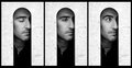
You have been very brave taking on a Panda given your available light. The definite black/white is always difficult to get right.
On a very positive point of view your composition is fine, the placement of the panda is commendable.
On the learning side, and we all can learn from this image, I can shortly raise a few points.
The image itself is more a snapshot than an arty picture to be remembered. Harsh, I know, but I do want you to develop your eye to 'see' what is good not good.
Overall, there is just too much in the image, If yo could have zoomed in and get a sharper, more contrasted photo of the head self, this would have been good.
Because of the time of day you took the picture, you could have used a flash to even out the hard shadows, like a fill light. That again would have afforded you the opportunity to work more on contrast and color and even on the sharpening as well.
Taking pictures of animals, always try and get them to show an eye, a well focussed and sharp eye. The way we see animals is their 'catching' our eye with contact.
Most important advise, I think is that you should add contrast, best way with curves, and work on color.
Just remember, if an image is not interesting people will glance over it, marking it down. This was an advanced post processing challenge, you could make the image interesting, being creative and maybe even a bit daring.
You are a new photographer and maybe new to it in every respect. Like me, I needed in the my first years some people to be honest with me and build me up.
You can become good, no doubt. I looked at your other challenge images and just knew you will become better every time.
Do what I did, on advise of my old mentor;
- look at images,
- look at every challenge entry and ask yourself why one scored better/not, more/less,
- read up on photography articles,
- check out YouTube with all their wonderful photography videos
- work on post processing, play with ideas, re-do an image in a number of ways, that way you will develop your eye and your style.
- and enter every challenge with a critical eye
I am looking forward to see your next image.
docpjv
|
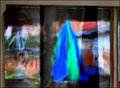
| 11/28/2010 12:35:56 AM | i think thats my eyelid....by Love6Comment: I love the reflection. Give it a little more contrast, LOL!
Girl, you are very fortunate to have made it through this one!
You did NOT wear your seatbelt!!! Message edited by author 2010-11-28 00:37:13. |
| 11/28/2010 12:34:04 AM | |  Photographer found comment helpful. Photographer found comment helpful. |
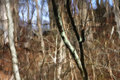
| 11/27/2010 10:49:59 AM | the not-birchby posthumousComment: Welcome from the Critique Club..
Dear Don,
We must stop communicating like this, LOL.
General Introduction;
Thanks for allowing us to have a closer look at your photograph. It is a fact that on average people look and evaluate an image presented to them in 5 seconds. When we are given the opportunity to really look and interpret the image, that is when we appreciate people like you. And thanks to you, we hope to learn much together.
The process I deploy is first of all to look at your previous work and then look at the currents comments made. I want to have a 'feel' for the person who entrusted me with this responsibility. Only then do I spend time with the image for a critique.
The critique can be both Applied (To the image self) and Theoretical (Attempt to philosophy and theorise about the work). It is important for me to be able to describe, to interpret, to evaluate and even to theorize about it. If I can encourage discourse about your work I will be happy.
In the final analysis, I hope you can learn something from this, take something of it and improve both your skill and self confidence.
So, here goes for your image.
Your Image
This is your style, strong and creative. An image that will either appeal or not. From your 4 feedbacks it is a 50:50 positive to not that positive. on the positive it is well recognized as creative, eye appealing and definitely an image to take notice of.
On the side of the not so convinced, which I am supporting, is that you "have no clear subject/looking all over thew place", your point of view is too abstract. The only support for the eye to on is in the title. And even that means every one knows what 'birch' means. my eye moved between the two thick branches, just off-centered and to the left.
That being said, I gave it, and expected it to, a much better score. I was very impressed by the movement, well controlled and almost hazy, dreamy. Even more to note is how well you have controlled the light, there is absolutely no hot spots/burned out areas. The light balance between your birch and the rest, if one spends time on the image, eventually creates a bit of depth.
This surely is an under rated image, but one I would have been proud to have in my portfolio if it was mine.
You truly are one creative photographer!
docpjv
| | Photographer found comment helpful. |
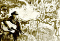
| 11/26/2010 09:08:31 AM | Urban Cowboyby NatashaComment: GOOD DAY FROM YOUR DPCHALLENGE CRITIQUE CLUB!
Dear Natasha, ,
Thanks for allowing us to have a closer look at your photograph. It is a fact that on average people look and evaluate an image presented to them in 5 seconds. When we are given the opportunity to really look and interpret the image, that is when we appreciate people like you. And thanks to you, we hope to learn much together.
The process I deploy is first of all to look at your previous work and then look at the currents comments made. I want to have a 'feel' for the person who entrusted me with this responsibility. Only then do I spend time with the image for a critique.
The critique can be both Applied (To the image self) and Theoretical (Attempt to philosophy and theorise about the work). It is important for me to be able to describe, to interpret, to evaluate and even to theorize about it. If I can encourage discourse about your work I will be happy.
In the final analysis, I hope you can learn something from this, take something of it and improve both your skill and self confidence.
So, here goes for your image.
This I must get out of the way, I gave this image a 7 for the creativity, the challenge fit and the wonderful monochrome post processing. Underscored, for sure, but let's have a look at it.
You have an average of 5.98 after 55 challenges, very few people can say the same. You yourself said that you would rather post images you are happy with, not necessarily what pleases others. That is exactly why I love this image, your attitude shows. NEVER, change your view, you are a refreshing artist, not just a person with a camera.
Melting in with the background or stand out? You had one comment touching on that issue for each. Personally I would have opted for the latter, this image would have presented better if it stood out, if you got some depth on it.
Something about your lighting may have made it difficult, for example the cowboy has a tad too much contrast yet the background lacked contrast. Yes, again you are right, this image, the original, should be played with for alternatives and options. That is what makes this a great image... not only perfect for a challenge, but an interesting piece of good work.
Some other thing that must be said, the white center is a bit overwhelming and does tend to pull the eye away from your subject, supporting my feeling of not enough contrast on the wall?
On another note, look at HIS right side face...is that a scar from nose to jaw? How come the shadow is sort of split? The little imperfection on the chin, is it a blond goatee? His darker right nostril? Pedantic, picky, silly maybe, but I want to point out to you your image is so good, that for anyone to say something negative they surely will have to begin nit picking.
All in all, fantastic work from you as always. I will keep an eye out for your work, it was a pleasant surprise to me. Refreshing like your Bio description.
Keep up the great work!
docpjv
| | Photographer found comment helpful. |
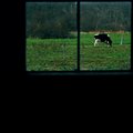
| 11/26/2010 08:32:22 AM | The Cow of Peaceful Meadows by Love6Comment: GOOD DAY FROM YOUR DPCHALLENGE CRITIQUE CLUB!
Dear Love6 ,
Thanks for allowing us to have a closer look at your photograph. It is a fact that on average people look and evaluate an image presented to them in 5 seconds. When we are given the opportunity to really look and interpret the image, that is when we appreciate people like you. And thanks to you, we hope to learn much together.
The process I deploy is first of all to look at your previous work and then look at the currents comments made. I want to have a 'feel' for the person who entrusted me with this responsibility. Only then do I spend time with the image for a critique.
The critique can be both Applied (To the image self) and Theoretical (Attempt to philosophy and theorise about the work). It is important for me to be able to describe, to interpret, to evaluate and even to theorize about it. If I can encourage discourse about your work I will be happy.
In the final analysis, I hope you can learn something from this, take something of it and improve both your skill and self confidence.
So, here goes for your image.
Looking at the feedback you received you should be quite confident, they were all positive. The only firm recommendations you received were on the 'black space'. Going through your portfolio confirmed my suggestion that you should be very pleased with a special eye for photography. You have a very good eye, very creative way of presenting your images and should only get better.
The 'Cow of peaceful meadows' is a perfect fit for the challenge, deploys very good composition and is sharp and colorful. Yet, it did not do too well in the challenge itself. Above average at about 5.7 should never be good enough for you.
I must agree, although you had a positive comment on it, that the black space is not contributing to your image. Nor is the topic something I will remember for a long time.
Art, in the first instance, must be interesting. It must grab the eye, force me to look again, want to look again and explore. good techniques itself, which you have displayed here, is just not good enough. The image is just not that exciting and the black area sucks my eyes into its depths. The slight reflection on the window sill is also distracting. Others may argue that it gives depth. It is just to dark for that argument and should rather have gone up the left side too if you wanted depth.
Now to become terribly pedantic, but it should show you how to examine and critically look at your images.
Left bottom of the photograph; why didn't you clone out the blue stubble, the white plastic bag and the eye-stealing orange dot about 1/3rd up on the stump? Also, that blue-ish tint (left bottom corner, center and top middle as well as the length of the top right window)possibly as a result of burning? also is remarkably unkind to the image. Finally, the dirty vertical V-shape on the window/reflection, just to the right and above the cow, keeps drawing my eye.
As the score indicated, a strong average image. I honestly believe we have not seen your best. Keep up your participation, experience added to your talent will yield great results.
docpjv
| | Photographer found comment helpful. |
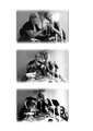
| 11/20/2010 12:58:20 PM | Here's To You, My Friendby dgodardComment: GOOD DAY FROM YOUR DPCHALLENGE CRITIQUE CLUB!
Dear Debbie, ,
Thanks for allowing us to have a closer look at your photograph. It is a fact that on average people look and evaluate an image presented to them in 5 seconds. When we are given the opportunity to really look and interpret the image, that is when we appreciate people like you. And thanks to you, we hope to learn much together.
The process I deploy is first of all to look at your previous work and then look at the currents comments made. I want to have a 'feel' for the person who entrusted me with this responsibility. Only then do I spend time with the image for a critique.
The critique can be both Applied (To the image self) and Theoretical (Attempt to philosophy and theorise about the work). It is important for me to be able to describe, to interpret, to evaluate and even to theorize about it. If I can encourage discourse about your work I will be happy.
In the final analysis, I hope you can learn something from this, take something of it and improve both your skill and self confidence.
So, here goes for your image.Congratulations with your third challenge, you are doing quite well for a 'new' member.
Looking at the feedback you received, and what a large number you received, we all will have to agree this is some special image. Yes, it did not score as well as most said, but that is actually less important than the learning experience AND the fun you so obviously had. I agree, you must have had fun. And for me that is another side of a creative person. Well done.
After having a good look at the image I would like to communicate the following.
First of, I absolutely agree with L Vicari's comment about the size of the frame. It is in my opinion the most worthy comment. I have noted that it is becoming a bit of a trend, the big border. Like the massive black two sided frames, you actually take image space for a border. A big risky trade off.
watch out for what you have behind you, it actually draws the eye away from the subject matter. For example, you did not have adequate Depth of Field to isolate the flower/stick arrangement. In the last picture it the most distracting because the base is unseen.
If you used the same zoom size for all three images, it might also have been better. In this case the first image is the one of choice. It allows you to be less distracted by just too many items. The faces by itself is actually the focus, and some of that was lost by zooming out. Composition wise, image one is superior.
This is a very simple tip, but always keep it in mind. The idea is for you to grab the eye, which you did, but then keep it on the subject. In a way we discussed that above. But that less serious than having a LIGHT spot, look at the spot in image one behind your left shoulder. in every respect, try never to have areas like that, again, the eye is always drawn to that area, not 'looking' where you the photographer wants it to look.
Your lighting was great on the faces of the first image, spot on. Images two and three has burnt out ares on the faces and neck.
Finally, the more I looked at this image the more I liked it. As with the other challenges, it shows a very creative photographer who needs to 'play more to learn more' in terms of her photography. Creativity, you have, practice will make perfect.
Enjoy your photography, and keep on participating!
docpjv
| | Photographer found comment helpful. |
| 11/20/2010 12:24:47 PM | | | Photographer found comment helpful. |
| 11/19/2010 01:29:15 PM | Hope Risingby MArteSiComment: GOOD DAY FROM YOUR DPCHALLENGE CRITIQUE CLUB!
Dear Maria, ,
Thanks for allowing us to have a closer look at your photograph. It is a fact that on average people look and evaluate an image presented to them in 5 seconds. When we are given the opportunity to really look and interpret the image, that is when we appreciate people like you. And thanks to you, we hope to learn much together.
The process I deploy is first of all to look at your previous work and then look at the currents comments made. I want to have a 'feel' for the person who entrusted me with this responsibility. Only then do I spend time with the image for a critique.
The critique can be both Applied (To the image self) and Theoretical (Attempt to philosophy and theorise about the work). It is important for me to be able to describe, to interpret, to evaluate and even to theorize about it. If I can encourage discourse about your work I will be happy.
In the final analysis, I hope you can learn something from this, take something of it and improve both your skill and self confidence.
So, here goes for your image.
First things first, you got only two comments and both of them are very good. Interesting is the one from Lydia Too. She is a gifted photographer and I am sure she was really impressed, as I too was. The other comment said you should win it. Very positive.
This is a very creative image, beautifully presented and a very good choice to have it in B&W. That is why most voters gave you a 6.
On composition I think if the eye in every image was on the top line of the Rules of Thirds lines, it would have been better. look at the bottom of the images, the dark sweater is taking up too much space.
There are elements of fine creativity in terms of your setup and the models' eye movement. Other than that, there is not enough creativity in the presentation of the face itself. Let me explain, if the face was post processed in grunge, more people would have given it a second look. That is what photography is all about, grabbing a second look, something exciting and different and striking. You may also have a re-look at the angle of lighting. Anything to catch the eye of the voter and still be your interpretation.
The B&W is great, but have you thought about a Duo- or even quad tone?
I think, please forgive it if I am going too specific, the little white spot on the collar could have been removed. The human eye, we all know, is drawn to those 'high lights', however small.
Finally, a little more contrast would surely improved the overall look.
One thing I have to say, you have a very good eye and are really creative. Invest a bit more time in mastering post processing, you are never going to be sorry.
Ik heb een definitieve aanbeveling, sorry voor dit niet in het Nederlands en niet België. Ik wil echt meer van uw kunst te zien. Help mee vaker! Alsjeblieft?
docpjv | | Photographer found comment helpful. |
| 11/18/2010 12:14:36 PM | Umbrellaby daisydavidComment: If your horizon was straight, I would have given you at least an 8. | | Photographer found comment helpful. |
|
Showing 571 - 580 of ~2342 |
Home -
Challenges -
Community -
League -
Photos -
Cameras -
Lenses -
Learn -
Help -
Terms of Use -
Privacy -
Top ^
DPChallenge, and website content and design, Copyright © 2001-2025 Challenging Technologies, LLC.
All digital photo copyrights belong to the photographers and may not be used without permission.
Current Server Time: 08/11/2025 10:21:51 PM EDT.
|