| Image |
Comment |
| 09/05/2005 11:56:26 AM |
Contrasting Colorsby trobergeComment: the quality is very lowon this image, very grainy I like the take on the color contrast side of things but the green in the frame takes it farther away from contrast and farther towards a color triangle, which is balance not contrast |
 Photographer found comment helpful. Photographer found comment helpful. |
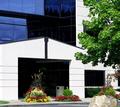
| 09/05/2005 11:55:13 AM |
6845 S Contrast Drby ace flymanComment: very nice shot, I like it alot. It fits "contrast" very well but there are some problems with the comp. the rock in front is taking away from the flow sceme that could bring balance to the eye in the picture and the whole thing lacks sharpness, next time use an unsharpen mask to fix this. The trash can like object inside the garage is to dark and takes away from the white color in the rest of the frame. I think it may be a tad bit overexposed, mabey like half a step. I like what you were going for though, don't get discourged and keep shooting |
| Photographer found comment helpful. |
| 09/02/2005 08:55:46 AM |
Mandi1.jpgby nomad469Comment: I would work on the pose a little mabey use a hair light and something to soften the lines on her face. If you can reshoot it I think if you took it from the other side it would look a lot better. There is some weird shadow across her face and on her hair on the right side. I think if you move the light source farther back it would help with harsh shadows and the low contrast levels. Watch how you convert it to black and white, there are many ways to do this is some work ALOT better than others. I like the model though and I like the vission you have for this shot, just change those few little things and it will "snap". Have you shown this shot to her yet? I bet she will love it |
| Photographer found comment helpful. |
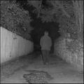
| 08/30/2005 10:12:00 AM |
Distant & Lonelyby Nikolai1024Comment: there is a lot of grain and a slight color cast in this frame. the white balnce is set very wrong and nothing is in very sharp focus. it almost look like it was taken in auto mode or program mode. the center waited compostion is completly breaking the rule of thirds and makes this frame look like nothing more than a snapshot. 1 |
| 08/30/2005 10:06:45 AM |
Dangerous & Littleby bobdaveantComment: this shot is very grainy and the highlights on the face are very blown out and the darks of his shoulders and his eyes are way to dark, watch how you are converting this to b and w and watch your lighting to begin with |
| 08/30/2005 10:04:10 AM |
Dynamic Linesby trnqltyComment: nice shot but it looks very grainy and the darks are a little too dark |
| Photographer found comment helpful. |
| 08/30/2005 10:03:44 AM |
Dark & lonely roadby burtctComment: this shot is vey very grainy and the image qualtiy is very poor. the use of on camera flash is what is robbing this shot of image quality |
| Photographer found comment helpful. |
| 08/30/2005 10:02:31 AM |
Dance & Liveby TranquilComment: this shot is very blown out and almost looks like it's put into a thresh hold mode |
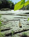
| 08/30/2005 09:56:21 AM |
Death & Life (in the algae-covered marsh)by tateComment: wo wo wo....way way blown out. the leaves in the front give the image a snapshot kind of feel and the lack of detail due to the blown out highlights make this shot an overall one imho |
| 08/30/2005 09:55:05 AM |
Damp & Leanby DottieDComment: wow, interesting take on the whole d and l idea. The shot itself lacks in imaige quality and the pose almost looks painful. the flash robs the image of quality and there is osmething about the foot that just doesn't look right |
Home -
Challenges -
Community -
League -
Photos -
Cameras -
Lenses -
Learn -
Help -
Terms of Use -
Privacy -
Top ^
DPChallenge, and website content and design, Copyright © 2001-2025 Challenging Technologies, LLC.
All digital photo copyrights belong to the photographers and may not be used without permission.
Current Server Time: 08/18/2025 04:29:58 PM EDT.