|
|
|
Showing 871 - 880 of ~4457 |
| Image |
Comment |
| 07/26/2007 12:50:15 PM | The Connectionby robgregoryComment: Greetings from the critique club :)
Well I didn´t vote in this challenge but if I had, I probably would have voted this a 3. Sorry but I got to be honest about such things when I am supposed to be giving a critique. Most of that is the very poor connection to the challenge theme, I just don´t see any connection to the theme "missing link" no matter how hard I look. I assume you mean they are connected through nature but how? By poking at a butterfly and flower? It´s just too much of a stretch for me and I think I usually have a pretty open mind about photos meeting the challenge.
Just look at the top 10 in this same challenge. All of them are unquestionably meeting the challenge head on, there is pretty much no way you can missunderstand these images unless you really try or come from a very different backround than the people who photographed them. Try to be more direct next time, like for instance going in really close and just having the butterfly between two different childrens fingers. Make sure that there would be no way people thought the hands belonged to the same person, maybe using makeup or dirt to make one hand darker than the other or use a grown up hand versus a childrens hand? I at least am not fond of the composition and if the main focus of the picture is supposed to be the fingers and butterfly, it´s just too little a part of this photo.
Regarding technical features of this photo, the exposure seems ok. I am not fond of the fact that the heads of the children are slightly out of focus, I would either want to see you use a smaller aperture to have everything in focus or the opposite, their heads more out of focus. Colors seem a bit too warm but that´s not bothering me much, if it was intentional I totally see why you used a warmer white balance.
Anyway hope I am not being too negative and welcome to DPC. Just try to keep things simpler next time and try to put yourself in the voters shoes and do something they might find interesting and make sure you really tackle the challenge head on instead of having such an ambigous tie to the challenge theme.
You seem to have the camera basics down so just try to be a little bit more inventive and put more effort into your next entry and you should be fine.
Kind regards from Iceland, Lárus. |  Photographer found comment helpful. Photographer found comment helpful. |
| 07/25/2007 10:50:00 AM | Now what?by ScapeshotsComment: Greetings from the critique club :)
I didn´t vote in this challenge but to be honest I wouldn´t have voted it very high, since I think it meets the challenge ok though I most likely would have been one of your 4 votes.
Most of that is the poor image quality, most noticeably the lighting. The lighting for the keyboard is not bad though but for the hands, it´s too strong, blowing out some of the fingers and DPC voters hate blown highlights. I don´t think the white backround helped in this instance, I personally would have liked this image better if you had a desk as the backround or something usually seen underneath a keyboard. Actually, the blown highlights might be a result of the tweaking of contrast/brightness. Trust me, stay away from those tools in photoshop, concentrate more on using levels and curves cause if you set strong settings on contrast/brightness you stand a good chance of blowing out highlights and shadows. I think there is a tutorial on DPC on how levels or curves work, if not just google it, there are hundreds of tutorials on how those tools work, I found several when I started out post processing and someone pointed them out to me.
Besides image quality, this idea is not bad but it´s kindof been done before here at DPC and that also hurt the score I am sure, there is nothing wrong with doing stuff people have done before you (I do it all the time) but try to put your own twist on the shot then or make it more visually interesting if you want to score really well here.
I think if I had taken this shot, I would have used a natural backround, like a desk and probably just used light from a window to light the shot, using tungsten lights often is too harsh and if you use window facing north, you get much smoother and more natural looking lighting.
Well can´t really think of anything else to say except welcome to DPC, I see this is your first entry and your second entry scored much better so way to go, keep at it :)
Kind regards from Iceland, Lárus. | | Photographer found comment helpful. |
| 07/25/2007 10:37:32 AM | Mmm! Yum!by CitadelComment: Greetings from the critique club :)
Well first of all, what a cute baby :) I am supposed to critique this but find it kindof hard as I personally don´t like it when people say negative things about pictures of my kids so I find it hard to say anything negative about photos of other peoples kids too.
Instead I´ll just point out a couple of things that I think would make this photo better. I do like that you shot it against the light but still would just have wanted you to concentrate on exposing for the face as it´s kindof underexposed and just not cared about the backround, just let that blow all out if neccesary to expose the face correctly. Also, I see you used daylight white balance, I think this would be much more pleasant if you upped the WB to about maybe 7000 kelvin (or even more, just play around with it for personal preference), that would take care of the bluish skintone cast and yield a lot more warmer and pleasant colors in the shot as a whole.
I like the shallow dof and sharpness in the shot, contrast is also good and I frankly can´t understand why this only just barely scored above a 5. Maybe people are getting fed up by baby pictures but not me so I don´t get it, think it´s a bit underrated. Backround bokeh is also good and again, that´s a very cute baby and he´s got a great expression :)
Kind regards from Iceland, Lárus. | | Photographer found comment helpful. |
| 07/24/2007 11:06:45 AM | Guitarist dreamingby jeromeComment: Greetings from the critique club :)
Well I didn´t vote in this challenge but I probably would have given it a 4. Most of that would have been attributed to the image quality of this photo and then also a weak tie to the challenge theme.
I noticed you are new here at DPC and you really need to take away any and all doubt of the voter that the image was shot specifically for this challenge and that it meets it head on. To me and probably most of the voters, it kindof seems you just took a photo you liked and slapped a title on it to make it fit the challenge. That is almost always a sure way to score poorly here.
In regards of the image quality, I notice you wrote "Photo shown as is." I hope you don´t have anything against post processing, if you do and you want to be successful as a photographer you need to change that attitude pretty much right now. Maybe I am reading too much into that sentance but I get this vibe from a lot of people who are just starting out with photography.
Try shooting this in raw format next time and use a raw converter to tweak the white balance to a more neutral color (I find the shot to have way too warm tones in it, the guys skin color is too orange and in my experience you need to adjust the WB to somewhere around 3200-4000 kelvin for concert photos, most of the time) Also boost the contrast and sharpen the image and you would be set with under a minute of post processing. If you feel like this is "cheating" from the integrity of the photo, let me just point out to you that everything that is possible in photoshop has been possible to do in the film darkroom for decades, only difference is you get an undo button in photoshop.
Kind regards from Iceland, Lárus. |
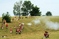
| 07/24/2007 10:56:18 AM | Fighting an American Revolutionby fenix247Comment: Greetings from the critique club :)
First of all, I didn´t vote in the challenge but if I did, I probably would have give a 5 and moved on to the next image without commenting.
Why?
Well I don´t really know what to say about this image, I am not, have never and will never be an war enthusiast and since the total time I have spent in the US has been under a week I simply don´t understand what you guys find so romantic about the civil war. Please don´t take offense at me using the words "War Enthusiast", what I mean is I am not really against it, just I don´t understand it, just like I don´t understand women :) Having gotten that off my chest I will say no more about the content of the image.
First of all, I don´t understand the settings on the camera. Why iso 1600, f16 and 1/500 for this scene? To me iso 200, f8 and 1/250 would make much more sense and lead to much better image quality. I don´t know how familiar you are with these settings but using a lower ISO will lead do less noisy images. Sure that doesn´t matter in web resolution but if you want to use it for anything else, like print, lower iso is optimal. Secondly, regarding the aperture, this seems to me to have been shot at a wide focal length so if you wanted everything to be in focus, f16 is overkill since there is nothing that is close to you that really needs to be in focus, everything is far away. Thirdly using a 1/500 is not a bad idea but since nothing is moving very fast in this photo, 1/250 would have been more than enough to freeze the frame, unless you were aiming to freeze bullets in the frame and then 1/500 would have been way too slow.
Not everything is negative about it, I think it´s decently composed and the exposure is dead on, even if I don´t agree with how you set your camera to expose this photo. Colors and contrast are not bad but pesonally I would want to see more vivid colors, mostly i the cyan colored sky.
Hope this helped and hope I didn´t offend in any way.
Kind regards from Iceland, Lárus. | | Photographer found comment helpful. |
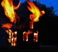
| 07/24/2007 10:02:44 AM | My house burning downby snafflesComment: Greetings from the critique club :)
I didn´t vote in the challenge but if I had, I would probably have voted this a 6. It´s very visually striking and you could have fooled me about it not being a doll size house, I did notice there was something that wasn´t right about the scale of the flames vs. the house but like I said, had you not written it in your comments section I would never have been sure. I do like the colors in this shot and that bush or tree silhouette in the backround really makes the shot work, without it the photo would have been too two dimensional so good placement of the model.
The whole shot is a bit too dark for my taste though, I wish you had taken it a bit earlier in the day but still during dusk to show the surroundings more, maybe that would have been worse but that´s the vibe I get from the photo, it needed to be a bit brighter.
Also, the photo seems a bit soft, I would have preferred it sharper, I noticed you use a 1/8th shutterspeed? That´s all good if you used a tripod, if you didn´t that would explain the slight blurry nature of the photo. I took the liberty of looking up your entry in "Heat" and this is miles better so you have really improved since last year, no doubt :)
Kind regards from Iceland, Lárus. | | Photographer found comment helpful. |
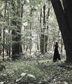
| 07/24/2007 09:45:50 AM | And the forest turned to silver...by HaneckComment: Greetings from the critique club :)
Well I didn´t vote in this challenge but if I had I probably would have given this a 6 since I think it´s above average in the challenge but still not a great photograph. I like the high key feel to it, the exposure the light got in this photograph. The soft colors also appeal to me.
However, I am not as fond of the composition. What mostly bothers me about it is all that space around the model. The space to her left is to my taste (although I would crop out that plant) but I would crop/frame a little bit off the top and almost all of the front, I would have cropped this shot to a more square size and cut off everything from almost just beneath her feet, leaving just a little bit of room there. I put my hands over the screen like that and it instantly appealed more to me personally.
To score better I think you would need to watch highlights better, DPC voters really tend to dislike blown highlights, I do not mind them in this photograph and I think they make it more dreamy but trust me, watching those highlights will seriously help you score.
I took a peek at your outtakes and nr 1 and 3 are really nice, don´t care as well for nr 2, the color is a bit too strong for my taste there.
All in all I think this shot is good, just needs a bit of a push and it would be great :)
Kind regards from Iceland, Lárus. | | Photographer found comment helpful. |
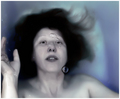
| 07/24/2007 09:36:22 AM | i drownby ursulaComment: Greetings from the critique club :)
First of all, congrats on the top 5 placement :) Is this a self portrait? Well not really all that much I can critique about this image, I think you hit the challenge head on and pretty much nailed it. To say anything, I don´t really care for the "Noise Ninja" or blurry look of the model but it´s not really bothering me at all since she´s underwater and it just kindof makes sense she´s sligthly blurry. You know me though, I usually want images tack sharp, hehehe :)
Other than that, top notch. I really like the color tones in the image, very fitting. Composition good as well as the lighting.
What to do to improve the score? Next time, throw yourself off the bridge :P Muahahahahaha!
Kind regards from Iceland, Lárus. | | Photographer found comment helpful. |
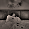
| 07/24/2007 06:55:49 AM | Itsy Bitsy Nightmare by artvetComment: Greetings from the critique club :)
First of all, congrats on the top 20 placing. Well I didn´t vote in the challenge and if I did, I would probably have scored it pretty highly, a 6-7 most likely depending on how I liked the rest of the challenge.
I like the look of the image, nice touch to make it b/w. The contrast and sharpness are also good and I do like the composition. The shadows on the wall are a nice touch and the spiders on the bed look real enough. Model oddly enough reminds me of  fotomann_forever fotomann_forever and I would have thought this was his shot if I were voting :)
I think this is a good shot, just not sure what would make it great or what could have helped the score. Maybe if you had put like dozens or even hundreds of spiders around him, that would certainly have put some more wow factor in the shot, maybe even wider too make the person seem smaller and the bed bigger (or did you use the 10mm of the lens already, then backing up would lead to the same effect of course) to emphasize him being small and helpless against the spiders.
Anyway, again, good shot and could have gone even higher in the challenge in my opinion, would not have been surprised to see it in the top 10.
Kind regards from Iceland, Lárus. | | Photographer found comment helpful. |
| 07/24/2007 06:48:20 AM | Dreamy Sunsetby DigiFotoBuddyComment: Greetings from the critique club :)
Well I didn´t vote in this challenge but I kindof like this shot and would probably have given it a 6. I just like the composition and the color in it, I can´t put my finger on it but it´s sort of grabbing my eye, not really getting a hold on it though and hence "only" a 6.
You have been here long enough to know why this didn´t score too well, my best estimate is the applied gaussian blur + not a strong connection to the challenge theme, I just don´t think you care and submitted anyway and that´s great, respect :)
Kind regards from Iceland, Lárus. | | Photographer found comment helpful. |
|
Showing 871 - 880 of ~4457 |
Home -
Challenges -
Community -
League -
Photos -
Cameras -
Lenses -
Learn -
Help -
Terms of Use -
Privacy -
Top ^
DPChallenge, and website content and design, Copyright © 2001-2025 Challenging Technologies, LLC.
All digital photo copyrights belong to the photographers and may not be used without permission.
Current Server Time: 08/14/2025 07:17:26 AM EDT.
|