|
|
|
Showing 841 - 850 of ~4457 |
| Image |
Comment |
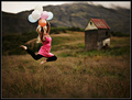
| 08/02/2007 10:43:19 AM | Rhythm of the Waves.by slytennisComment: Greetings from the critique club :)
Well I didn´t vote in this challenge but sorry, if I did I probably would have given you a 4. Most of that is due to the composition and depth of field and the fact that I don´t really see how it ties in with the challenge by just looking at the photo, I needed to see the title to see where you were going with this and I don´t think you should need to do that, use the title to explain how a photo fits the challenge.
The reason why I say so is because of your choice of composition and placement of depth of field, my eye is drawn nowhere near the moving water but instead at that mountain in the backround and the clouds, wich are pretty nice. I almost want to say I feel like the out of focus water is just in the way of what could have been a lovely photo of that mountain, I tried putting my hand over the bottom 1/3 or up to the point the water starts to be in focus and well I thought the shot improved a whole lot when doing that. Also that black object in the lower right corner is something that is really distracting me, I would have moved to the left and taken another photo without it or if that was not an option, taken it out while doing the post processing.
If you really wanted to show a photo that emphasized the movement of water as rythm, I would have just concentrated on that, taking a more closeup of a wave and let the backround just be what it may, here I feel like the backround is the main focus of the picture.
One other thing, the haze in the backround, it´s not really crystal clear and I think you just simply took this during the wrong time of day, try when going out to take landscape photos to stay close to either sunset or sunrise, you will get much softer lighting and usually less haze, your photos will have much more creamy lighting and be more pleasant to look at.
I think it´s good that you are experimenting by going down low close to the surface of the water and playing around with depth of field, definately keep up the experimenting, that´s the best way to learn.
Kind regards from Iceland, Lárus. |  Photographer found comment helpful. Photographer found comment helpful. |
| 08/02/2007 10:26:36 AM | Con Caloreby freakin_hilariousComment: Greetings from the critique club :)
I didn´t vote in this challenge but would probably have joined the majority and voted this a 6. I really like the tonal range in the shot, think you did a great job with the b/w conversion, nice work. The composition and DOF are also very good. Frankly the only reason why I wouldn´t vote higher is that I have seen so many similar photos that photos like this don´t really visually interest me as much as they used to do but technically speaking this photo is very well done.
I also would not have gotten what this was a photo off had I been voting as I don´t recognize the subject and "Con Calore" doesn´t mean anything to me :) Don´t know if this hurt or helped your score, just thought I´d mention it.
I think one thing about the composition could be improved if you cropped out the two pegs at the bottom left half, I put my figer over that part of the screen and the photo seemed much more clean cut and simple, think that would have improved the shot, but that´s it.
Kind regards from Iceland, Lárus. | | Photographer found comment helpful. |
| 08/02/2007 10:15:03 AM | Infinityby jackal9Comment: Greetings from the critique club :)
I don´t have a whole lot to say about this image so I´ll keep this short. I kindof like it but it also is just lacking something that would want to make me vote it very high.
What I like is it´s simplicity, it´s easy to look at, very easy on the eyes. Got great focus/dof and I like the bokeh. Composition is also above average but could have been better, mostly I would want to see an even steeper angle and more panoramic crop, the close to square crop is kindof "squishing" everything together, for lack of a better word. A longer crop and more area to the right with stuff out of focus is something that would have appealed more to me.
I think that most people did vote this a 5 is a tell tale sign that while it´s a pleasant photo to look at, there was pretty much nothing memorable about the photo so probably most people just threw a 4-6 rating on the shot and just moved on to the next photo. You needed something that was different about this photo, like really odd coloring on the posts or something that added interest.
One thing you probably already know, but having a blown sky or any big areas with blown highlights will always hurt your score here at DPC. Personally I don´t mind and think it goes well together with the dark posts to create contrast but there are just so many self proclaimed experts here who can easily identify blown highlights and think a photo can not work with a sky like this.
I don´t know what else to say so I´ll just say kind regards from Iceland, Lárus. | | Photographer found comment helpful. |
| 08/02/2007 09:55:31 AM | Who knew stoping to smell the flowers could taste so good!by CboydrunComment: Greetings from the critique club :)
Well I didn´t vote in this challenge, truthfully if I had, I would probably have been one of those 5 votes you got and would have moved on to the next shot without commenting. The photo is not really bad but it´s just not really appealing to me either, it is promising though so definately keep at it.
First of all, it´s too dark for my personal taste, so dark it makes me wonder if your monitor is calibrated, can you see all the grayscale underneath pictures when you vote or do some of the squares seem the same to you? Secondly, I don´t really agree with the DOF in this picture, I do like that the glass in the backround is out of focus but I would have strongly preferred it if all of the flower was in focus, or if not, the center of the flower were in focus and the petals you chose to have in focus were not.
Lighting is probably the weakest part of the photo, lighting is so much the key to everything when you take still life photographs. If I were lighting the same subject, I probably would have used three lights, one on my right side with a softbox to light the subject from the front, one on my left side behind the subject giving off some backlighting, preferrably some kind of honeycomb grid with barn doors to control the spill of the light so none of it reaches the backround and I would probably use a third light from behind/to the right of me with a snoot or some kind of very narrow lighting to light up the coctail drink since large parts of it are pretty much solid black. That is what I would do anyway if I wanted the shot to look pretty much similar and with a black backround.
To make it simpler, you might just want to use a big window as lighting, preferrably facing north so you don´t get any direct sunlight in there, well assuming you live in the northern hemisphere. That would much rather be useful if you wanted a high key/out of focus look and is commonly used when taking pictures of food for cookbooks so this image would look totally different.
The last thing I want to mention is that your concept is not weak but very average and you usually need a stronger visual concept if you want to do well in challenges here at DPC. Just look at the red ribbon winner and you´ll know what I mean. Having a flower and then glass is so ordinary and cliche (wich is not always bad) that you really need to put some twist on it to score really well, otherwise most voters will do what they did, just give it a 4-6 rating and move on to the next picture without commenting.
Again I want to say this is promising so keep at it and you´ll do fine here :)
Kind regards from Iceland, Lárus. | | Photographer found comment helpful. |
| 08/02/2007 09:06:04 AM | |
| 08/01/2007 03:56:42 AM | |
| 07/30/2007 01:05:29 PM | Daughter's Eyesby tennernieComment: Greetings from the critique club :)
I am always not sure what to say when commenting on a picture of someones child so I´ll keep this short and focused on the technical details of this photo.
First of all, your camera settings and perhaps choice of lens for this photograph. I see you used a 28-80mm lens with a small aperture but you own a 50mm 2.0 lens? Don´t know what exact focal length you used but my gut tells me the 50mm lens would have been a far better choice for this photograph. The reason I say this is because you use a 5.6 aperture when 2.0-2.8 would have been a far better choice, both to have less DOF wich is often more pleasant in portraits and also would enable you to set the ISO lower for better quality and also a higher shutterspeed so the image was better frozen, the image either apperas out of focus or more likely has some slight motion blur cause it´s not nearly as sharp as I would have preferred it.
Composition is not bad but I strongly prefer when people shots include the whole chin, cutting off the tip like you do here is not really what I find flattering, I would much have preferred it if you instead framed the shot slightly lower and include less of the forehead and all of the chin.
Other than that, I agree with most of your commenters about this lacking contrast and sharpness, when photos are b/w I personally want much more contrast than I want with color photos. Boost that and make sure the last thing you do after resizing the photo for DPC use is to sharpen it and you should be set cause all in all this is far from a bad photo, just needs a little bit more thought out settings and lens on the camera and a little bit of post processing and it would really pop much more off the screen :)
Kind regards from Iceland, Lárus. | | Photographer found comment helpful. |
| 07/30/2007 12:47:27 PM | The Girl Next Doorby labudsComment: Greetings from the critique club :)
Well this shot I like! I don´t love it though, the tilt of the head along with the hair gives me the impression that I too should shake that hair out of my face :) Nice lighting though, looks completely natural and nice use of a reflector. The eyes are kindof too dark for my taste, think I would have liked this shot better if you had brightened them up a bit. The composition is good, I like that it´s tightly framed. I personally would have increased the contrast though but I completely understand why you didn´t, that´s just a personal preference of mine.
The model is doing a good job too, the hair doesn´t seem to bother her in the least and she´s got a nice connection to the camera, I like the hand there so coudos to her.
Anyway, you know what you are doing so I´ll leave it at that.
Kind regards from Iceland, Lárus. |
| 07/30/2007 11:52:31 AM | In Grandma's Armsby LipstudiosComment: Greetings from the critique club :)
I didn´t vote in this challenge but if I had I probably would have given it a 5 and moved on to the next challenge. I do like the moment you captured, the lighting and composition is pretty good. However, the dark areas are kind of too dark for my taste in regards to the tonal range of the rest of the photo, they are just dragging too much attention to them, the first thing I looked at when seeing this picture were the upper and lower left corners of the photo and not their faces. I also find the sharpness and contrast in this image lacking for my taste, I would want to see a stronger contrast (I usually do in b/w photos) and definately a sharper photo.
What I would suggest in post processing would to use something like shadow highlights to seriously brighten up the darker areas, then use something like curves or whatever you personally like to increase contrast and then after resizing, sharpen it with whatever tool you prefer. This would have improved your score significantly, I am sure.
Again, the rest is pretty good and the moment is gold.
Kind regards from Iceland, Lárus. |
| 07/30/2007 11:34:34 AM | Recycled artby Rino63Comment: Greetings from the critique club :)
I didn´t vote in this challenge but honestly, I probably would have voted this a 5 and just moved on to the next photo in the challenge without commenting. It´s not a bad photo and the idea is not bad either but still, just not really an interesting photo as it is.
Most of that is that yellow backround, to me it just looks like you printed out a couple of photos and threw them on your couch and took a photo, uploaded to the computer and sent to this challenge. I suspect a lot of other people thougth the same and I think you know this after being here at DPC for this long but just in case someone new is reading this critique, if it looks like you went through some trouble for your entry you will score better.
I think if you had printed the same photos and then gone to another beach and put them there, it would have been so much more interesting, like if you had gone there to take newer and better photographs of the beach instead of those you printed, you know what I mean? Maybe doing a self portrait in the meantime, you being in the frame, taking pictures of the beach and be out of focus, having the focus on these same photos sticking out of the sand in the foreground?
Also I kindof agree with  surfdabbler surfdabbler, the lighting seems a bit wierd, with that big shadow there, is it in the print or was the lighting like that at the time?
Kind regards from Iceland, Lárus. | | Photographer found comment helpful. |
|
Showing 841 - 850 of ~4457 |
Home -
Challenges -
Community -
League -
Photos -
Cameras -
Lenses -
Learn -
Help -
Terms of Use -
Privacy -
Top ^
DPChallenge, and website content and design, Copyright © 2001-2025 Challenging Technologies, LLC.
All digital photo copyrights belong to the photographers and may not be used without permission.
Current Server Time: 08/13/2025 09:35:53 PM EDT.
|