|
|
|
Showing 811 - 820 of ~4457 |
| Image |
Comment |
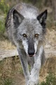
| 08/23/2007 08:01:28 AM | Hungerby essieComment: Greetings from the critique club :)
Well this is a pretty nice shot but still, in a free study this would have gotten a 5 vote from me, I am a little bit more demanding on pictures in free studies even when they are speed challenges. I think this shot is far from bad but there are a couple of things I would personally want to see different about it.
First of all, I don´t really like the framing of this shot. I would either have wanted to see it framed/cropped more closely or a little wider. If you had gone for closer, I would basically just have wanted to see a "headshot". When I say wider I mean mostly that you cut off the "toes" or front tip of the paws, and that doesn´t sit right with me, even though it´s not bothering me much. I think if this is how it came out of the camera in regards to framing, I would have cropped it to a more square format and taken off the bottom part of the face, cutting off the part just a little lower than the tounge reaches, I tried putting my hand over the screen and I like it much better that way cause it seems like he/she is ready to pounce in a crop like that.
Also, this shot seems to have been taken in very flat lighting, was it very cloudy? I personally would have gone a little bit further with increasing contrast, but just a little. I also would have added a little vignetting or a frame as the even lighting across the frame tends to not draw attention to the face, a little vignetting would have taken care of that "problem".
I do like the color tones in the image and you did a nice job on the eyes, photo is also sharp enough so those parts are all good. DOF is also good, I think personally I would have wanted to see a bit shallower DOF but that´s just me and my taste, the DOF is good as it is.
Kind regards from Iceland, Lárus. |
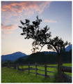
| 08/22/2007 08:44:14 AM | Drawn to the lightby KHoltComment: Greetings from the critique club :)
Well this is a pretty nice shot, if I had voted I probably would have given it a 6. Not really much constructive stuff I can say about it, the shot is nicely composed and exposed, got tones all over. Maybe the darkest parts could be a bit brighter, for my taste but that´s not something that is bothering me at all. All in all this is a pretty pleasant shot to look at but there is also nothing that is extremely interesting about it, something that would warrant it a higher vote from me and apparently most other users.
I at least completely disagree with apple77berry, I think the composition is nice but I think wickee_one raises a good point about noise, the shot would be better without it but it´s also nothing that is bothering me.
What I like best about the composition is that the tree seems to be stretching up to the clouds in the upper left corner.
Sorry but don´t really have anything more to say so I´ll just say kind regards from Iceland, Lárus. Message edited by author 2007-08-22 10:41:48. |  Photographer found comment helpful. Photographer found comment helpful. |
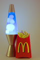
| 08/22/2007 06:42:35 AM | McMunchiesby photodudeComment: Greetings from the critique club :)
Well to start off I would probably have given this image a 4, sorry but I don´t think this image is really bad but I would classify it as being a little bit below average and kindof agree with the score and place it got.
The biggest reason is the lighting on this shot. You say you built a lightbox for this photograph? I can´t really see that in this photo, you sure you used it correctly? The standard fool proof way of using a lightbox is to fire at least two lights into it, one from each side and pretty much the same power on both lights. Sure, there are a ton of other ways to do it but that´s the easiest way to do it and get acceptable results.
The image is also in my opinion underexposed, if I had taken this shot I would have wanted a much more high key look to it since you placed it in a lightbox, if you have not familiarized yourself with the camera histogram I encourage you to do that, it´s an invaluable tool.
There is also what appears to me to be some strange artefacting in the mcdonalds box in the red areas, just above the "M" on the right side, did you use some tool to clip the red highlights (like levels?). Looks a bit wierd, whatever caused it.
The colors seem a bit off to me too, looks like the WB was a bit off, did you light this with tungsten bulbs? If you are not shooting in raw and can correct WB afterwards, I encourage you to familiarize yourself with the WB settings and use the correct ones when shooting with artificial lighting, tungsten lighting can cause non flattering color cast´s on subjects.
All in all this definately met the challenge and I did get the humor in the shot, think you should have gone all the way though and just filled the shot with french fries and not just one box cause that´s what I think of when I think of Munchies, A LOT of food and just not one box of fries :)
Kind regards from Iceland, Lárus. | | Photographer found comment helpful. |
| 08/22/2007 06:26:03 AM | Burst of colorsby sekarmalathyComment: Greetings from the critique club :)
Well don´t really know what to say as constructive critizism, I like the shot pretty much as it is. Only thing that I would change was I would have had just a little bit more space at the bottom but only like 2-3% just so that the glasses don´t seem to cramped in there.
That´s it, I like everything else about the shot, the colors and lighting in particular. I still am not really in awe about photos like this so I would "only" have voted this a 7 but I know how hard they are to do so I respect that. In short, I think the only reason this didn´t do better is that a lot of people who participate on DPC are like me, we want awe inspiring photos every time of something extraordinary like a killer sunset, some exotic location or portraits of very interesting people and that is usually what does well in free studies.
Anyway, nice job :) Kind regards from Iceland, Lárus. | | Photographer found comment helpful. |
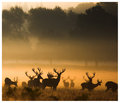
| 08/22/2007 06:21:18 AM | Wildernessby AlexSaberiComment: I actually prefer this one over your entry but that´s just me, great shot´s both of them though! | | Photographer found comment helpful. |
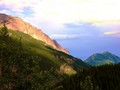
| 08/17/2007 11:12:13 AM | Shadow Valley.by slytennisComment: Greetings from the critique club :)
Hi there again :) Well first off, congrats on your new personal best score so far.
I have some major issues with this image though, mainly the image quality. I am sorry if I am too frank about this but whatever caused it, especially the sky in my opinion and also the mountain that is in the right side of the picture just looks awful, if this is how this image came out of your camera at iso 50 I would seriously check into if it´s defect cause there is simply way way too much color noise in those areas of the picture.
I have some suspicions that maybe your monitor is not calibrated, do you see all of the grayscale underneath pictures when you vote?
I think the color noise rather comes from something you did when you post processed this image. I don´t know what software you use but I think most of them allow you to see the histogram, it´s a good tool for knowing when you are blowing out either the shadows or highlights, you are totally blowing out the higlights in the sky. I suspect you increased the saturation somewhat to get more vivid colors? Well I personally if anything decrease saturation and instead use levels/curves and other contrast related stuff like tweaking contrast in the raw converter since I only shoot raw images, that way I don´t get the color noise that is in this image and still get pretty vivid colors. I urge you to try it out anyway if you haven´t used curves or levels so far.
Other than that, the image quality, I think this is a pretty good image. It´s well composed, MUCH better than the other one I commented on the other day and you seem to have been there at the right time of day cause the lighting looks pretty good so I think you could have scored even better with this image if you had taken care not to blow the highlights like that and used some other method than you did to get the vivid colors. Again, I urge you to check out if your screen is off, that could also explain a lot cause if your screen has some bad settings on it, images can look great at your screen but much worse for other people.
Kind regards from Iceland, Lárus. | | Photographer found comment helpful. |
| 08/17/2007 10:24:39 AM | Shadows From The Jurassic Periodby sz1_Comment: Greetings from the critique club :)
Well sorry but I don´t have a whole lot to say about this shot. I find it a pretty good shot but I kindof totally agree with the score it got cause if I had voted I would have wanted a 5.5 button to press cause while this shot is allright, there isn´t really anything awe inspiring about it.
Sure, the shadows are cool but this photo just is what it is and I can´t tell you a way to improve it, except maybe I would have preferred this photo if the shadow in the left corner were not overlapping the shadow of the T-Rex.
Kind regards from Iceland, Larus. |
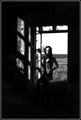
| 08/16/2007 12:57:48 PM | The shadows of my soul by DogAngelComment: Greetings from the critique club :)
Well hi there Guðbjörg, always fun to critique a fellow Icelander.
Well I kindof like it too but I don´t love it, if I had voted I probably would have given it a 6. It´s a pretty cool shot, I like the wind in the hair and the shadow in the window falling on her. The black areas are too much for my taste though, I would have either wanted to see a little bit brighter shadows or simply a photo that cropped a lot off the top and bottom of this photograph.
I don´t fully understand the camera settings, why iso 800? If it´s grain you are looking for, sure but that won´t be visible in web resolution anyway, why not may be 1/125 shutter, iso 100 and 5.6? Eh, that is just what I would do so don´t listen too much to me, I just think that would have lead to better image quality.
Nice choice to make it b/w, I think this photograph would do well in a series with several others like it so just keep at it and work on your own style.
Kind regards from your own Iceland, Lárus. | | Photographer found comment helpful. |
| 08/16/2007 06:03:33 AM | Gust of Shadowsby fotojunkieComment: Greetings from the critique club :)
Well I honestly am a bit stumped here and don´t really know what to say. I took a look at your portfolio and the other two challenges you have entered say to me that you know what you are doing so this image is obviously intentionally out of focus and abstract.
Frankly, I don´t really care for it and had I voted I probably would have given it a 3, I simply am not a fan of abstract art so that´s a personal issue/preference.
Since you are new here I´ll just say this, if you want to score well here your images usually have to be technically well done (wich I can see you can achieve by your other photos) and then have some special interest.
This image simply looks like (to me at least) you accidentally pressed the shutter while pointing the camera at the floor and I guess that is what most other people thought, hence the low score.
Kind regards from Iceland, Lárus. |
| 08/15/2007 09:17:38 PM | Allureby TOYComment: ignite, you wierdo, all I notice in this picture is the hot naked lady :P
Ah who cares about cigarettes and how bad they are for you, I don´t smoke and absolutely detest the act of smoking but I love quite a few people who do smoke and I don´t judge them, who cares who is smoking in a photograph or not, can you smell it off the screen?
Nice shot Laurent, love the lighting :) | | Photographer found comment helpful. |
|
Showing 811 - 820 of ~4457 |
Home -
Challenges -
Community -
League -
Photos -
Cameras -
Lenses -
Learn -
Help -
Terms of Use -
Privacy -
Top ^
DPChallenge, and website content and design, Copyright © 2001-2025 Challenging Technologies, LLC.
All digital photo copyrights belong to the photographers and may not be used without permission.
Current Server Time: 08/13/2025 05:41:23 AM EDT.
|