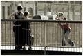
| Image |
Comment |
| 07/18/2005 01:22:32 PM |
keys to the back roadby aplomb76Comment: Nice shot and love the shallow dof and contrast/sharpness but I dislike the white studio backround, I personally would have liked this more if it had been shot with a real backround to give it more context. In short, to "sterile" for my taste. |
 Photographer found comment helpful. Photographer found comment helpful. |
| 07/17/2005 04:44:49 PM |
Family Businessby madison461Comment: Not a bad idea, to photograph a family buisness but this photo doesn´t really work in that regard as I have no clue on what the family buisness is after seeing this. What I am suggesting is that next time you take a step back and try an environmental portrait approach and show what it is that they are doing. I can´t tell if they are bagging groceries, sewing, wrapping a brand new 1Ds mkII in gift paper for your special someone or writing a nobel prize book
Also the image quality isn´t very good, there are a couple of very ood lines that lead through the lady in the bottom left corners face and over the yellow t-shirt and there doesn´t seem to be any one point in this shot that is spot on in focus.
Gave the shot a 4. |
| Photographer found comment helpful. |
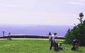
| 07/17/2005 04:40:35 PM |
Picnic with a Viewby nick800Comment: Not a bad shot at all but hardly good either, if it would have had more pleasing colour and better image quality, specifically sharpness/contrast I would probably have given this a 6-7. However, the shot has a serious purple cast to it and the sky is very odd to say the least, too overexposed and hazy. You sure your monitor colour is calibrated? |
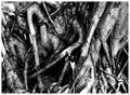
| 07/17/2005 04:37:21 PM |
Ancient Celtic Rootsby amberComment: Sorry, I personally don´t really think this fits with the theme of this challenge, too bad since this would have been perfect for the texture challenge. Like the shot but I didn´t want to give it 5 because of the loose tie in with the theme, IMHO you shouldn´t have to rely on the title to connect a shot with the challenge. |
| 07/17/2005 04:31:40 PM |
best man and best dadby tomzinhoComment: Wether the motion blur is intentional or not, IMHO it doesn´t improve this shot as opposed if the motion had been stopped, I at least would have given at least 1 or 2 more points when I scored this if it had been "frozen". Also the backround is distracting to say the least. Framing and colours/contrast are good though. |
| Photographer found comment helpful. |
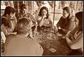
| 07/17/2005 04:28:42 PM |
Family Games at the Cabinby dwterryComment: Good choice to make this Sepia coloured, gives that "timeless" feel too it, it seems they could just as easily have been wearing cowboy hats and been playing poker and this shot had been taken about 140 years ago. |
| Photographer found comment helpful. |
| 07/17/2005 04:23:34 PM |
4.75by ImagineerComment: I don´t completely get the title, are you referring to a wish of having a score of 4.75 or do you mean that there is a fifth member to this family on the way?
Anyway, I don´t really care for the pink monotone in this image, I am not sure but I personally would probably have liked it better in a traditional b/w. Also I think it´s framed a bit too tightly or not tight enough, to just barely cut off the backs of the adults you give me the impression that you just didn´t have a wide enough lens to get them all in the picture as opposed that the framing is intentional.
I have to congratulate you though for thinking of this shot, wether this is a self portrait or this is some family that is close to you I bet that the persons on the photo will be glad this was taken in the years to come. Congratulations on your/their baby to come. |
| Photographer found comment helpful. |
| 07/17/2005 04:17:26 PM |
Family Hikeby wardComment: Not bad at all but it seems a little bit soft or even out of focus and also a bit flat, I would suggest an "s-curve" and some sharpening and I bet you would like the outcome more. Lovely family you got there. |
| 07/17/2005 04:11:44 PM |
Snapshotby aznymComment: There is something about this shot that I like, I think it´s mostly the sublte colouring and the composition along with a perfect choice of DOF. Good job, I gave it a 7. |
| Photographer found comment helpful. |
| 07/17/2005 04:01:27 PM |
just one leftby JohannesFrankComment: Not bad at all but if I may be frank this is an example of a poor choice in aperture size or placement of DOF since the head of the mother is out of focus but the tail feathers are in focus. Like the colours, sharpness and contrast though. |
Home -
Challenges -
Community -
League -
Photos -
Cameras -
Lenses -
Learn -
Help -
Terms of Use -
Privacy -
Top ^
DPChallenge, and website content and design, Copyright © 2001-2025 Challenging Technologies, LLC.
All digital photo copyrights belong to the photographers and may not be used without permission.
Current Server Time: 08/11/2025 05:50:23 PM EDT.