| Image |
Comment |
| 11/21/2005 04:43:29 AM |
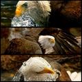
Bird of Prey by CutterComment: Congrats on the yellow ribbon, hope you do´t take this the wrong way but I am glad you didn´t do better :D Excellent captures, all of them, I especially like the middle one and I would have given this a good rating if I had voted. |
 Photographer found comment helpful. Photographer found comment helpful. |
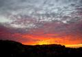
| 11/21/2005 04:42:24 AM |
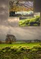
Peak District Triptych by FalcComment: Hehe, pretty close :) I am seeing this image for the first time now and I really like it. Congrats on the red ribbon, well deserved. |
| Photographer found comment helpful. |
| 11/18/2005 06:04:26 AM |
|
| Photographer found comment helpful. |
| 11/18/2005 06:03:46 AM |
Long Range Fighterby JCYRHSComment: Cool paint job on the lens, how does one get one of those :P Anyway, think it´s missing something, like the head of the photographer and he/she was also painted in camouflage colours in the face or something but it works nicely like it is, you got a 6 from me. |
| Photographer found comment helpful. |
| 11/18/2005 06:02:28 AM |
Heaven's INFERNOby rapidComment: Huh? How is this camouflage? Just wanted to leave a comment as to why I only gave this a 3, like the shot but doesn´t meet the challenge as far as I am concerned. |
| 11/18/2005 05:58:38 AM |
Camoflauged 350zby huitzilopotchtliComment: Sorry, not fond of the lighting here and I frankly don´t understand why you didn´t take this shot during the daytime somewhere with a forest behind it or whatever. The first thing that popped into my mind when I saw it was that this just screamed at me "this person didn´t put a lot of effort into this challenge at all..."
Fit´s the challenge though so I still gave it a 4. |
| Photographer found comment helpful. |
| 11/18/2005 05:56:31 AM |
Holiday Parade Entryby FrostyPawsComment: Sorry but the cheap photoshop effect is just not flattering at all and if that isn´t bad enough I don´t really see how this fit´s the challenge. I assume the truck is painted in military camouflage colours but there is just no way of telling because of the effect you put on the shot so I voted as if it didn´t meet the challenge and frankly I gave this a 1, a rating I don´t give out often. However, if YOU like this then I encourage you to keep it up as that is all that should matter, what the hell do I know anyway. |
| Photographer found comment helpful. |
| 11/18/2005 05:53:25 AM |
On Your Marks... Get Set...by anthonyczajaComment: Not really fond of the frame but the shot itself is good, love the image quality and the title helps, one of the better shots in the challenge, gave it a 7. |
| Photographer found comment helpful. |
| 11/18/2005 05:51:30 AM |
Things are not always as they seem...by jasm8Comment: Not really fond of the short DOF here as it works out that the eye to the right is out of focus. If you had to have the aperture so big I would rather have it the other way around, the eye to the right in focus and the one to the left out of focus as my vision is more drawn to the eye to the right. Shot itself is good but need something to make it "pop" more. |
| Photographer found comment helpful. |
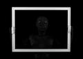
| 11/18/2005 05:48:25 AM |
Empty Frameby myceliumComment: Very symmetrical, it works nicely and the idea is good an executed well, just doesn´t have any "wow" value with me but technically it´s very well done, you got a 7 from me. |
| Photographer found comment helpful. |
Home -
Challenges -
Community -
League -
Photos -
Cameras -
Lenses -
Learn -
Help -
Terms of Use -
Privacy -
Top ^
DPChallenge, and website content and design, Copyright © 2001-2025 Challenging Technologies, LLC.
All digital photo copyrights belong to the photographers and may not be used without permission.
Current Server Time: 08/14/2025 04:04:03 PM EDT.