| Image |
Comment |
| 06/25/2006 02:44:17 PM |
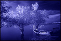
The River's Edgeby BudComment: Pretty cool shot, I like the blue hue and the location you found here, seems like a place I´d like to visit. |
 Photographer found comment helpful. Photographer found comment helpful. |
| 06/23/2006 12:59:28 PM |
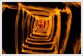
Burning Box of Fireby dan501Comment: This is pretty cool, I like the symmetrial pattern, it really draws me in, I guess I must be a pyromaniac :) |
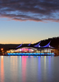
| 06/23/2006 12:58:10 PM |
Nightlightsby bryanbrazilComment: Pretty cool, not really fond of the blue hue on this one, think I would have liked it better with a more neutral hue, the sky more black and "natural" but this is still pretty good. Wish there was something in the foreground that stood out more with some kind of illumination but I guess "painting with light" doesn´t work on those mountains, hehe :) Nice work anyway, gave it a 7. |
| Photographer found comment helpful. |
| 06/23/2006 12:56:06 PM |
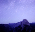
30" from the Shoreby alanfreedComment: This is pretty nice, one of the better shots in the challenge, you make my top 10 list this time, love the clarity and composition in this one, nice work! 7 from me. |
| Photographer found comment helpful. |
| 06/23/2006 12:55:22 PM |
Colour of Nightby lentilComment: I gotta put a question mark about the portrait orientation of this shot, to me it would have been much more natural to have this in landscape orientation and show a little bit what´s around this interesting building instead of including so much of the water and sky wich I think don´t do much for this building. If you still want portrait orientation I would suggest not having the subject so in the middle next time, try putting it either higher or lower in the frame. That said though I like this shot as it is and think it´s above average, gave it a 6. |
| Photographer found comment helpful. |
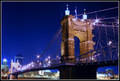
| 06/23/2006 12:48:59 PM |
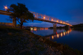
Midnight Beautyby Nikonian NinjaComment: Pretty cool stuff, love the coloring in this shot and also the composition. Kindof a shame this is basic editing as the blown out top columns on the bridge kindof draw too much attention for my taste and that could easily have been corrected in advanced editing so I am going to assume you would have done so if you had the chance and vote as I see the image should look. That means an 8 from me, I really like this shot. |
| Photographer found comment helpful. |
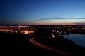
| 06/23/2006 12:47:34 PM |
A City Dividedby KarenNfldComment: Been done a million times already but that doesn´t really matter when it´s done well, like it´s done here. Nice shot, nothing spectacular about it though but shot at the correct time of day with nice composition. Gave it a 6. |
| Photographer found comment helpful. |
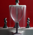
| 06/23/2006 12:46:07 PM |
My cup runeth overby Elvis_LComment: Kind of cool, I like the idea, just think that a kitchen sink isn´t the best setting for a shot like this, I can just see this done on a tabletop and water all around, maybe with a black and white square cloth (like a chessboard) and something around the glass, like smaller glasses or something like that... 6 from me. |
| Photographer found comment helpful. |
| 06/23/2006 12:43:36 PM |
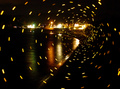
Beach Vortexby charliebakerComment: I can´t for the life of me figure out how this shot is taken but that doesn´t meen that I like it, the "vortex" is very disorienting and not really aesthetically pleasing, I get slightly dizzy looking at this shot. Still, I appreciate the effort so I gave it a 6. |
| Photographer found comment helpful. |
| 06/23/2006 12:42:27 PM |
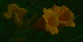
Daylilies by Nightby sasadaComment: Sorry but way too dark for my taste, and yes, my screen is calibrated so if this is bright for you, you might want to check out your screen settings. |
Home -
Challenges -
Community -
League -
Photos -
Cameras -
Lenses -
Learn -
Help -
Terms of Use -
Privacy -
Top ^
DPChallenge, and website content and design, Copyright © 2001-2025 Challenging Technologies, LLC.
All digital photo copyrights belong to the photographers and may not be used without permission.
Current Server Time: 08/28/2025 10:17:51 AM EDT.