| Image |
Comment |
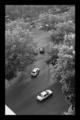
| 07/14/2006 01:48:21 PM |
madridby tracey3Comment: I can promise you a higher score if you make the most out of the allowed 640 pixles. |
| 07/14/2006 01:47:35 PM |
Relaxby fotomann_foreverComment: Nice to see a nude here to break up the voting process. However, I find the lighting less than inspiring here, very dead on and uninteresting, I always find nudes more tasteful and interesting when there are shadows and more mystique to them. Also, not really all that fond of the black backround, it often works but here the garment she is in blends so totally in, I just don´t think it´s really working for this particular shot. Still not a bad photo, just not something I´ll qualify as being above average so I gave it a 5. |
 Photographer found comment helpful. Photographer found comment helpful. |
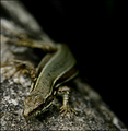
| 07/14/2006 01:44:46 PM |
If You Were But An Antby Bernard_MarxComment: Thumbnail looked good but wasn´t pleasantly surprised when I opened this, it needs much better focus, it´s way too fuzzy for my taste. |
| Photographer found comment helpful. |
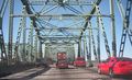
| 07/14/2006 01:44:10 PM |
Welcome to Washingtonby cordeliawlComment: You should really try to avoid taking photos through a window, it will always lead to much worse image quality. I hope you weren´t driving when you took this, hehe :P |
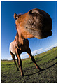
| 07/14/2006 01:43:36 PM |
From The Horse's Mouth by PedroComment: I gotta say, this is probably the most unflattering use of a wide angle lens to a subject I have ever seen and the subject isn´t even human! Man that horse looks wierd, makes me wonder what the heck was in that coffee I drank this morning, hehe :) |
| Photographer found comment helpful. |
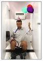
| 07/14/2006 01:29:48 PM |
Another Crappy Birthday!by JayWalkComment: Lol! Hadn´t seen this before, think it´s bloddy brilliand and an instant favorite. Only to nitpick about the photographic side, I wish you had included the feet in the picture and had it slightly wider but nothing really that matters. Anyway, made me laugh out loud and would be perfect as a gift card :) |
| Photographer found comment helpful. |
| 07/14/2006 01:14:36 PM |
A Different View At Old Gloryby brimacComment: A bit too centrally composed for my taste but nothing horribly wrong with the composition, just wish it was a tad more from the right bottom corner up to the left top corner, that´s all. Nice color scheme in it. |
| Photographer found comment helpful. |
| 07/14/2006 01:13:50 PM |
Rusticby jaxedComment: Nice shot, love the DOF and color/contrast in this one, well composed. |
| Photographer found comment helpful. |
| 07/14/2006 01:12:59 PM |
highway to darknessby MIN-BITERComment: Nice work, love the composition and tonal range here, awesome clarity in it. Just wish the black part of the photo were dark rather than black, had something going in it... Anyway, nice photo, gave it an 8. |
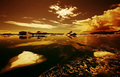
| 07/14/2006 01:03:10 PM |
Golden Ice Cubesby StructorComment: Not really sure how I feel about the sepia toning, I think I would have liked this image better in color and not quite with such strong contrast but this is hardly bad, gave it a 6. |
| Photographer found comment helpful. |
Home -
Challenges -
Community -
League -
Photos -
Cameras -
Lenses -
Learn -
Help -
Terms of Use -
Privacy -
Top ^
DPChallenge, and website content and design, Copyright © 2001-2025 Challenging Technologies, LLC.
All digital photo copyrights belong to the photographers and may not be used without permission.
Current Server Time: 09/01/2025 03:47:43 PM EDT.