| Image |
Comment |
| 01/04/2007 06:10:26 PM |
Twenty Below by Sunshine86Comment: I really dig this shot, not much more I can say but not enough for a 10 though, something missing for that but good enough for 9 from me and I am picky :) |
 Photographer found comment helpful. Photographer found comment helpful. |
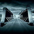
| 01/04/2007 06:09:46 PM |
Blizzardby JutildaComment: Well maybe it´s cause I have taken photos in a real blizzard several times and know what photos in them usually look like but this just screams "fake" to me when I opened the shot. I still like it though, don´t get me wrong and I really dig the composition. You probably know this though and while it doesn´t bother me, blwon highlights/white areas with little texture usually draws negative scores and comments here at DPC so if you are new, keep that in mind, people can be very anal about blown highlights here. 8 from me. |
| Photographer found comment helpful. |
| 01/04/2007 06:07:03 PM |
|
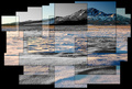
| 01/04/2007 06:05:54 PM |
Winter Morning at Red Pine Mountainby jrtoddComment: Well, I have seen  arnit arnitdo similar stuff but they work much better in my opinion cause all of them are with the same color tone and hue and no black and white inbetween, that´s what mostly bothers me with it, also the fact that some of the squares are not really squares at all but have an odd shape, this just seems so chaotic and poorly though out if you pardon me for saying so while his collages of pictures look more organized and well laid out. Not bad though but not good either, makes the image too busy for my taste and I voted a 5. |
| Photographer found comment helpful. |
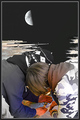
| 01/04/2007 06:01:50 PM |
No Giant Stepsby raishComment: Well three things bother me with this shot and made me vote a 3. The first and smallest thing is that there is no face in this shot to make me identify with anyone. Then I dislike the image quality, fisrt the color noise, most visible in the hands and then the selective desaturation, most visibleon the brown cap and blue jacket towards the tops.
Thirdly and this is the big thing, that backround just really looks fake and unreal and just doesn´t do it for me, sorry :( |
| Photographer found comment helpful. |
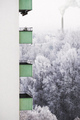
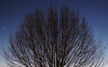
| 01/04/2007 05:59:57 PM |
Oh, cold and lonely orb...by photom1946Comment: I do like this shot but feel that something is missing. Maybe the fact that I feel like I am looing at the top half of a photograh, I have a feeling I would have liked it better to see a portrait shot of the whole tree, dunno... 6 |
| Photographer found comment helpful. |
| 01/04/2007 05:57:53 PM |
SWAMP OF THE LIVING DEADby AlexSaberiComment: Alex, is that your brother? Dig the shot, nice work, two things though, I would have had your brother wear a shirt or different clothes on the three photos of him in the backround to well maybe make it more realistic that they were three different people and also the hand creeping out of the frame has a much yellower skin tone than the face and that kindof bothers me. Anyway, other than an awesome shot definately one of the best in the challenge :) |
| Photographer found comment helpful. |
| 01/04/2007 05:43:50 PM |
|
| Photographer found comment helpful. |
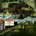
| 01/04/2007 05:43:13 PM |
Engulfment Hazardby posthumousComment: Sorry but something about the look of this image just doesn´t agree with me, I can´t put my finger on it but the cartoonish coloring along with the low contrast, I dunno, just not my cup of tea, sorry :( |
| Photographer found comment helpful. |
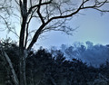
| 01/04/2007 05:34:57 PM |
Bushfires & Drought.by BrianRComment: I like the red tone and red sky here. Compositionally I think tilted back a little would have improved it as the foreground is a bit too much for me and I dislike that you cut off the top of the tree like that. Also the strong halo around the trees (especially the big one but also those along the horizon) bothers me a bit. Above average though in the challenge, gave a 6. |
| Photographer found comment helpful. |
Home -
Challenges -
Community -
League -
Photos -
Cameras -
Lenses -
Learn -
Help -
Terms of Use -
Privacy -
Top ^
DPChallenge, and website content and design, Copyright © 2001-2025 Challenging Technologies, LLC.
All digital photo copyrights belong to the photographers and may not be used without permission.
Current Server Time: 08/24/2025 04:31:16 PM EDT.