| Image |
Comment |
| 04/24/2007 08:22:01 AM |
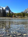
Riversideby jamfullComment: Nice shot, looks like a lovely place to visit. However I get the feeling when watching this shot that it would have worked better in landscape, at least I get the feeling I am only looking at half the shot and this is the left part. |
| 04/24/2007 08:19:31 AM |
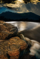
River Aurousby CutterComment: Well I like the thought behind this image but I find this frame way too busy for my taste. There is simply too much to look at here and the composition doesn´t do anything to lead my eye around the frame. I feel the rocks are simply in the way of that water and that sky is way over the top for me, it just steals attention. Sounds like I gave this shot a 1, wich I didn´t, it got a 5 from me, I neither like it nor dislike it.
Darker rocks, brighter sky and had you moved slightly to your right you never know what I would have given it :) |
| 04/24/2007 08:17:11 AM |
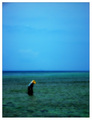
Heatby dmaddenComment: Nice but I personally would have wanted to see this slightly darker, like a 1/3 or 1/2 stop as I think it would have appealed more to me like that. Also take better care when processing next time, there is some very distinct halo around the are where the land meets the water. |
 Photographer found comment helpful. Photographer found comment helpful. |
| 04/24/2007 08:16:01 AM |
A Country Sceneby IvoryComment: A bit over the top dramatically wise for my taste but other than that pretty good. |
| Photographer found comment helpful. |
| 04/24/2007 08:14:48 AM |
Into the Westby illoosi0nComment: This is very nice, I really like the composition. However, take better care when you save it next time cause it will help you score better, this image is only 20kb and you are allowed 200kb so chose better quality next time, there is some really bad artefacting going on around the bridge. |
| Photographer found comment helpful. |
| 04/24/2007 08:11:56 AM |
Sea Surchinby bradicalComment: Well whatever the cause, I must say I don´t care for the "look" of this image, the soft focus or blur on the water just doesn´t appeal to my personal taste. Voted 4. |
| Photographer found comment helpful. |
| 04/24/2007 08:10:54 AM |
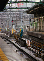
TrainScapeby MCCullenComment: Well sorry but I do believe I have a very open mind on wether an image meets challenges or not but here I just don´t see it. Also the dead center composition of the guy isn´t really working for me. Tried this in black and white?
Voted 2 and purely because I don´t think it meets the challenge. |
| 04/24/2007 08:09:21 AM |
|
| Photographer found comment helpful. |
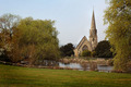
| 04/24/2007 08:08:59 AM |
Oasis in the Cityby GrandadComment: Pretty good, I do find those trees to the sides a bit off though, perhaps closer to the church, wider lens and including more of the reflection in the water next time? |
| Photographer found comment helpful. |
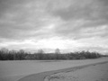
| 04/24/2007 08:07:52 AM |
Windy day after a stormby gdub1189Comment: Sorry, don´t really care for the grain/lack of contrast and think I have a strong feeling I would have liked it better in color. |
Home -
Challenges -
Community -
League -
Photos -
Cameras -
Lenses -
Learn -
Help -
Terms of Use -
Privacy -
Top ^
DPChallenge, and website content and design, Copyright © 2001-2025 Challenging Technologies, LLC.
All digital photo copyrights belong to the photographers and may not be used without permission.
Current Server Time: 08/23/2025 10:00:54 AM EDT.