| Image |
Comment |
| 02/18/2003 09:30:28 PM |
Rhythmical Pawnsby arnitComment: effective shot .. I like the gradual blurring of the pawns. I would like to see more pawns and closer together ... In my eyes, it would make the shot more dramatic. Good luck. |
| 02/18/2003 09:29:02 PM |
Making Waves by kosmikkreeperComment: What a pretty shot. I really like the flow of you picture. The soft blue works really nice. The only thing I find disctracting is the little threads everywhere. Still an effective shot. Good luck. Jacko. |
 Photographer found comment helpful. Photographer found comment helpful. |
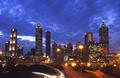
| 02/18/2003 09:26:39 PM |
Rhythm of the Nightby CoreyComment: Great night shot. I really like the colour of the sky; you picked the perfect time to do this. The long exposure of the cars gives it a nice touch. Jacko. 8 |
| Photographer found comment helpful. |
| 02/18/2003 09:25:45 PM |
Log Rhythmsby alanfreedComment: There certainly is a pattern here, however the picture looks a bit flat, mising a little ooomph. However very crisp and sharp. Jacko. |
| Photographer found comment helpful. |
| 02/18/2003 09:24:26 PM |
Hip Repetitionby lisaeComment: This pictures seems a bit too busy, in my eyes: multi colours background especially. Also the colours on the belly look over exposed (due to long shutter speed). I'm not actually sure what this represents (belly dancing?). |
| Photographer found comment helpful. |
| 02/18/2003 09:22:06 PM |
escapeby tomzinhoComment: Fits the challenge very nicely. I really like how the stairs stand out. You could try cropping out the bottom portion (people and cars), this would help keep the eyes on te stairs and the perspective. Good job. Jacko. |
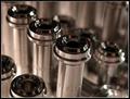
| 02/18/2003 09:19:45 PM |
Concentricby smellyfish1002Comment: I like it. I like it. Very nice controle over depth of fiels. Great sharpness of the middle (tumpet pistons?). Nice interpretation of the subject. Jacko 9 |
| Photographer found comment helpful. |
| 02/18/2003 09:18:32 PM |
Vinerowsby lennierComment: Nice subject, however the sky is really taking the show here. YOu might want to consider spot metering the ground or the poles to better expose the main subject, which should be everything under the sky. NIce idea. Jacko. 7
This can be fixed with photoshop (I tried it). I can send you a copy if you would like to see the difference (I actually convereted to sepia) . |
| Photographer found comment helpful. |
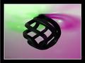
| 02/18/2003 09:10:36 PM |
Funkyby SonifoComment: Nice splash of colours, good job. I also like the placement of the subject in the middle; it works nicely here, as does the border. Good luck. Jacko. 8 |
| Photographer found comment helpful. |
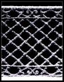
| 02/18/2003 09:08:53 PM |
Benched Snowby crabappl3Comment: Very nice patter. Great contrast black/white. Nice crop; highlights the symetry. Jacko. 8 |
| Photographer found comment helpful. |
Home -
Challenges -
Community -
League -
Photos -
Cameras -
Lenses -
Learn -
Help -
Terms of Use -
Privacy -
Top ^
DPChallenge, and website content and design, Copyright © 2001-2025 Challenging Technologies, LLC.
All digital photo copyrights belong to the photographers and may not be used without permission.
Current Server Time: 08/20/2025 02:55:42 AM EDT.