| Image |
Comment |
| 10/25/2004 10:39:37 AM |
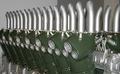
Thursty?by vasilkovayaComment: Glasses aren't truly equidistant from each other. Also, burn in the third glass so it has the same blacks and richness of the first two. Lastly, consider making their arrangement even deeper. Right now they're a bit tight and the negative space to their right is distracting and doesn't represent any element of visual language. |
 Photographer found comment helpful. Photographer found comment helpful. |
| 10/25/2004 10:37:02 AM |
Duesenburg V-16by drydocComment: Great subject. But the focus, color, lighting and contrast are all detractors from the photo. |
| Photographer found comment helpful. |
| 10/25/2004 10:35:36 AM |
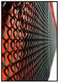
Fenceby bobdaveantComment: Deeper focus would help this photo significantly. Excellent subject matter, however. |
| Photographer found comment helpful. |
| 10/25/2004 10:33:24 AM |
|
| 10/25/2004 10:31:40 AM |
A Natural Formation of Linesby atsxusComment: Interesting photo. Well executed. But, the title is the only thing that forces us to see lines in the photo. Yes, if I try REALLY REALLY hard I can see lines in the picture. This one seems to be too much of a stretch to me. |
| 10/25/2004 06:47:48 AM |
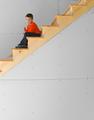
New Constructionby cloudsmeComment: The child isn't in focus. Additionally, the composition doesn't work. The large amount of negative space pulls the audience's attention AWAY not towards the center of interest. |
| 10/25/2004 06:43:43 AM |
Line of Fireby bongoComment: Wow, great idea! I just wish the photo was sharper and there was more detail in the fire. |
| Photographer found comment helpful. |
| 10/25/2004 06:39:33 AM |
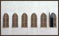
Windowsby yael27Comment: Great idea! However, this needs to be pushed to the next level. Consider reshooting and doing some of the following:
- place the open shutter at a steeper angle so we can see more of it.
- Consider shooting when the natural light is more dynamic and interesting.
- Make sure your perspective is TRULY flat. There are tiny signs of perspective shifting that hurt the photo's ultra-symmetrical composition.
- Use photoshop to increase the sharpness. Boost the saturation of certain hues (such as the brown shutters) and exaggerate the contrast. Bring out some minor hue in the wall so it isn't so boring. Burn in the residual dirt along the bottom of each window. |
| Photographer found comment helpful. |
| 10/25/2004 06:33:27 AM |
( (by JC_HomolaComment: Great photo, but where are the lines? Also, your overall exposure is too dark. It's fine to have an extreme amount of contrast, but consider studying Ansel Adams' Zone System to better understand why this photo feels "crushed." |
| 10/25/2004 06:29:43 AM |
seasons come, seasons goby ursulaComment: The photo isn't bad. However, it's composition is a bit confusing. What exactly is the area of interest that I'm supposed to focus on? The house to the lower right? The rose of houses to the lower left? Or the mountain that is hovering towards the middle of the frame? Lastly (and this is the most important part) I see NO lines in this. You haven't used composition to create the sense of lines at all. |
| Photographer found comment helpful. |
Home -
Challenges -
Community -
League -
Photos -
Cameras -
Lenses -
Learn -
Help -
Terms of Use -
Privacy -
Top ^
DPChallenge, and website content and design, Copyright © 2001-2025 Challenging Technologies, LLC.
All digital photo copyrights belong to the photographers and may not be used without permission.
Current Server Time: 12/18/2025 11:38:26 PM EST.