| Image |
Comment |
| 11/24/2004 12:48:35 AM |
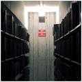
Sacred rules of the libraryby nico_blueComment: I like this one. The sole color, red, has great inpact. The composition, balanced and strong. The light is a bit too bright, and while the grain doesn't bother me, it seems over-sharpened in some places. |
 Photographer found comment helpful. Photographer found comment helpful. |
| 11/24/2004 12:46:37 AM |
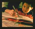
An Exercise in Defianceby yuormeComment: An interesting interpretation of the theme, but unlike many, this works. I would desire slightly more balanced lighting, the highlight onthe boy's face is a bit over-exposed. Also, the colored pencils in the foreground are a bit coars and grainy. |
| Photographer found comment helpful. |
| 11/24/2004 12:43:40 AM |
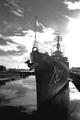
793by jjbates4Comment: The highlight on the right center is almost painfully bright. Thelines of the picture pull my eye right to the flag, but the flag is a bit indistinct. |
| 11/24/2004 12:42:17 AM |
Walking Papersby smithmaComment: The paper, which seems to be the focal point, is a little blurry, and at such a straight angle to the camera, it is very difficult to read what it says. |
| 11/24/2004 12:41:06 AM |
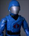
The Cobra Army's Ultimate Authorityby darbComment: A couple of small things: The crop is a little low on the helmet. The depth-of-field would be better a bit more centeredon cobra commander. It feels unbalanced with one arm clear and one really blurry. |
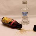
| 11/24/2004 12:39:32 AM |
ABSOLUT Authoritarianby aplomb76Comment: Focus is a bit off. For the effect, the background my be a bit too uneven. Without any sense of location or situation, the image lacks punch. |
| Photographer found comment helpful. |
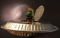
| 11/24/2004 12:37:57 AM |
From out of space... Marvin meets Ed Woodby grandmarginalComment: While I haven't gotten through all of the entries, this may well be the best shot of pie tins in this challenge. The light is a bit too bright on the front of the "ship", and too dark on marvin. It's a bit out of focus and the background would be better without the light spot. Also, a loose connection to the challenge. |
| Photographer found comment helpful. |
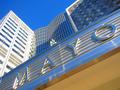
| 11/24/2004 12:36:09 AM |
medical authorityby ssenguptaComment: The converging lines of the building probably would have been interesting enough without the angle of the frame. It's a bit of a shame in an otherwise good shot the reflection on the "M" is so bright an over-exposed. |
| 11/24/2004 12:34:54 AM |
U N Flag.by H R VerryComment: It mey just be me nit-picking, but the blue flag against the blue sky leaves me focusing on the pole. Nice capture of a blowing flag. |
| Photographer found comment helpful. |
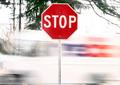
| 11/24/2004 12:33:57 AM |
Fedex! Stop!by BullpupComment: I don't really care for this one. Without an actual shot of the fedex truck, or blur entirely crossing the frame, it doesn't mesh for me. |
Home -
Challenges -
Community -
League -
Photos -
Cameras -
Lenses -
Learn -
Help -
Terms of Use -
Privacy -
Top ^
DPChallenge, and website content and design, Copyright © 2001-2025 Challenging Technologies, LLC.
All digital photo copyrights belong to the photographers and may not be used without permission.
Current Server Time: 08/21/2025 11:55:00 AM EDT.