| Image |
Comment |
| 11/24/2004 01:51:04 AM |
Squad Carby sfarrell23Comment: Nice tone, good detail. A little shift in camera angle, to get a "forward" feel would have more movement than this, where my eye goes right to the door handle. |
 Photographer found comment helpful. Photographer found comment helpful. |
| 11/24/2004 01:43:54 AM |
|
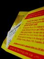
| 11/24/2004 01:43:00 AM |
To "Authority" ¢25=$25by fotodudeComment: The question: is this happenstance, or did you get a ticket just for the challenge? :P Nice, vivid colors, but the white is a litle grey. Perhaps the camera metering was a little off for this shot. |
| Photographer found comment helpful. |
| 11/24/2004 01:41:18 AM |
Matriarchby BibliophileComment: Good use of negative space. Good lighting, except for the glare on the glasses. |
| Photographer found comment helpful. |
| 11/24/2004 01:40:25 AM |
|
| 11/24/2004 01:39:43 AM |
12 Drinks Too Manyby bruskiComment: Well, if ever there was a good use of a really bad lens on an SLR, this is it. :) Cute. |
| Photographer found comment helpful. |
| 11/24/2004 01:38:36 AM |
|
| Photographer found comment helpful. |
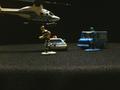
| 11/24/2004 01:37:57 AM |
On the Runby ehelgrenComment: Interesting set-up. The focal plane is way off. Too bad, it's a cute idea. |
| 11/24/2004 01:37:25 AM |
Penalty Timeby eaglebeckComment: Seems out of focus. It is very hard to make out any detail at my viewing esolution. Composition/action is no that interesting to me. Well exposed. |
| Photographer found comment helpful. |
| 11/24/2004 01:35:47 AM |
Tybee Lightby ejonesComment: The flag is competeing with the lighthouse for being a focal point. they are too close in height, and they are both sharp... If one or the other were less important, I'd like the shot more. |
Home -
Challenges -
Community -
League -
Photos -
Cameras -
Lenses -
Learn -
Help -
Terms of Use -
Privacy -
Top ^
DPChallenge, and website content and design, Copyright © 2001-2025 Challenging Technologies, LLC.
All digital photo copyrights belong to the photographers and may not be used without permission.
Current Server Time: 08/21/2025 03:40:55 PM EDT.