| Image |
Comment |
| 11/24/2004 12:04:48 PM |
Tyranny of the Pressby codauberComment: Looks out of focus. The towel as background is distracting, something smoother. For the tile, neither the statue nor the glasses is necessary and just adds too many elements. Some ege have highlights that are getting alittle our of hand, a more diffus elighting setup would help with that. The subject.... doesn't really say much to me. |
 Photographer found comment helpful. Photographer found comment helpful. |
| 11/24/2004 12:01:02 PM |
My height will never be under authorityby balaaComment: The angle is unnecesarry in this shot. It doesn't give it any more interest and takes away from the appeal. There is a near-complete lack of detail, but thelights are prettty. If horizontal, a nice night shot of city, but I don't see how this really fits the topic. |
| 11/24/2004 11:59:16 AM |
Doctor’s Orders…by basia03Comment: Technically, it seems nice. Thematicaly, it seems like a very loose connection to the topic. Laso, not sure the red really works. |
| Photographer found comment helpful. |
| 11/24/2004 11:57:20 AM |
Authorityby speaseComment: Good composition, good tones, but the one highlight to the left of "POLICE" is distracting. |
| Photographer found comment helpful. |
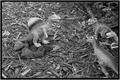
| 11/24/2004 11:54:09 AM |
Prehystoric Leaderby racerraulComment: Cute. The background is so busy against the dinosaurs it makes it a bit more interesting that the dinosaurs. A duller background (dirt or sand perhaps) and a slightly greater tonal range on the dinosaurs would enhance the shot. |
| Photographer found comment helpful. |
| 11/24/2004 11:52:29 AM |
What would my authority say to one more beer for me?by ArnarpComment: Rather gimicky, IMO. The position you've chosen is a hard one to keep sbsolutely still, revealing quite a bit of motion blur. On a compositional note, the purple flashlight seems unnecesaary. It is very contrasty and competets with the green of the beer can against the black shirt. |
| Photographer found comment helpful. |
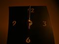
| 11/24/2004 11:50:29 AM |
The Ruler Of Allby DmaskezeComment: You've obviously chosen to have a very low-key shot. I have to say it doesn't work for me. The clock seems rather awkwardly bent, which is distracting. The basic choice of composition is good, central and balanced, but with the curve of the clock, the compoistion is lacking. |
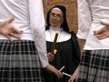
| 11/24/2004 11:48:10 AM |
We just found them here Sister... honest by ColeyComment: With a shot like this, a more central composition would be stronger. I would also question, in this instance, shooting against that wall. The nun's face is almost the exact same tone. Very nice, though. |
| Photographer found comment helpful. |
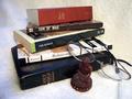
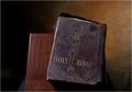
| 11/24/2004 11:46:58 AM |
Oldest of them All...by echo68phComment: The table and the (what looks like) pant leg underneath it are unnecesarry. The lighting from theleft has put too much of an edge highlight on your subject. Most of the detail around the edge of the book looks blurry, though the middle looks pretty good. |
| Photographer found comment helpful. |
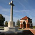
| 11/24/2004 11:44:58 AM |
Remember 1939-1945by simbambaComment: This may be too regional specific. I don't really understand the subject, or its relation to the topic. Good exposure, the whites are not blown out, and the shadow still has good detail. |
| Photographer found comment helpful. |
Home -
Challenges -
Community -
League -
Photos -
Cameras -
Lenses -
Learn -
Help -
Terms of Use -
Privacy -
Top ^
DPChallenge, and website content and design, Copyright © 2001-2025 Challenging Technologies, LLC.
All digital photo copyrights belong to the photographers and may not be used without permission.
Current Server Time: 08/21/2025 03:41:03 PM EDT.