|
|
|
Showing 211 - 220 of ~434 |
| Image |
Comment |
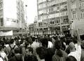
| 11/24/2004 12:54:25 PM | people vs authorityby akyrosComment: One of the best images in this challenge. You seem to have gotten a shot of authority that is unique and topical. Good tone. The title could have been a little more explicit. Although I get the general idea, I obviously missed something onthe news somewhere, because I don't know what thisis. |
| 11/24/2004 12:51:18 PM | Oh and Merry Christmas, Kidsby DustyOComment: Technically fine, the colors look good, and there are no onscene highlights. However, theangle, slight as it is, is distracting. |  Photographer found comment helpful. Photographer found comment helpful. |
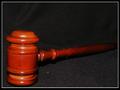
| 11/24/2004 12:50:23 PM | Lights of Justiceby DefyTimeComment: Since thelights were your subject,a tighter crop may have worked better. As it is, I'm forced to ignore half the shot which has very little detail. Crop out the bottom third. |
| 11/24/2004 12:49:10 PM | |
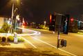
| 11/24/2004 12:48:26 PM | Running The Red-Lightby tito79_98Comment: Putting this shot onthe horizontal would be better. The angle is just distracting. Also, some shade over the lens to sut down on the lens flare would have been better. |
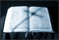
| 11/24/2004 12:45:39 PM | Moral Authority (for some)by snackwellsComment: On the plus side, you've intelligently titled your work. It is important to remember this a multi-cultural site, with many different viewpoints. You have, which makes this shot more palatable to those diferent viewpoints. It is a little soft on the text, but not processed enough to give it a "surreal" feel, going sharper, or more processed would improve, I think. Compositionally, with the shadow, I lik it. On the whole, a pretty good piece. | | Photographer found comment helpful. |
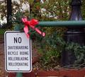
| 11/24/2004 12:41:05 PM | Keep Out!by justin_hewlettComment: The image is a bit too dark for my taste. With the signs stacked like this, I don't feel that they are blocking anything. If it had just been two, great, this, not-so-great. | | Photographer found comment helpful. |
| 11/24/2004 12:39:11 PM | The Foley's - Authority on Antiquesby Prof_FateComment: Nice environmental portrait. As is getting very common, a somewhat tenuous connection to the topic. I think ashallower depth-of-field, blurring out the busy background just a bit, would highlight the women more. | | Photographer found comment helpful. |
| 11/24/2004 12:15:50 PM | The Master's Touchby ryceComment: The slight angle is just enough to bother me, a shift back to vertical would be better. | | Photographer found comment helpful. |
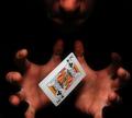
| 11/24/2004 12:14:29 PM | Psychic authorityby theodor38Comment: One of the more interesting shots in this challenge. A little tenuous on topic. Card doesn't look quite "on," maybe a faster shutter speed would capture more sharp detail(I'm assuming this was captured while you were tossing the card). Lighting is about perfect for the effect. |
|
Showing 211 - 220 of ~434 |
Home -
Challenges -
Community -
League -
Photos -
Cameras -
Lenses -
Learn -
Help -
Terms of Use -
Privacy -
Top ^
DPChallenge, and website content and design, Copyright © 2001-2025 Challenging Technologies, LLC.
All digital photo copyrights belong to the photographers and may not be used without permission.
Current Server Time: 08/21/2025 05:39:57 PM EDT.
|