| Image |
Comment |
| 12/15/2004 12:16:38 AM |
Chameleon in Yellowby hlswilsonComment: Thanks to everyone for your comments. So, why was it so orange you ask? It didn't even dawn on me until the voting was half over. My computer crashed a week before this challenge and I rebuilt it just in time to post-process my photo. What I did not do, however, was reset the gamma and the other calibration necessities on my monitor. This makes twice that calibration has caused an issue in my entries. I'm a B&W girl, so it's usually not such an issue, but I paid the price here. Once I got everything reset, I found that I needed to shift the hue about five points toward yellow to make a realistic representation of the color I used. I plan on posting a color corrected version to my portfolio later this week for those who are interested. Thanks again everyone. Heather |
| 12/08/2004 10:01:12 PM |
|
 Photographer found comment helpful. Photographer found comment helpful. |
| 12/08/2004 09:56:31 PM |
|
| Photographer found comment helpful. |
| 11/19/2004 09:58:32 PM |
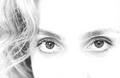
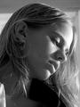
Who's looking at Whom?by bairasComment: The reflections in the eyes are a very pleasant surprise - like overhearing a secret. I think I would have cropped up just a tad to remove the slight shadow from the nose. The shallow DOF is very well used here. 8 |
| Photographer found comment helpful. |
| 11/19/2004 09:55:42 PM |
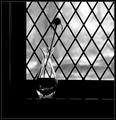
Faded Memoryby instepsComment: Very strong and compelling image. The highlights in the glass vase give it that extra punch and the distortions of the leading help break up the predictability of the pattern. Lovely! 8 |
| Photographer found comment helpful. |
| 11/19/2004 09:51:48 PM |
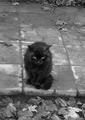
a catby dee_deeComment: I like this shot quite a bit, but I would like to have seen the top 1/4 or 1/3rd cropped. Nice contrast. 7 |
| Photographer found comment helpful. |
| 11/19/2004 09:48:16 PM |
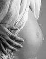
Pregnant Womenby mbojangComment: Very nice. I think a darker background would have improved the overall shot. The tones are so nice and varied on the hand but rather flat elsewhere. The darker background would have given a stronger line along her belly and improve the overall tonal quality. 7 |
| 11/19/2004 09:45:08 PM |
Rejectionby spreadcomComment: Nice composition but the shadows coming of her noise and lip detract from the image. Instead of such strong lighting, I think a darker more moody setup would fit the title of your shot much better. 5 |
| Photographer found comment helpful. |
| 11/19/2004 09:41:17 PM |
Markenby AzrifelComment: The town looks so perfect that it's bordering on surreal. Was a noise-reducing filter used on this shot? Some of the clouds look a little strange. The left side of the shot is the most interesting to me. I'd like to see it cropped to just include the left 2/3rds. |
| Photographer found comment helpful. |
| 11/19/2004 09:33:20 PM |
gallery by undieyatchComment: Wonderful use of DOF and composition. I'd love to see this in person. Although the image leads me through the shot to the door, I'm very glad you included the figure in the background as well. It gives me a sense of the overall size. Excellent work. If you haven't mentioned it in your comments, please let us know where you took this. 10 |
Home -
Challenges -
Community -
League -
Photos -
Cameras -
Lenses -
Learn -
Help -
Terms of Use -
Privacy -
Top ^
DPChallenge, and website content and design, Copyright © 2001-2026 Challenging Technologies, LLC.
All digital photo copyrights belong to the photographers and may not be used without permission.
Current Server Time: 06/30/2026 03:18:35 PM EDT.