| Image |
Comment |
| 05/07/2005 03:20:28 PM |
|
 Photographer found comment helpful. Photographer found comment helpful. |
| 05/07/2005 03:20:00 PM |
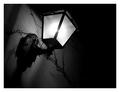
Tucked In For The Nightby ghostyComment: Prett cool, but there seems to be a little too much dead space. I would try cropping some ot the top and bottom to give it more of a panoramic feel. |
| Photographer found comment helpful. |
| 05/07/2005 03:18:03 PM |
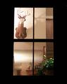
Funchalby RupertComment: Interesting separation of two very different areas. I think it would be better without the person peeking over the wall, and I would have tried not to include less of the left area, leaving out the part that is really "whited-out " (maybe cropping will do the trick?) |
| Photographer found comment helpful. |
| 05/07/2005 03:14:59 PM |
Downtownby JeileenComment: Not bad in terms of composition, but very washed out. |
| Photographer found comment helpful. |
| 05/07/2005 03:14:07 PM |
Save Pointby Dax-Comment: Cool! This is very nice. Simple yet dramatic. |
| Photographer found comment helpful. |
| 05/07/2005 03:13:17 PM |
Salah Eldin Castleby hossamComment: Very grainy, and very "square" composition. I would have tried more dramatic angles and not leaving so much empty space in the frame. |
| Photographer found comment helpful. |
| 05/07/2005 03:11:05 PM |
|
| Photographer found comment helpful. |
| 05/07/2005 03:10:19 PM |
The Motelby edwalk74Comment: Not very interesting. Technically nothing wronng, but I don't know what I'm supposed to be looking at and it doesn't really inspire any overall mood either. |
| Photographer found comment helpful. |
| 05/07/2005 03:08:55 PM |
|
| Photographer found comment helpful. |
| 05/07/2005 03:03:48 PM |
|
| Photographer found comment helpful. |
Home -
Challenges -
Community -
League -
Photos -
Cameras -
Lenses -
Learn -
Help -
Terms of Use -
Privacy -
Top ^
DPChallenge, and website content and design, Copyright © 2001-2025 Challenging Technologies, LLC.
All digital photo copyrights belong to the photographers and may not be used without permission.
Current Server Time: 08/01/2025 01:44:05 AM EDT.