| Image |
Comment |
| 10/22/2003 09:16:27 AM |
Sighby BlurryComment: The lighting on your subject is fantastic and I think you have definitely captured the mode of 'alone'. I subject's face says 'alone', so I think you could have cropped tighter and removed much of the door on the right. It's very good, but I think it has even more potential! |
 Photographer found comment helpful. Photographer found comment helpful. |
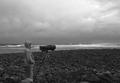
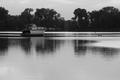
| 10/22/2003 09:03:25 AM |
The photographerby totiComment: I like this a lot, but I'll offer a couple of thoughts on the composition. The dark cloudy sky is great, but the hot spot at the top of the frame, sun behind clouds maybe, is a little distracting. A little less sky might have helped. The photographers head is 'split' by the horizon and camera lens is almost on the line formed by the dry shore meeting the wet shore. The MAY have been more dramatic with a lower perspective so the photographers head and camera rose above the horizon. I wasn't there, so none of this may have been possible |
| Photographer found comment helpful. |
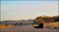
| 10/22/2003 08:49:12 AM |
One Chuck Roadby natorComment: I like this shot, but I think there is a little too much sky. You usually have the option of placing the horizon 1/3 of frame from top or bottom. Of course this guideline can be broke, but it is a good starting point. Since the depth of the road helps with the feeling of alone, I would have gone with less sky. Just some thoughts... |
| Photographer found comment helpful. |
| 10/20/2003 08:20:12 PM |
Shades of Autumn by moodvilleComment: The lighting has a very natural early morning look to it, which I like. The branch sticking out of the container appears to be out of focus or soft when compared to the container itself, which seems to take away from the overall composition. |
| Photographer found comment helpful. |
| 10/11/2003 01:05:09 PM |
Dreams of a photographer...by kosmikkreeperComment: First let me say that this is a really nice image, so take my comments as thoughts rather than negatives. The blue affect is slick, but the models shadow on the left is well defined which doesn't support the mode. I'm not sure why the camera is facing back, but that is probably just an artistic element that I'm missing, so no impact to score. I think I have some of the same photographer dreams, to bad I don't have the creativity to come through with an image like this. |
| Photographer found comment helpful. |
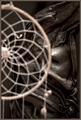
| 10/11/2003 12:57:05 PM |
Catching the Faces of my Dreamsby NatatorComment: Cool image! I like the layered afftect, but the dream catcher is a little strong when compared to the face. A little less dream catcher or a little less light on it might have helped balance the two elements better. Great concept.... |
| Photographer found comment helpful. |
| 10/11/2003 12:54:20 PM |
Ever Hit Bottom?by backslashComment: Creative interpretation of the "falling" nightmare. The motion blur adds and overexposed elements add to the dream atmosphere. I think the pattern on the back of the shirt detracts a little because it is the only red in the image and attracts too much attention. |
| Photographer found comment helpful. |
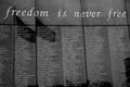
| 09/19/2003 01:58:16 PM |
Freedom is never freeby NusbaumComment: There were several lessons learned on this one:
1. Don't change your mind and submit a different image at the last minute. I decided to go with black and white 20 minutes before deadline and then submitted a working draft rather than the final image.
2. Look objectively at an image and evaluate it's impact to other viewers rather than the impact to me during the creation process. You had to be there - just doesn't work with photographs.
3. I've never liked titles on photographs and I'm not good at creating them. From now on the image will need to speak for itself.
Here is the color alternative that was abandon 20 minutes before the challenge deadline:

It's still not a great image, but probably better than the black and white draft that was submitted. |
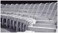
| 09/17/2003 05:48:19 PM |
Park Benchesby sahkoComment: Great repetition.
The overall composition is excellent and grabbed my attention.
The lighting is good, but something more on the back of the chairs might have bumped this up yet another notch. |
| Photographer found comment helpful. |
| 09/14/2003 03:55:07 PM |
Waiting for waterby NusbaumComment: Originally posted by tfaust:
Hate it when that happens! I might like to see this photo color... |
Here is the color version of this shot.

I thought the brilliant pink sunset became the subject rather than the "opps" that was supposed to be the subject of the shot. |
Home -
Challenges -
Community -
League -
Photos -
Cameras -
Lenses -
Learn -
Help -
Terms of Use -
Privacy -
Top ^
DPChallenge, and website content and design, Copyright © 2001-2025 Challenging Technologies, LLC.
All digital photo copyrights belong to the photographers and may not be used without permission.
Current Server Time: 08/26/2025 04:09:19 AM EDT.