| Image |
Comment |
| 09/19/2007 01:05:14 AM |
HOT SUNSETby UAE_GuyComment: someone went really overboard with saturation/contrast. composition is nice though, just wish it didn't look like the planet was melting. |
| 09/19/2007 01:03:34 AM |
The Fishermanby charmayneComment: I like it but wish he had just a bit more room under his feet, and the colors feel bit unnatural, but I'm not sure about that so I'll assume you didn't mangle them. |
 Photographer found comment helpful. Photographer found comment helpful. |
| 09/19/2007 01:02:39 AM |
Ducks in Flightby foxinsox47Comment: not sharp, not really a silhoutte, weird blotch in the corner, boring sky.
get your things in focus (unless the softness is intentional to add to the photo) then worry about the rest. |
| 09/19/2007 01:00:39 AM |
On The Farmby elpyComment: i like it, bit of a story telling element, and the repitition is nice throughout the frame. I just don't like the crop...these crops almost always feel unnatural to me. |
| Photographer found comment helpful. |
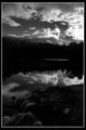
| 09/19/2007 12:59:38 AM |
Reflectby atsxusComment: this could be a nice image but it's not really a silhouette and it is either much too compressed or toned too roughly. I see where you were maybe thinking of the tree line being a silhouette but it looks blotchy. Overall the photo just looks too processed in a sloppy manner, but otherwise it's ok. |
| 09/13/2007 03:48:51 PM |
The Power and the Majesty by ShamanComment: to me, the sky looks unreal and oversaturated. I think it would have been as strong or more so without such aggressive post-processing work. |
| Photographer found comment helpful. |
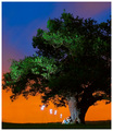
| 06/14/2007 01:06:17 PM |
The Magic Flute by AlexSaberiComment: Yeah this is one of the best things I've seen on here in awhile. What an imagination and well executed. |
| Photographer found comment helpful. |
| 04/11/2007 12:27:20 AM |
A motherly boxerby petrakkaComment: Thanks all for the comments.
I guess I should explain the angle and composition I chose because I got so many suggestions on it.
I shot down on the mother and child because standing at their level had them lost in the background (I did make photos like this)...and this was cleaner.
I shot this wide because, while I wanted to keep the subjects isolated I wanted to keep the punching bags in the frame to contribute information as to the type of the environment they were in.
I do wish that leg on the left were gone, but it was there in real life ..and so I leave it there. The moment was past when the leg was gone, so while the image could have been cleaner, the moment between mother and child was lost. Looking through the comments and looking at the photo again, it was probably too wide..but I still would want to keep the bags and background elements there.
Hope this doesn't come off as an excuse, but it's an explanation of wwhy I shot it this way. To tell a story and not so much to look as pretty...(though I did want it to look pretty).
|
| 04/10/2007 12:52:04 AM |
|
| Photographer found comment helpful. |
| 04/01/2007 12:38:36 AM |
DSC_9122.JPGby librodoComment: dude that is sweet. but the best part of this photo is, and I am not joking, I have those same exact sheets on my bed right now. Man you have good taste all around. |
| Photographer found comment helpful. |
Home -
Challenges -
Community -
League -
Photos -
Cameras -
Lenses -
Learn -
Help -
Terms of Use -
Privacy -
Top ^
DPChallenge, and website content and design, Copyright © 2001-2025 Challenging Technologies, LLC.
All digital photo copyrights belong to the photographers and may not be used without permission.
Current Server Time: 08/03/2025 12:12:27 AM EDT.