| Image |
Comment |
| 12/11/2003 02:34:59 AM |
|
| 12/11/2003 02:28:29 AM |
|
| 12/11/2003 02:26:32 AM |
Sittingby kosmikkreeperComment: very very cool. i think it might look even better if the light wasn't showing. however, like it is, it's still a very fine shot. |
| 12/11/2003 02:24:51 AM |
|
 Photographer found comment helpful. Photographer found comment helpful. |
| 12/11/2003 02:22:49 AM |
|
| 12/11/2003 02:10:41 AM |
|
| Photographer found comment helpful. |
| 12/11/2003 02:05:45 AM |
|
| 12/11/2003 02:04:57 AM |
As Simple As ...by GeneralEComment: i like the rusted looking background. one improvement would be to get rid of the glare on the first two letters. |
| Photographer found comment helpful. |
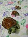
| 12/11/2003 02:03:47 AM |
Its how simple life worksby cosmofireComment: i like the angle the shot was taken from. however, the background seems to clutter the shot, and makes the subjects blend in. a solid color background would make them stand out and catch the eye more. |
| 12/11/2003 02:01:30 AM |
Thirsty?by TooCoolComment: the saturation seems to be a bit too much. everything else is very nice. |
| Photographer found comment helpful. |
Home -
Challenges -
Community -
League -
Photos -
Cameras -
Lenses -
Learn -
Help -
Terms of Use -
Privacy -
Top ^
DPChallenge, and website content and design, Copyright © 2001-2025 Challenging Technologies, LLC.
All digital photo copyrights belong to the photographers and may not be used without permission.
Current Server Time: 08/12/2025 09:06:40 AM EDT.