| Image |
Comment |
| 08/26/2002 03:25:00 AM |
Childhood For Sale!by aknComment: Nice image. Would have liked it a lot more though if the carriage had not been totally parallel with the dresser behind. All the objects are stacked against the background and the foreground is empty. I'm sure the storeowner would have let you put that carriage at an interesting angle in the foreground. Journey |
| 08/26/2002 03:29:00 AM |
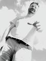
Need a hand?by KaveyComment: Cool image. Well done. Love the angle of the figure; and how it rises high above the small child. Love the blurred hand. Image seems a little washed out though in places; wonder whether you could improve that in Photoshop. Prelim: 7 Journey Update: I do not like sentimental and cute pictures and in this challenge have had more than my fill of those. This picture, however, is so very "sympathetic" (can't find a better word for it). Of all the pictures, this one symbolizes childhood most or what it OUGHT to be.: smiling, protective, secure.... I really love the blurred hand but am a little bothered by how large areas are washed out (duotoning in Photoshop could enhance this image a lot). Hence I can't give more than an 8 for a final score. Journey |
 Photographer found comment helpful. Photographer found comment helpful. |
| 08/30/2002 12:10:00 AM |
Chatting with a Friendby CreativeFlyPhotoComment: When flipping through the thumbnails, this is one of the image that pops out at me. I love the blurred background, effective cropping overall and particularly at the top of the head. Pleasing color scheme; good natural lighting. Since the image was obviously taken outdoors in natural light, there is the green color cast of the background trees. Am not saying that is desirable but here it happens to add move live to the character and image. 8 Journey |
| Photographer found comment helpful. |
| 08/26/2002 04:17:00 AM |
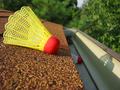
Not Again...by alanfreedComment: This brought up more memories of my own childhood and made me laugh. Would have preferred to see the badminton thingy more in the foreground. It is sharp but the foreground there is a little blurred and disturbs somewhat. Nice angles, nice composition otherwise. Fun original idea. 6 Journey |
| Photographer found comment helpful. |
| 08/26/2002 03:30:00 AM |
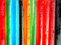
Flavor Ice!by jdincolspringsComment: Despite the wall to wall bright colors this image is very static. Not terribly exciting to look at. Sorry. Journey |
| 08/26/2002 11:56:00 PM |
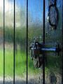
shed doorby grahamgormanComment: I'm not altogether sure how this relates to childhood? Was this shed used for playing or was it used to lock up the kids when they behaved badly? I don't know and it doesn't really matter all that much to me. It's a good image. The composition is all right; colors are beautiful. Prelim: 7 Journey Final score: 8 Journey |
| 08/26/2002 01:43:00 AM |
Always Lookin up!by justineComment: Okay, a portrait of Mickey Mouse. I don't care for the two white shapes in the bottom corners (probably his hands); it takes your eye right out of the picture frame. This image doesn't do much for me but that is very much my personal taste. Journey |
| 08/26/2002 02:30:00 AM |
untitledby johnny_justjohnnyComment: What my eye sees above all are those white squiggly things and I have no idea what they are or what they are meant to convey. I like the low angle of this image to transport the viewer into the world of thesmall child. Also suppose the image is so blurred to convey the feelings of confusion and anxiety of the child going to the doctor. Yet, the blurriness is overdone for my taste. Prelim: 6 Journey |
| 08/29/2002 03:02:00 AM |
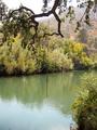
Swimming Holeby bobgaitherComment: This is a nice image. Sure wish I had had such a swimming hole available to me in my childhood. Colors are beautiful. The rope is great but unfortunately it is right bang in the middle. It would have been nice to see it pushed out but you may have lost those lovely orange-brown hills in the background. This image seems meant to convey a sense of tranquillity. It doesn't quite do that for me and it is because I sense some "busy-ness" in all the greens of the top branch and all the shrubs. Seems the result from oversharpening?????? 7 Journey |
| 08/26/2002 02:38:00 AM |
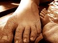
Footsby seby20Comment: It was my understanding that children shouldn't appear in the submission.? This is a nice image though and I like the sepia toning. The emphasis seems to be though on the foot of the mother. If I wanted to be a stickler about it I would say this conveys motherhood more than childhood. 6 Journey |
Home -
Challenges -
Community -
League -
Photos -
Cameras -
Lenses -
Learn -
Help -
Terms of Use -
Privacy -
Top ^
DPChallenge, and website content and design, Copyright © 2001-2025 Challenging Technologies, LLC.
All digital photo copyrights belong to the photographers and may not be used without permission.
Current Server Time: 08/23/2025 11:21:53 AM EDT.