| Image |
Comment |
| 04/26/2005 02:05:33 PM |
The Crossingby thsullivComment: good subject, pretty good lighting (no odd shadows or blow-outs) Image doesn't appear to be as sharp as maybe possible. Good luck |
| 04/26/2005 02:02:33 PM |
Beheadedby BlackDotComment: ouch, a good image hurt by some probably easy to fix items. Black line above rose, spot in front of rose to right smudge or something on left edge and below scissors handle, dull colors. If you can fix this you would probably have a nice print but not challenge worth due to the edits. |
 Photographer found comment helpful. Photographer found comment helpful. |
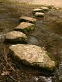
| 04/26/2005 02:00:44 PM |
Quartz among the stonesby AlanBesComment: Appears blurry and lacks color and substance. Perhaps a more colorful rock or some lighting tricks may have helped.
I have to edit my submission...your colors look better on my work monitor than my home monitor...guess I need to get one of them adjusted. Message edited by author 2005-04-27 15:54:37. |
| Photographer found comment helpful. |
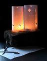
| 04/26/2005 01:59:39 PM |
Making Luminariesby dragonladyComment: finally something with a little imagination and setup to it. the only thing I really find distracting has probably been mentioned...the small silver thing (candle?) under the rock on the left in the back. Nice arrangement of objects...good luck. |
| Photographer found comment helpful. |
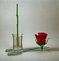
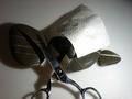
| 04/26/2005 01:58:04 PM |
Ready for the vaseby ShamanComment: I think you had something here but have some minor faults. That black thing behind the flowers kind of distracts and seems a little out of place. The scissors and flowers seem to be well placed but your colors are very muted. Not sure if it was to hide the fakeness of the flowers or just not set correctly. I think I would have liked this a lot with those minor changes. Good luck |
| Photographer found comment helpful. |
| 04/26/2005 01:55:18 PM |
|
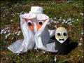
| 04/26/2005 01:54:22 PM |
Spring Weddingby glad2badadComment: creative and you apparently took some time to do it instead of just throwing the three together, colors are clear and good although the tux gets lost some in the ground. Wonder if you could have gotten a lower more direct angle? Good luck |
| Photographer found comment helpful. |
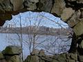
| 04/26/2005 01:52:04 PM |
Over the river and through the rock....by Jamie2772Comment: Now that's looking outside the box...or whatever that is. You've made something different than the norm submission. I like the idea since you didn't encompass the entire archway but didn't cut too much out either. Your colors seem a little muted but overall a creative idea. Good luck |
| Photographer found comment helpful. |
| 04/26/2005 01:50:16 PM |
Rock Winsby JacksonComment: the trees shadows have hurt your image maybe a different angle or time of day would help. While it is a little more creative than most on here I still don't feel it has much to it. |
| Photographer found comment helpful. |
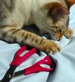
| 04/26/2005 01:48:25 PM |
Playing in the nightby sadloverComment: Without your title I was originally thinking this was too dark but is probably perfect given its title. I have found this challenge hard to judge because you have to make an interesting picture out of pretty boring items and it take a lot of creativity and imagination (which is why I did not submit) but I feel your image is too familiar and could be grouped with many others in the challenge. Setup wise I think you did pretty good, little blow out on the paper and blur on the scissors. Good luck |
Home -
Challenges -
Community -
League -
Photos -
Cameras -
Lenses -
Learn -
Help -
Terms of Use -
Privacy -
Top ^
DPChallenge, and website content and design, Copyright © 2001-2025 Challenging Technologies, LLC.
All digital photo copyrights belong to the photographers and may not be used without permission.
Current Server Time: 06/06/2025 07:33:37 PM EDT.