| Image |
Comment |
| 06/23/2005 12:49:08 PM |
Padlockby danderson107Comment: Fites Topic 5
I like the colors (tones), seems a little overexposed right on the lock but helps add to the metal theme. 1
Wonderful unique angle 1
DOF 1
Good luck |
 Photographer found comment helpful. Photographer found comment helpful. |
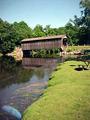
| 06/23/2005 11:16:55 AM |
Land's Edgeby KellilooComment: I know the camera your using isn't the greatest quality but you should still be able to benefit from it. This is a great capture but I would try a couple things.
I like your angle on the bridge and you didn't center it up and down, thats a good thing. The image is blurry but that could be from compressing it to get it loaded. If you can (not sure what software you have access too) use some Unsharpen Mask (USM) after you resize the image, start small and increase as needed.
Next check your surroundings, the picnic table is a distraction, while I know you couldn't really go into the water or maybe even move the table in this case but it is something to watch for in future shots. Not sure what the bright blue thing is in the water to the left, maybe a rock but seems more like reflection, again your position may have prevented this but maybe you can remove them both with post processing cloning.
I'm not sure if your camera will take filters and your colors really do seem ok but you may look into a Circluar Polarizer to help cut glare and reflections and enhance your sky even more.
Good luck, keep submitting even if you can't enter contest yet. You have a good eye, just minor things. |
| Photographer found comment helpful. |
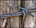
| 06/22/2005 07:38:28 AM |
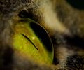
Lone Barbby mmenardComment: great shot. love the closeness of it. Good tones...good luck. |
| Photographer found comment helpful. |
| 06/22/2005 07:35:47 AM |
|
| 06/15/2005 07:59:20 AM |
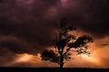
Sleep Well Mighty Giantby sabphotoComment: Thank you everyone for the comments and votes, I know I didn't ribbon but this is my highest ranking and placing image yet. I'm not sure if I'm getting better or you all are slipping...lol kidding. I had originally shot this as a silhouette with a much better sky, but thought that maybe there would be too many similar shots and I wanted more detail that I just couldn't seem to get with a fill flash (kept getting the grass only) so I did post processing which I'm not that great at but am learning.
Thank you again for everyones comments and votes, I'm hoping this doesn't stay my highest rated for long. :)
Scott
|
| 06/14/2005 04:20:04 PM |
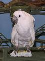
rockyby speaseComment: Hey this looks like my old bird, is this a Moluccan? I had to get rid of mine due to the squealing he used to do...drove me INSANE! I think a little more depth of field would make the background less obtrusive but still a good sharp image. Good luck. |
| 06/06/2005 03:57:58 PM |
Windowsby typologicComment: just have to say WOW, AMAZING, BEAUTIFUL. Sorry I can't vote, you'd get an 11. |
| Photographer found comment helpful. |
| 06/03/2005 07:58:14 AM |
And The Heavens Opened...by DamianComment: totally cool image. Glad you went landscape and not portrait with the layout. Wish there had been a little more light at the top left of the tree but I know you didn't have control over that. Great capture and good luck. |
| Photographer found comment helpful. |
| 06/03/2005 07:54:52 AM |
Passing Throughby RKTComment: wonderful infared image. Love the noise level and the simple black frame (I love b/w in a silver frame with b/w matting personnally). Good luck on the challenge. |
| Photographer found comment helpful. |
| 06/03/2005 07:52:52 AM |
|
| Photographer found comment helpful. |
Home -
Challenges -
Community -
League -
Photos -
Cameras -
Lenses -
Learn -
Help -
Terms of Use -
Privacy -
Top ^
DPChallenge, and website content and design, Copyright © 2001-2025 Challenging Technologies, LLC.
All digital photo copyrights belong to the photographers and may not be used without permission.
Current Server Time: 06/08/2025 05:30:46 AM EDT.