| Image |
Comment |
| 04/16/2006 12:10:07 PM |
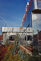
BAR BUTLERby corrieComment: Fits challenge=5
Color/lighting=0
DOF/focus=0
Wow factor/uniqueness=0
Attractiveness=1
cool object. I feel the lighting at the top could have probably been a little better so that more of that was visable, the darks seem to be too dark (if that's possible). Also, maybe cropped it a little different to avoid cutting off the top, hose and bottom with the border. If more of the bottom and maybe hose section had been cropped it would probably be fine but the little bit makes it appear that you could careless or just didn't take the time. I feel the top really needs the entire part in it. |
| 04/16/2006 11:54:50 AM |
the Diner on 55thby tateComment: Fits challenge=5
Color/lighting=1
DOF/focus=1
Wow factor/uniqueness=0
Attractiveness=1
I like this, it has color varities, depth and the chrome is great. The colors feel a little flat but I am on an uncalibrated monitor so it could just be it. |
 Photographer found comment helpful. Photographer found comment helpful. |
| 04/12/2006 07:55:44 AM |
|
| Photographer found comment helpful. |
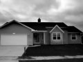
| 04/11/2006 04:11:29 PM |
My house!by ladyhawk22Comment: congratulations! wonderful feeling isnt' it. We are on year number 2 of our first house (new built too), I hope you have better luck with your builder than ours as we are just now finding stuff that of course happened AFTER the 1 year warranty is up...still like to know how they get everything to last till just past that one year mark then all heck break loose...and don't even get me started on the non warranty landscaping lol.
Again congratulations, enjoy!!!!
p.s. I'm only a couple hours away, when's the house warming party? ;) |
| Photographer found comment helpful. |
| 03/29/2006 07:35:32 AM |
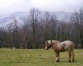
Horseby sabphotoComment: Originally posted by Jutilda:
Love the position of the horse in the frame. This might be really cool with a dark sepia or black and white as well!! ;~D |
cool idea, I'll have to try it. I did try to go with a gothic glow but just couldn't get it right.
Thanks for looking and commenting. |
| 03/28/2006 10:18:21 AM |
|
| Photographer found comment helpful. |
| 03/21/2006 10:14:58 AM |
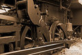
Train sepiaby sabphotoComment: I didn't realize when posting for the print option that it would put it this small, if you go to the DPC prints page (Train wheels print)it is bigger. Sorry about that. Message edited by author 2006-03-21 10:19:50. |
| 03/13/2006 07:46:32 AM |
|
| Photographer found comment helpful. |
| 03/08/2006 02:31:49 AM |
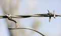
Vine mimics a barb on barbed wireby pointandshootComment: I just briely looked at the images and this is the only one that really shows what the description says AND you got it in a great shot too. The lighting is great, DOF perfect and you put the vine's in the picture so that the viewers eye followed it. Nicely done. |
| Photographer found comment helpful. |
| 02/07/2006 04:31:18 PM |
AshleyBrenna_Original.gifby dagills22191Comment: since this is the original I will comment on it. First off...I am in no way representing myself as a pro so what I say is just my opinion of what I would try to watch.
Your depth of field seems good, you can see the background but it really isn't distracting, maybe a little more blur would be nice but not too much...very fine line there.
Your framing of the two seems right on! While some of Brenna's (the little girl?) hair is cut off it is not an issue in my book.
Colors seem good and lighting is even, there are no harsh shadows that I can see.
The only thing I really see and it caught me right off the bat but is really a picky thing for me...the little girl's outfit appears to have ridden up and covering her face some. This caused a weird crop on her chin but like I said, it is just a picky thing for me and may not be an issue at all with the subjects. I would also be picky about the little ones hair, it is kind of flighty on top and she has a few bumps that could have maybe been flattened.
How are you coverting to b/w. I would research for the tutorial about converting using channel adjustments if you aren't doing that already. Seems like it could use some darkening in places is why I mentioned it.
Overall a really nice photo that looks good in color as well as b/w. Good job and good luck with the bizz. |
| Photographer found comment helpful. |
Home -
Challenges -
Community -
League -
Photos -
Cameras -
Lenses -
Learn -
Help -
Terms of Use -
Privacy -
Top ^
DPChallenge, and website content and design, Copyright © 2001-2025 Challenging Technologies, LLC.
All digital photo copyrights belong to the photographers and may not be used without permission.
Current Server Time: 06/10/2025 12:44:05 AM EDT.