| Image |
Comment |
| 04/16/2006 12:41:59 PM |
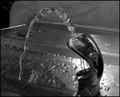
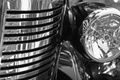
Industrial Poresby kaileComment: Fits challenge=4
Color/lighting=1
DOF/focus=1
Wow factor/uniqueness=1
Attractiveness=1
Interesting angle and DOF but it doesn't say chrome to me. While some of it is shiney and bright it just seems like something black that is over exposed in areas. This is of course my opinion only and should be taken with a grain of salt as the rest of the image is nice and pleasant to look at as a whole. |
| 04/16/2006 12:38:11 PM |
Frozen Beverageby spistoleComment: Fits challenge=5
Color/lighting=0
DOF/focus=1
Wow factor/uniqueness=0
Attractiveness=1
While there is a part of the darkness of this image I really like I just can't help but think it would do better nice and bright. Since the first thought most think of when you mention chrome is shiney and refective adding some more light, even in post processing would help out a lot. |
 Photographer found comment helpful. Photographer found comment helpful. |
| 04/16/2006 12:36:27 PM |
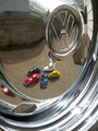
"Reflection From The Past"by f-Stop1Comment: Fits challenge=5
Color/lighting=1
DOF/focus=0
Wow factor/uniqueness=0
Attractiveness=1
I like the idea of this but think the VW symbol could be much sharper, maybe some post processing USM would help. I also feel the house reflections are distracting and hurts your image a bit. The little bit of color you have really helps draw the eyes to the middle of the image but is subtle enough to let them look around and see the entire image. Good job. |
| Photographer found comment helpful. |
| 04/16/2006 12:33:15 PM |
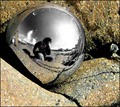
washed ashoreby xtineComment: Fits challenge=5
Color/lighting=1
DOF/focus=1
Wow factor/uniqueness=2
Attractiveness=1
It took me a minute to realize that you desaturated all the blue to get the sky like that...very cool. I do wonder if the entire image would look as good b/w like that. My first impression was also wishing you had stood back some and used a telephoto to minimize your presence in the ball but the more I look at it the more I like it this way. I really feels like your title states, it just washed ashore and you are investigating it. Give a kind of alien feel to it. Very nicely done. |
| Photographer found comment helpful. |
| 04/16/2006 12:27:48 PM |
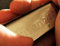
Harmonicaby outlandComment: Fits challenge=5
Color/lighting=0
DOF/focus=1
Wow factor/uniqueness=0
Attractiveness=1
I realize that you're probably holding it as it would be played but I almost wonder if it would be more interesting with the words turned around...maybe not. I also wonder if you could take some red out (or add blue) to take it from the goldish tone back to the chrome that most are looking for. Still a very nice image with lots of detail. |
| Photographer found comment helpful. |
| 04/16/2006 12:24:43 PM |
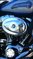
Chromaholicby strickerblue21Comment: Fits challenge=5
Color/lighting=1
DOF/focus=0
Wow factor/uniqueness=2
Attractiveness=1
I think a different DOF would have been better so that everyhing could be kept in sharp focus. I like the lack of colors and your angle of attack is wonderful. |
| Photographer found comment helpful. |
| 04/16/2006 12:22:46 PM |
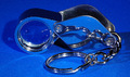
Chrome Catch by TransitComment: Fits challenge=5
Color/lighting=1
DOF/focus=1
Wow factor/uniqueness=2
Attractiveness=1
WOW. Love this image. So simple and clean. The hook looks like it could use a little sharpening but not too much. Outstanding job. |
| Photographer found comment helpful. |
| 04/16/2006 12:21:13 PM |
A Man and His Harleyby timfythetooComment: Fits challenge=5
Color/lighting=1
DOF/focus=1
Wow factor/uniqueness=0
Attractiveness=1
Nicely executed. I like how you can see just enough of the man to show his "Harley Man" style. You probably could have cropped out the tank and still got a really nice image and would have avoided the slight distracting reflections there. |
| Photographer found comment helpful. |
| 04/16/2006 12:17:51 PM |
ChromiumBluby lenox114Comment: Fits challenge=5
Color/lighting=1
DOF/focus=1
Wow factor/uniqueness=0
Attractiveness=1
What is this thing? You'd have a ten if the vote depended on how long I looked at it lol. I like the blue with the chrome as it adds so much and refects well. The settings are perfect to get the twinkle and also add to it. |
| 04/16/2006 12:12:29 PM |
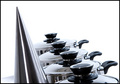
The Monolithby andriComment: Fits challenge=5
Color/lighting=1
DOF/focus=1
Wow factor/uniqueness=1
Attractiveness=0
I like the image a lot but feel that it would have been better with just the pots and lids. I find the thing on the left very distracting. I think you had a good object but went just a little too far with it. I like the placement colors and even simple border but can't get past the thing on the left. |
| Photographer found comment helpful. |
Home -
Challenges -
Community -
League -
Photos -
Cameras -
Lenses -
Learn -
Help -
Terms of Use -
Privacy -
Top ^
DPChallenge, and website content and design, Copyright © 2001-2025 Challenging Technologies, LLC.
All digital photo copyrights belong to the photographers and may not be used without permission.
Current Server Time: 06/10/2025 05:58:54 PM EDT.