| Image |
Comment |
| 04/17/2006 01:35:16 PM |
Chrome Logoby TullyComment: Fits challenge=5
Color/lighting=1
DOF/focus=1
Wow factor/uniqueness=1
Attractiveness=1
Cool! I like the placement and idea but have a few suggestions. You can see water spots in the logo, maybe could be dried more to get it cleaner. I wonder what it would look like if you desaturate the blue only and make the chrome really pop while still keeping the other colors...just a thought, already a cool image. |
 Photographer found comment helpful. Photographer found comment helpful. |
| 04/17/2006 01:34:25 PM |
"untitled 11175" 01.45hrs CHby renefunkComment: Fits challenge=5
Color/lighting=1
DOF/focus=1
Wow factor/uniqueness=1
Attractiveness=1
wow this one's seen some rough times (pun on purpose) huh. Nicely done. I like the subtle hints of color (I wonder if you could desat the green to make it only have the red). Image is slightly smaller than the normal submission but not on a scale that hurts it really. |
| Photographer found comment helpful. |
| 04/17/2006 01:33:45 PM |
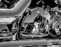
Alignedby TimyComment: Fits challenge=5
Color/lighting=1
DOF/focus=1
Wow factor/uniqueness=0
Attractiveness=0
I like small amount of color and your depth of field is nice.
I don't mark down for it but I do think I should mention that you may have a problem with compression. To the right of the subject you can see color bleeding and jpg artifacts. I usually check my monitor if I see a lot of these but your's is the first image I've found it on. If you compressed too much to fit the submission requirements this will happen. You may only be able to see it if you crank up your brightness or contrast on your monitor. It doesn't hurt the main subject but can detour from the quality of it.
edit 17Apr...took another look at your image, while I do see the jpg noise or artifacts I think the red color banding I saw may just be reflections so it may not be as serious a problem as I had thought. |
| 04/16/2006 03:09:11 PM |
Antique Toaster - Salt & Pepperby ladpupmoeComment: Fits challenge=5
Color/lighting=1
DOF/focus=1
Wow factor/uniqueness=0
Attractiveness=1
I think even though the toster is chrome too, you have put too much into the image. I think a single colored base and background (maybe black) with the right lighting would really make the shakers show their detail. I notice some blue coming through some of them, maybe a light behind them making that more apparent would have added that little bit of extra it needs. |
| 04/16/2006 03:06:35 PM |
Untitledby OriontjComment: Fits challenge=5
Color/lighting=0
DOF/focus=1
Wow factor/uniqueness=0
Attractiveness=0
I think you could have done a couple simple things to avoid this looking like a traditional snap shot... Get rid of some of your brightness, if you can't move the bike to another location then maybe find a way to shield it, your chrome is blown out to the point of being a distraction. I think the rim itself would have been more interesting shot at the right angle.
Your colors are a little plain and dull, see if you can adjust the curves a little or maybe your brightness and contrast to make this image stand out more.
While your image isn't really too small, it is well below the recommended submission sizes so you had room to grow. Try and use the full size allowed
to maybe give more to look at or at least a larger image to appreciate.
Hope this helps. |
| Photographer found comment helpful. |
| 04/16/2006 03:00:52 PM |
Chrome Vanadiumby timwest167Comment: Fits challenge=5
Color/lighting=1
DOF/focus=1
Wow factor/uniqueness=0
Attractiveness=1
Someone got a new set of tools...or did you take them back after the shoot? lol. So nice and shiny, the black background really adds punch to it. |
| 04/16/2006 02:56:02 PM |
Dualityby neophyteComment: Fits challenge=5
Color/lighting=2
DOF/focus=1
Wow factor/uniqueness=1
Attractiveness=1
BAM! That was my first thought when I opened this because it just jumped out at me and made me want to look at and around it. There are a few other reflections similar but they do not compare at all. Nicely done, sorry the scale only goes to 10. |
| Photographer found comment helpful. |
| 04/16/2006 02:54:14 PM |
Crystal Shadowby KaupsComment: Fits challenge=5
Color/lighting=1
DOF/focus=1
Wow factor/uniqueness=0
Attractiveness=0 |
| 04/16/2006 02:52:52 PM |
Black Chromeby ralfwComment: Fits challenge=5
Color/lighting=1
DOF/focus=1
Wow factor/uniqueness=1
Attractiveness=1
Nice unique idea. I like the black and red aspect of it. would like the stings to be a little sharper especially at the tuning wrench location but still a nice image. |
| Photographer found comment helpful. |
| 04/16/2006 02:52:50 PM |
domestic robotby ZILAComment: Fits challenge=5
Color/lighting=1
DOF/focus=1
Wow factor/uniqueness=1
Attractiveness=1
Very unique image. Nicely executed too. I could be a little picky and say that your angle of attack caused the two front extensions (legs) to not be level but not a big deal. I like the colors in the background too. Good job. |
Home -
Challenges -
Community -
League -
Photos -
Cameras -
Lenses -
Learn -
Help -
Terms of Use -
Privacy -
Top ^
DPChallenge, and website content and design, Copyright © 2001-2025 Challenging Technologies, LLC.
All digital photo copyrights belong to the photographers and may not be used without permission.
Current Server Time: 06/12/2025 04:35:48 AM EDT.