|
|
| Image |
Comment |
| 01/30/2018 12:55:16 PM | St. Andrews church and cemetery by RulerZigzagComment: Hello from the critique club
An appealing image that contributes to the challenge brief well
Your composition works well with nice framing from the tree. The low viewpoint emphasises the near headstone nicely but the downside is that it exaggerates the converging verticals of everything else, the spire of the church is fine but everything else rather feels as though its falling backwards. All the colours are nicely saturated and warm looking, a pleasing image Anton, well done. |
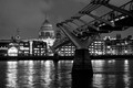
| 01/30/2018 12:48:10 PM | Bridge to the Cathedralby darnokComment: Hello from the critique club
An appealing image that contributes to the challenge brief well
This is a lovely nightime shot of an iconic scene. The composition is pretty much determined by the nature of the scene in front of you though to be honest, I think I would have preferred St. Pauls to be further to the left with more of the cityscape under the bridge to the right, I would probably have cropped it just to the right of the church tower. I like your mono processing you have a lovely range of rich tones with good contrasts, nice. You have given the camera sufficient support everything is very nicely sharp, all in all a nice result, well done Konrad |
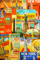
| 01/23/2018 03:07:20 PM | New York Guide in a single sheet of paperby clickodakComment: Hello from the critique club
An interesting image that contributes to the challenge
Its a striking, colourful poster you've found here Marcel, there is plenty of interesting detail there. However, in terms of the challenge brief it is hard to identify this as a single sheet of paper, because you have chosen to shoot it full on there is nothing to act as a reference, it could easily be a sheet metal plate. In order to fulfil the brief you would have been better to either screw it up so that creases were clearly evident or to shoot it from an angle where we could see the edges of the poster |  Photographer found comment helpful. Photographer found comment helpful. |
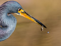
| 01/23/2018 03:00:36 PM | Mine.......by PhocalComment: Hello from the critique club
An appealing image that contributes well to the open challenge
Ooh you little tinker, you threw me there, I thought whose this Phocal, it looks like serious competition to Ronnie�! Who else could it be, it has all your hallmarks of a quality image except as you have already identified for yourself all of which I agree with, sharpness in the beak and prey that would have resulted from a smaller aperture would have made this a winner. | | Photographer found comment helpful. |
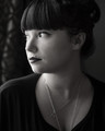
| 01/20/2018 05:10:39 PM | The Window and Her Soulby ColeyComment: Hello from the critique club
An appealing image that contributes well to the challenge
I like your lovely natural light mono portrait Cole, it is very accomplished. However, I also have reservations about the right eye, it looks unnatural because there is by contrast too much light falling on her iris, it is too bleached which unfortunately is often associated with the look of visual impairment or blindness. It's such a shame because the rest of the portrait works really well and although its such a seemingly minor fault it has a significant impact on the end result. The high score and placement serves to confirm what a strong image the rest of it is, well done. |
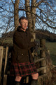
| 01/20/2018 04:59:49 PM | The Scottish Wayby PangurbanComment: Hello from the critique club
An image that contributes to the challenge
Your portrait fulfils the challenge brief in that it has been taken in natural light, there are however, a few things that I may suggest as potential improvements. There is a lot of distracting background that competes with the main subject as a result of the chosen aperture which has given you too much DOF. Most good portraits isolate the model from the background through use of (often) maximum aperture, sufficient distance between the subject and the background and by moving in closer to also reduce DOF. The composition is very central, use of thirds would greatly improve impact and also use of landscape orientation would enable you to make more use of the scene to add impact to the end result. I can see that you would want to include his kilt so a cropped composition just above the hem line and just above his head with landscape orientation with him to the left hrizontal third would have greatly improved the impact. Hope this helps a little Ellie, keep at it... | | Photographer found comment helpful. |
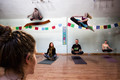
| 01/17/2018 05:42:11 PM | Still can't levitate or sparklefart...*sigh*by snafflesComment: Hello from the critique club
A fun image that contributes well to the challenge
Oh Susan, you can't levitate or sparklefart? I thought everyone could do that� A great image most amusing, I like the way you've included Alisha from behind, and your envious look up towards Meghann and her self-propelled flight of delight. Keep at it you'll soon be sparkling with the best of 'em... | | Photographer found comment helpful. |
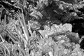
| 01/17/2018 05:34:32 PM | Iced Gemsby PangurbanComment: Hello from the critique club
An image that contributes to the challenge
The way the ice encapsulates the leaves like this is amazing sin't it, I recall a similar experience in Iceland some years ago. To be honest, I think there is rather too much going on here, there is no focal point, I think you would have been better to isolate a smaller part of the image in a macro to emphasis that encapsulation. Also, you remark about your ISO but to be honest with such a small aperture you couldn't have gone too much lower anyway. I always try to avoid using such small apertures to avoid the high ISOs compensation necessary to produce a shake-free image. | | Photographer found comment helpful. |
| 01/17/2018 05:27:54 PM | Fireworksby clickodakComment: Hello from the critique club
An image that contributes to the challenge well
Nice one Marcel, I like it. My first words as I was scrolling down the image �oh, I like that�, this is a lovely abstract and very fitting for the challenge. Your composition is good using the corner to anchor the cascades of the flower and yes, I can see your 'fireworks' connection. I also like the lighting and the processing, it all hangs together well. Good seeing and execution Marcel, well done. | | Photographer found comment helpful. |
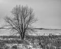
| 01/11/2018 02:33:58 PM | A morning at -27 degree Celsiusby clickodakComment: Hello from the critique club
An image that contributes to the challenge
Ah, the things that have to be done for the sake of our art! It is perhaps understandable given the freezing conditions, that you didn't make more of the scene in front of you even though it is, to be honest, quite an uninspiring vista you have chosen. This country scene is having to do battle with the man-made horizon of the distant city on the left. So, I think a square crop of the right just to the left of the twin trunks makes for a more harmonious image. The other big problem is the lack of contrast, it lacks the impact that could have revitalised it to some extent with whiter snow and darker tree and grasses. If you were to use such a crop the distant vertical structure would need removing too. Never mind Marcel better luck next time... | | Photographer found comment helpful. |
Home -
Challenges -
Community -
League -
Photos -
Cameras -
Lenses -
Learn -
Help -
Terms of Use -
Privacy -
Top ^
DPChallenge, and website content and design, Copyright © 2001-2025 Challenging Technologies, LLC.
All digital photo copyrights belong to the photographers and may not be used without permission.
Current Server Time: 08/27/2025 02:33:41 AM EDT.
|