| Image |
Comment |
| 10/28/2004 12:56:14 PM |
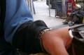
empty cupby clictacameraComment: The photo seems a bit distracting.
Also, with the front left being quite OOF it doesn't make any impact on me. |
 Photographer found comment helpful. Photographer found comment helpful. |
| 10/28/2004 12:54:54 PM |
|
| Photographer found comment helpful. |
| 10/28/2004 12:52:54 PM |
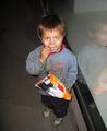
Dry and Impoverishedby neehaiComment: Lovely photo and nice contrasts in the black and white.
A nice way to convey poverty - different to most of the pics I've seen so far. |
| 10/28/2004 12:50:05 PM |
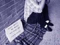
Photographic Poverty?by SteveJComment: :) LOL. Nice idea, but I am really missing seeing the person's head. My eyes are just led that way and then - nothing! |
| Photographer found comment helpful. |
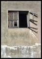
| 10/28/2004 12:48:15 PM |
Windowlessby yael27Comment: For some reason this photo seems a bit unbalanced to me . . .
Also seems a little bright . . .
Good idea though, well done. |
| Photographer found comment helpful. |
| 10/28/2004 12:44:50 PM |
Poverty Isby DianaComment: It's not a bad idea for this challenge, but could have been executed a bit better. Seems a bit much like a happy snap to me. |
| Photographer found comment helpful. |
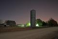
| 10/28/2004 12:43:38 PM |
Tired Farmby billmortonComment: Lovely sky in this photo! Maybe a little too much road showing for my tastes, but that's just my opinion. |
| Photographer found comment helpful. |
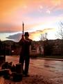
| 10/28/2004 12:42:22 PM |
Old manby nickstyleComment: There are some beautiful colours in this photo and the lighting is quite nice. Seems a little out of focus in the front? |
| 10/27/2004 03:01:41 PM |
|
| 09/03/2004 12:49:33 PM |
Roughby flip89Comment: Critique Club Comment
Composition: While this photo has a nice tight crop, the attention is very focused on the model's armpit! It almost seems as though the model is struggling to get his face into the photo, perhaps because of the strong line of his arm and the shadows. Maybe a different angle of the same pose could have worked better.
Lighting: There is not too much variation in tones in this B&W. The shadows are fantastic in this photo though and the darkness around the model's eyes is striking. The esp. shiny spot on the model's nose is distracting to me, but maybe I am just being picky! No one else seems to have noticed it judging from your comments.
Focus: There could have been a sharper focus on the model's face as it seems that the sharpest point on this photo are his hairs! His neck also seems to be especially in focus.
Overall Impression : The contrasts between shadow and light are very effective in this shot and overall I think it is a nice photo but with a few touch ups could have had more of a 'wow' factor. |
Home -
Challenges -
Community -
League -
Photos -
Cameras -
Lenses -
Learn -
Help -
Terms of Use -
Privacy -
Top ^
DPChallenge, and website content and design, Copyright © 2001-2025 Challenging Technologies, LLC.
All digital photo copyrights belong to the photographers and may not be used without permission.
Current Server Time: 08/15/2025 09:38:26 PM EDT.