| Image |
Comment |
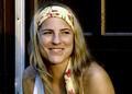
| 10/11/2004 03:11:40 PM |
Cool 'Do, Great Eyes.by dsa157Comment: If this shirt had no dots, this image would be perfect. The dots are quite distracting, though, in such a pure composition. |
 Photographer found comment helpful. Photographer found comment helpful. |
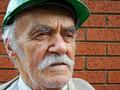
| 10/11/2004 03:09:11 PM |
Mr. Mischieviousby JesuispeureComment: Great shot, except for the focus being on the hat instead of the eyes. You might also think about using software to whiten his teeth a tiny bit. Pure white teeth are scary, in my opinion, but since the rest of the composition is in blues and greens, the slightly orange tint on his teeth really stands out. |
| Photographer found comment helpful. |
| 10/11/2004 03:05:58 PM |
Playfulby TranquilComment: This is a good shot. To be picky, I'd say that the sameshot, but with the eyes a bit wider, the feet still, and the horizon level would be perfect. Good composition and concept. The white balance looks a bit too blue, but that can be forgiven because of all the blue in the shot, which would give a blue cast with film as well. |
| Photographer found comment helpful. |
| 10/11/2004 03:02:58 PM |
Stabbing Glareby JPRComment: I'm afraid the crotch seams in his pants are more striking than his glare. Maybe some more grass in the foreground could have camoflaged his lower body a bit better? The bunch in the back of his jacket also makes him look a bit hunchbacked. Perhaps sitting a bit more upright with the camera at a slightly lower angle would have resolved both issues. |
| Photographer found comment helpful. |
| 10/11/2004 01:22:03 PM |
her glow...by melongrindComment: This image is great, but that bright silver metal has to go. It looks like it would be easy to clone out. |
| Photographer found comment helpful. |
| 10/11/2004 01:18:49 PM |
|
| 10/11/2004 01:07:56 PM |
Mr Baldyheadby johnmComment: This looks like an ad for Dockers. Was that intentional? |
| Photographer found comment helpful. |
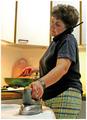
| 10/11/2004 01:06:57 PM |
Mother: Multi-Taskingby JinjitComment: Great idea, but there's not enoug tension in the ironing hand. It doesn't look like she's actually gripping the iron, so it loses some realism. Otherwise, this shot is great. It's hard to do a casual shot like this without having it look like a snapshot, you did a great job with the lighting and composition to take this photo beyond that level. |
| Photographer found comment helpful. |
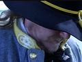
| 10/11/2004 01:03:26 PM |
An Officer and a Gentlemanby drydocComment: You need to adjust your colors on this shot, his face looks very pink, and the background glows cyan. The composition is good, though, I like the concept. |
| Photographer found comment helpful. |
| 10/11/2004 01:00:16 PM |
|
| Photographer found comment helpful. |
Home -
Challenges -
Community -
League -
Photos -
Cameras -
Lenses -
Learn -
Help -
Terms of Use -
Privacy -
Top ^
DPChallenge, and website content and design, Copyright © 2001-2025 Challenging Technologies, LLC.
All digital photo copyrights belong to the photographers and may not be used without permission.
Current Server Time: 08/01/2025 04:00:51 PM EDT.