| Image |
Comment |
| 09/05/2004 07:50:26 PM |
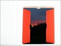
As night falls.by foxycoxy2auComment: This one made me smile, just knowing that last week, somewhere in the world, a photographer was sitting in a playhouse watching the sunset. I think your flash was a bit too bright though. You might have done better with a flashlight shining on the back wall of the playhouse (since it is white it would have bounced to provede some illumination) and a longer exposure, which would have given you a more balanced exposure between the sunset and the inside of the playhouse. |
 Photographer found comment helpful. Photographer found comment helpful. |
| 09/05/2004 07:46:43 PM |
Old Fenceby Keith-Comment: This would be better if you could have angled just a bit to cut out the metal gate on the right edge of the image. Great use of framing relevant to the subject. |
| Photographer found comment helpful. |
| 09/05/2004 07:45:42 PM |
Yonder Gazeby JarradComment: Excellent! Great compisition, good use of framing, an interesting subject, nice and clean but still interesting. (Fascinating, actually. I want to find one of those, it looks like fun!) |
| 09/05/2004 07:43:39 PM |
Look at me.by zirkovicComment: Great compisition! I love how you used something as foreground which also exists in the background, so that even though it is intentionally out of focus to not distract, it also doesn't distract because we're trying to figure out 'what are those blurry things blocking the view?' Great exposure and I love the tone you used, much richer than the usual sepia. I also love how you managed to arrange the pose so that we can actually see her eyes through her shades, which can be very difficult to do!The only thing that I don't like about this image is the bit of something sticking up above her head on the other side of the railing. |
| Photographer found comment helpful. |
| 09/05/2004 07:39:22 PM |
framed yellow eyesby visaksenComment: This might be more interesting if I had a clue what I am looking at. Unfortunately, I don't. There are a lot of distracting elements in this shot. The bit of something sticking out into the shot on the right hand side, the shadow across the front, the bit of orange something (is that hose?) along the bottom... All of these things distract from the image, especially when the subject is not something that most people will be able to identify. |
| Photographer found comment helpful. |
| 09/05/2004 07:35:58 PM |
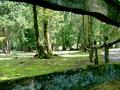
Woodland Oasisby downward_spiralComment: If it were possible, removing those two white sticks on the right side of the image would really have helped to clean up and 'prettify' this shot. That said, great shutter speed, exposure, and interest. |
| Photographer found comment helpful. |
| 09/05/2004 07:32:05 PM |
Surounded By Flowersby dirkjan_denelzenComment: This is a nice shot, but all of your 'action' is in the top and left of the image. The lower right quarter is entirely empty, and it gives this image a lopsided, top-heavy feel. A couple things would have really helped here. First, you could have taken this shot (assuming no interference) from a slightly higher angle to bring the fountain and buildings off the top edge. Then, a bit of greenery peeking out of the right (even if it's just a couple blades of grass that you snatch up from the ground, and hold in the composition while you take the picture) would really complete the balance. |
| Photographer found comment helpful. |
| 09/05/2004 07:26:47 PM |
|
| Photographer found comment helpful. |
| 09/05/2004 07:25:14 PM |
One Candleby lwkimagesComment: This is a lovely image, but I think it would serve the challenge criteria better if there were more difference between the pitchers (which I take to be your foreground) and the candle. You have depth, but I don't really see foreground/background here. It would also be better, I think, if there were a bit more space around the outside edges, particularly the sides. With so much lovely space around the flame, the handles really look like they're squeezing in to get in the shot. You might also consider getting a piece of fabric to function as a flooring, as the seams are very out of place and distracting among your lovely swirling forms and textures. |
| Photographer found comment helpful. |
| 09/04/2004 07:30:28 PM |
In Playby ClubJuggleComment: Great picture, but there isn't anything in the foreground, let alone framing the subject. |
| Photographer found comment helpful. |
Home -
Challenges -
Community -
League -
Photos -
Cameras -
Lenses -
Learn -
Help -
Terms of Use -
Privacy -
Top ^
DPChallenge, and website content and design, Copyright © 2001-2025 Challenging Technologies, LLC.
All digital photo copyrights belong to the photographers and may not be used without permission.
Current Server Time: 08/02/2025 02:10:40 AM EDT.