| Image |
Comment |
| 09/01/2004 11:02:04 AM |
|
 Photographer found comment helpful. Photographer found comment helpful. |
| 09/01/2004 11:01:08 AM |
Lace in Windby lytaComment: Wondering how you got your frame. Looks kind of like a vignette filter. I do like how some of the plants seem to be blowing in the wind. |
| Photographer found comment helpful. |
| 09/01/2004 10:59:13 AM |
|
| 09/01/2004 10:54:03 AM |
Girl in the Slideby gwhippleComment: I like the concept. The rims in the slide make the eyes follow back to the girl. The one curl of hair in her face is a bit distracting. |
| 08/25/2004 12:20:21 AM |
Neon in Motionby dwolffComment: Thanks to everyone. I knew this wouldn't do to well because I couldn't capture what I wanted. (I would have gave this a 3 myself.) Sign is kind of a landmark here in St. Louis, I think its been here longer than me (born here,raised here). Anyway, the eagle "flies" above the company A (fancy script w/a star on top), the lights flashing in a pattern to show two flaps of the wings (four motions per flap), then the eagle disappears and the A fills up w/ red & white lights. The white budwiser was added later and the flag after 911. I wanted to capture a few of the positions in one shot, but the lights ended up overexposed and all the details got lost. Message edited by author 2004-08-25 12:57:17. |
| 08/21/2004 03:07:48 PM |
Energyby DougPazComment: Although this photo looks a bit dark overall, I still like it. My favorite part is the shiny spot on the left, just outside the ball. It add a bit of intetest as well as a pop of light. I'm too much of an amature to give a good critique, but I also think the blue and reddish purple colors compliment each other very well. I gave this a 9. |
| Photographer found comment helpful. |
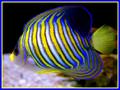
| 08/21/2004 03:03:16 PM |
Shark Bait....Boo Ha Haby foxycoxy2auComment: I moved my score on this photo up twice. The picture is nice, a soft focus and you didn't seem to get any glare from the fish tank. The border is the only thing I don't like. The blue seems to match well enough, but the yellow looks funny, at least on the side by the tail. I still gave you a 9. |
| Photographer found comment helpful. |
| 08/19/2004 02:20:04 AM |
Yoga Bouquetby BradComment: I like the effect you captured. Only thing I wish was different was the bottom, I would have liked to see the full effect instead of it being cut off. 8 |
| Photographer found comment helpful. |
| 08/19/2004 02:16:34 AM |
|
| Photographer found comment helpful. |
| 08/19/2004 02:14:36 AM |
Wildflowersby sprite777Comment: Very abstract looking. I was wondering what type of flower that is. The coloring is perfect. I was also wondering how much, if any, color adjustments had to be made. My favorite this round. |
| Photographer found comment helpful. |
Home -
Challenges -
Community -
League -
Photos -
Cameras -
Lenses -
Learn -
Help -
Terms of Use -
Privacy -
Top ^
DPChallenge, and website content and design, Copyright © 2001-2025 Challenging Technologies, LLC.
All digital photo copyrights belong to the photographers and may not be used without permission.
Current Server Time: 08/04/2025 01:27:25 PM EDT.